
Culture IQ is a custom Web-based software-as-a-service (SaaS) application serving human resource (HR) professionals looking to improve organizational culture through the creation and distribution of employee surveys, analysis of results, and the dissemination of finding to help guide improvements within client organizations. Engaging data visualization displays would play a major role in helping client team members tell their story, augmented by a solid user interface to make their tasks easier.

Main application dashboard, where users can see a high-level overview of their data. This card-based interface can be customized, as well as offering quick drilldowns to more detailed information.

Self-service view of the overview of the Create Survey process. Here, self-service clients are given the option of selecting from custom surveys, those provided by the application, or for legacy clients, the older Clear Advantage format. Due to the need to careful attention to detail in order to not skew results, some options are locked, and any changes must be done by Culture IQ delivery team staff.

For proper analysis, survey questions must be mapped to categories. Here, the interface interactions are shown on how a user would accomplish this, as well as displaying the already selected categories, to make the question process more user-friendly.
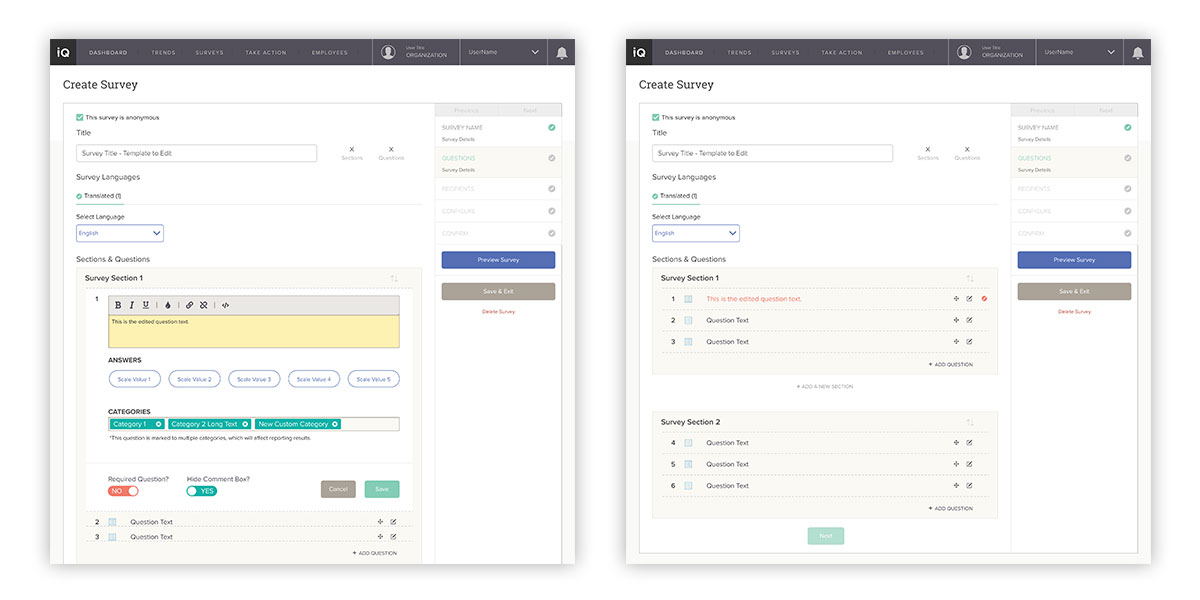
When a user opts to modify a question, because of the potential data ramifications, there is compelling need to visually indicate edits. Here, the interface clearly displays it, in two steps in process—while editing (left), and in the overall survey view (right).
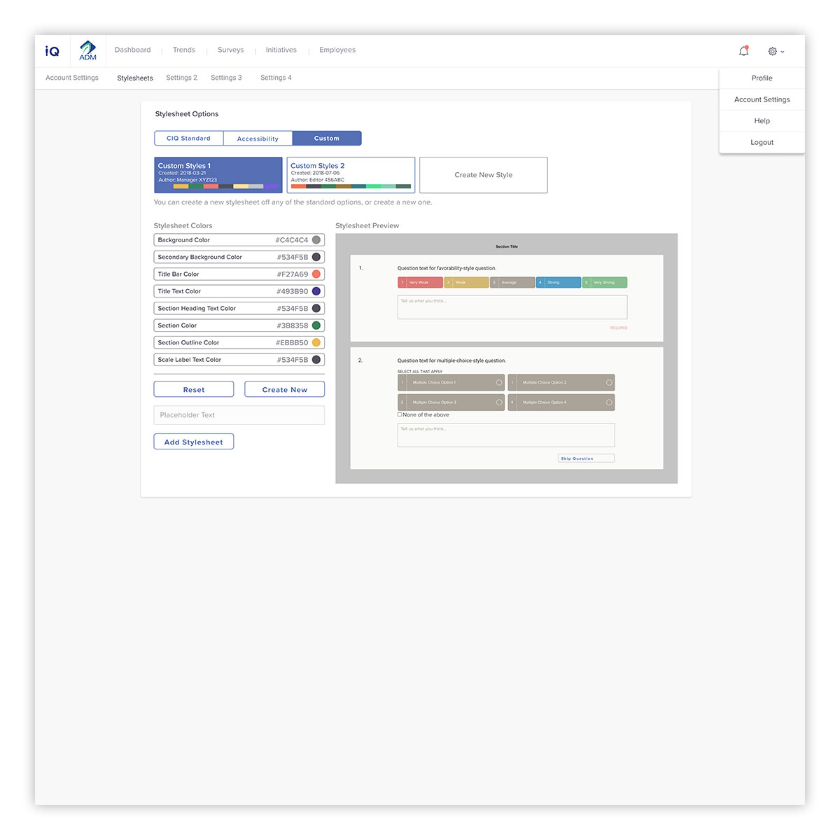
As the industry moves to more customizable options for the survey taking experience, there is naturally a need for an interface to facilitate this. Here, users can select from application-standard, accessibility-enhanced versions, as well as creating custom stylesheets. Accessibility is a major factor, and key in allowing clients to serve their users and be Section 508 compliant. To help users see the end result, the display interface updates instantaneously to show what style edits will look like to the end user.
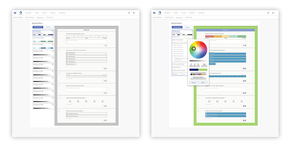
Display of interface states for customizing colors, and the instantaneous updates to the preview, to allow rapid feedback for easy customization.
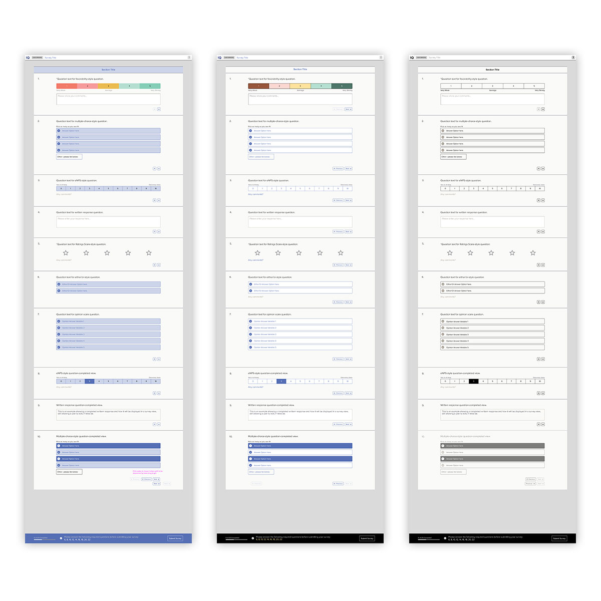
A key client (and legal) requirement is accessibility. Here, three default survey color modes are displayed. On the right is the default view, which displays by default when a survey is built, unless a customization has been set. In the center is a high-contrast color scheme, designed and tested for visually-challenged users. On the right is a full-accessibility view, set to a monochromatic scheme in order to display in the most challenging environments.

Advanced functionality—such as adding questions and other assets to an account—is reserved for Culture IQ delivery team staff use. This section is named Backstage, and is visually and organizationally distinct from the client-facing application. Here, staff assists clients to import assets to be used in their account. Here, the survey question bank default view is displayed, which shows a high-level overview of each question.

Matching data fields between external sources and existing data can be a challenge. Here, this interface shows the field importer, where an automated best effort is made to match up fields. Unconnected strings are shown, allowing the user to ignore or manually match before completing the data import.

For more granular functions within Backstage, modal dialogs are used. Here, the interface patterns are on display for the functions of adding a question to the bank (left), and editing a question (right). In addition, critical steps, such as benchmark mapping, are displayed to the user using alert dialogs, highlighting, and focus states.
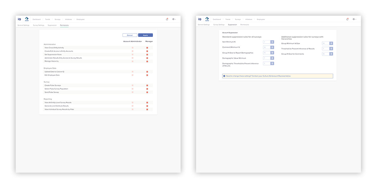
To give clients greater control, account settings are devised to be clear and easy to implement. On the left, account permissions are set to be quite granular, and are role-based. On the right, account suppression settings are displayed—but disabled—with an alert notifying users that these settings must be modified through Culture IQ staff, in order to protect the confidentiality of survey takers.
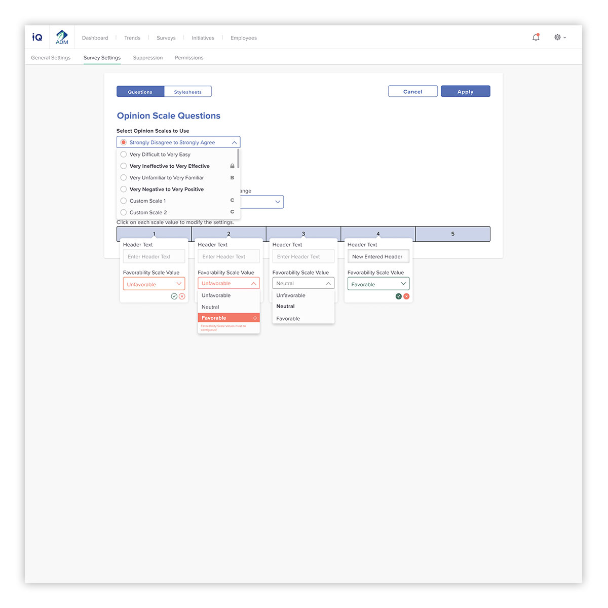
Due to the number of facets that accompany the composition of a survey question, a clear interface for end users is required. It needs to easy to modify, while keeping within the constraints of data best practices. Here, different question answers are shown, with clear indication of what category they are pulled from, as well as guiding a user on making usable options for their surveys.
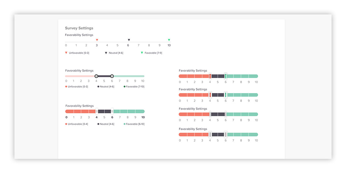
Relating to the previous screen, different input options were explored, ranging from the existing application settings that made user input intuitive, while at the same time conveyed vital statistical information. The goal was to do this, without creating a laborious interface.

To assist clients in telling their part of the data story, a customizable export format is available. Here, users can add their own branding, as well as work with editable presentation output to share with their teams.
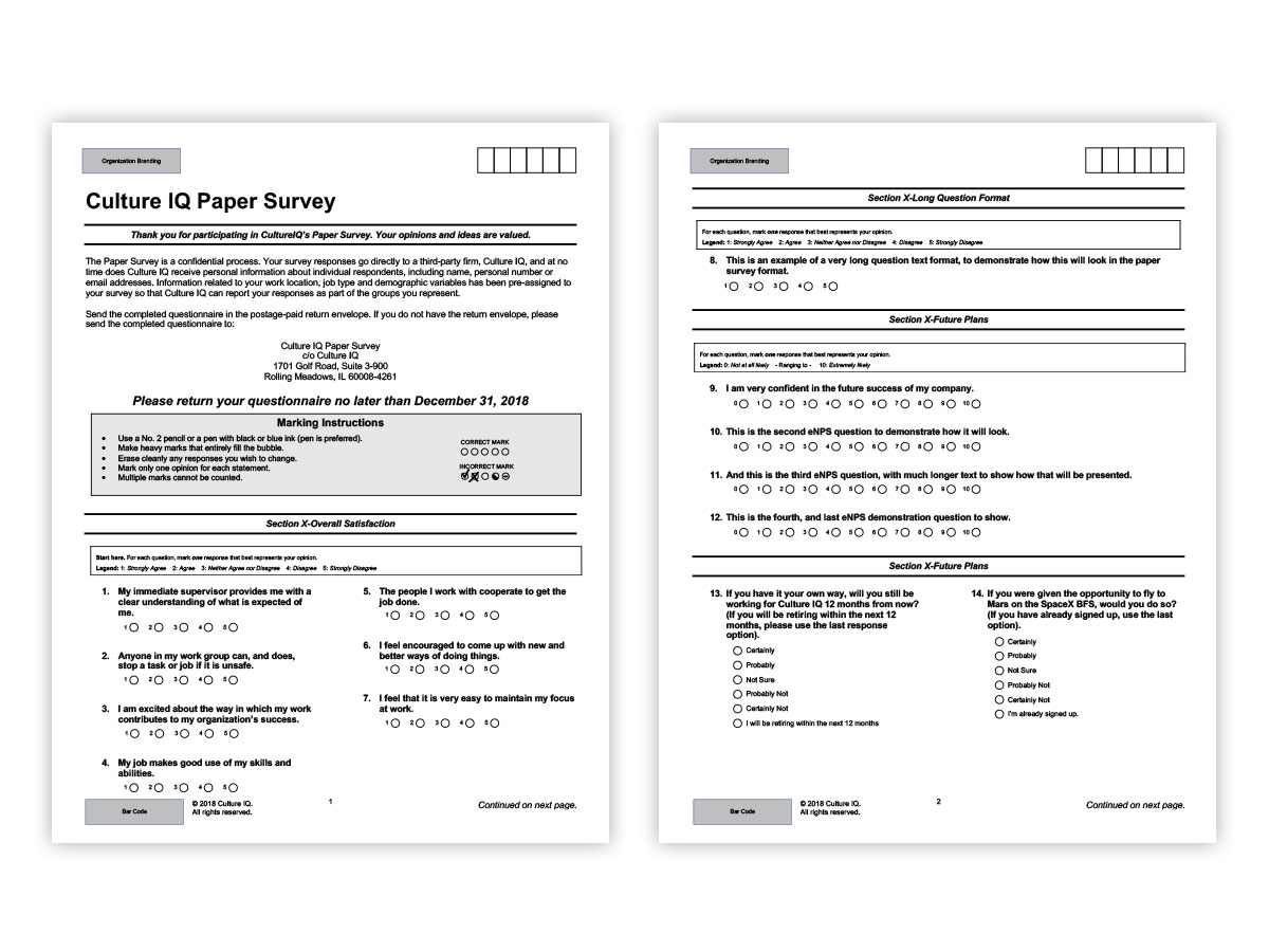
Since some clients have team members without access to computers, a paper export format is required for thier use. Here, a format was devised that is both easy for users to enter, and scannable either by machine or data entry staff. Like the online counterpart, this is also possilbe to brand, and customize for specific use cases.
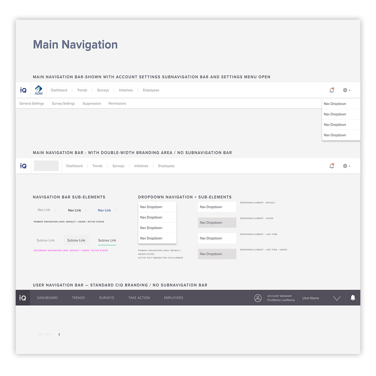
For distributed design teams, a UI kit is a great asset. Here, navigation elements, set as components in Figma, help normalize asset use within the application layouts and workflow. Nested components also help to maintain design consistency, as well as help with accessibility and user navigation within the application.
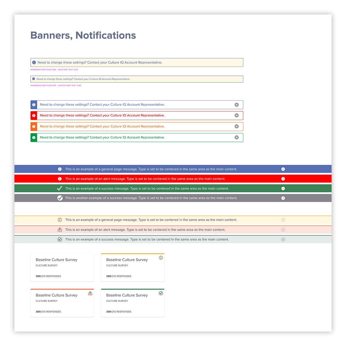
Another advantage of an expansive UI kit is easier iteration and updates. Here, various types of application user alerts, for different types of messaging are shown. This also allows rapid user testing, when the need arises.
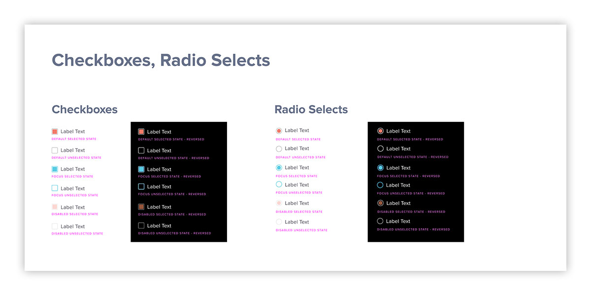
Form elements, often overlooked, are a critical component of user interface, and directly impact the overall user experience. Here, various different form states, on different backgrounds, are demonstrated in the UI kit. These are all nested components within Figma, designed for rapid reuse and updates, when need be.
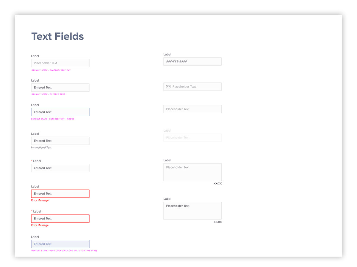
Another critical component of the user interface are form input fields. Here, various states and use cases are demonstrated in the UI kit.
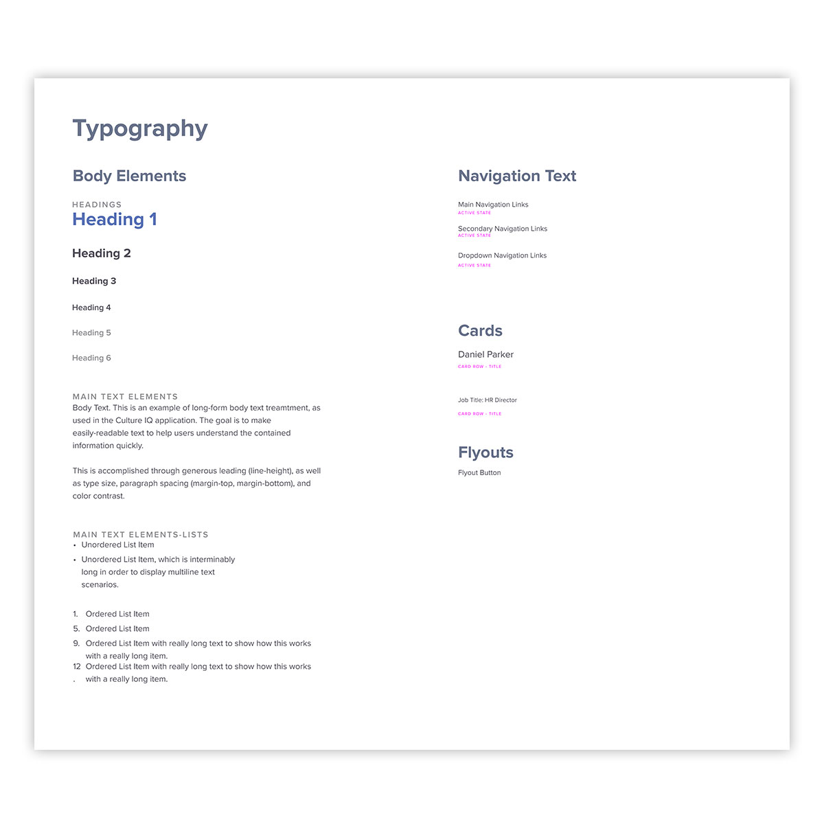
Since so much of the content and interface elements within the application are text-based, typography is critical. For readability, accessibility, and brand recognition, a consistent experience is required. Here, the major HTML elements are shown, displaying their colors and sizing relative to one another. This is another component that affects many other elements within the UI kit and the application proper.
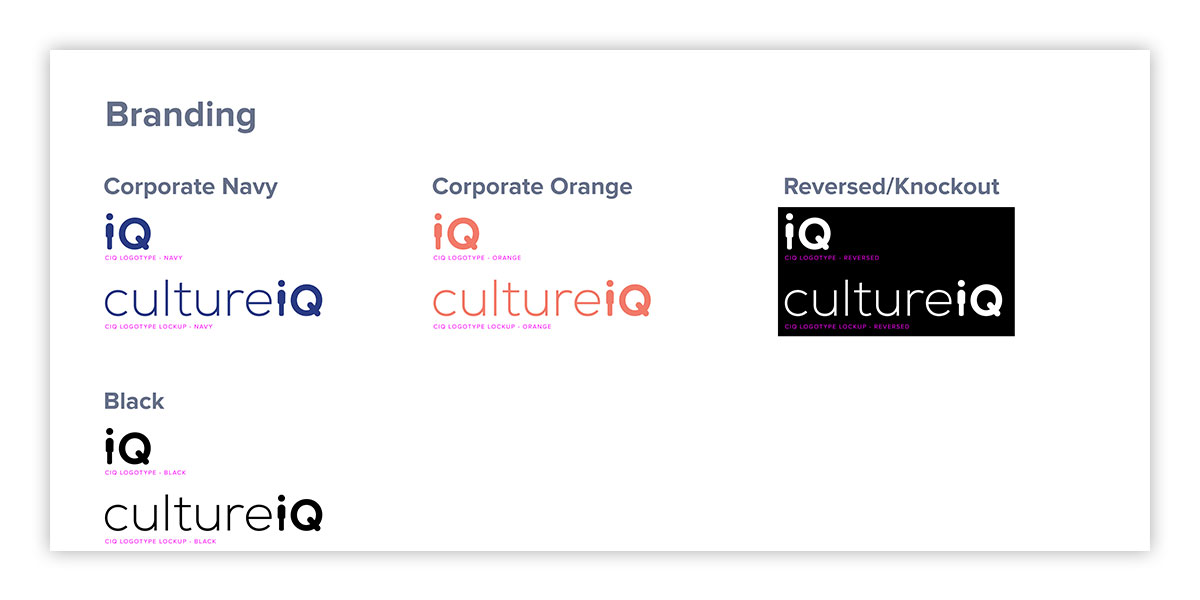
Branding is also a critical component of marketing in recognition. After an evaluation of the current state of the application, it was apparent that consistent rules around logotype elements was required. Here, both elements, in various color schemes and use cases, are shown. These were then propagated into other components in the UI kit to establish consistent patterns.
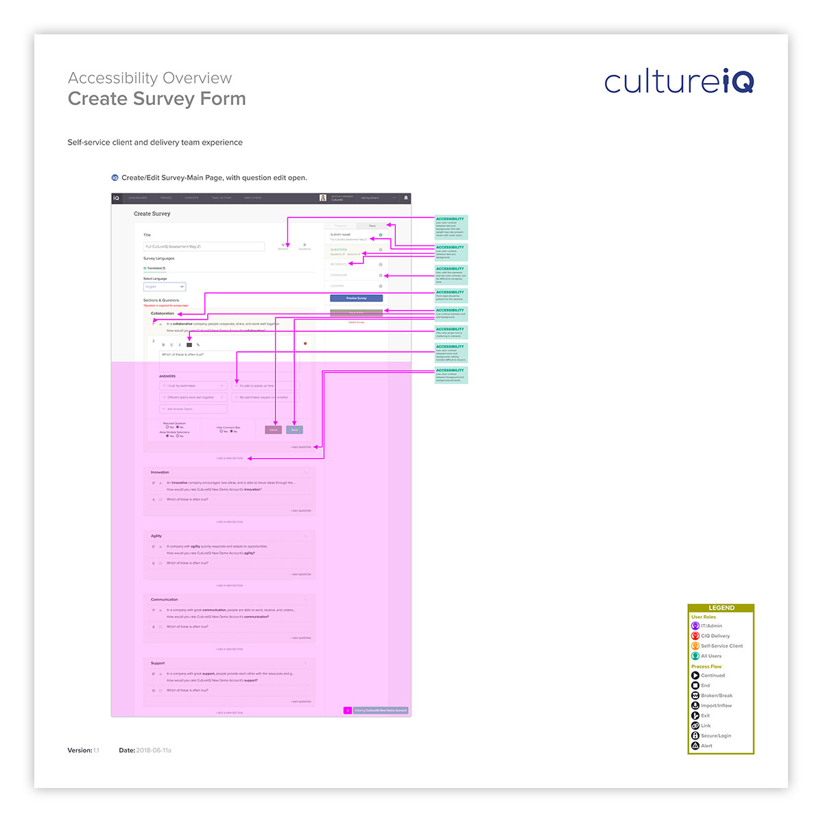
Accessibility is a critical requirement of modern Websites and applications, and is increasingly a legal requirement as well. Here is a listing of comprehensive results of an audit run on the create survey from within the application.

Here is the same process applied to the survey taker’s interface. Findings from this were applied to accessible versions of the new survey format iterations.
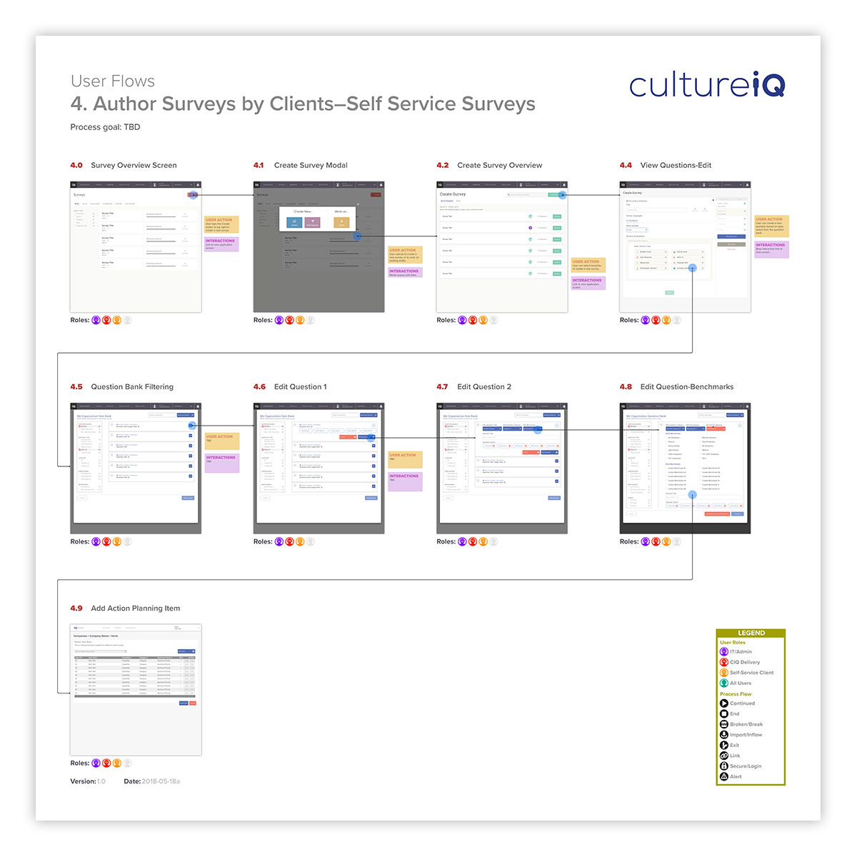
Application user flows are a good step in understanding user flows, and helping to improve the user experience. Here, a typical survey creation by a self-service user is mapped, as well as actions annotated.
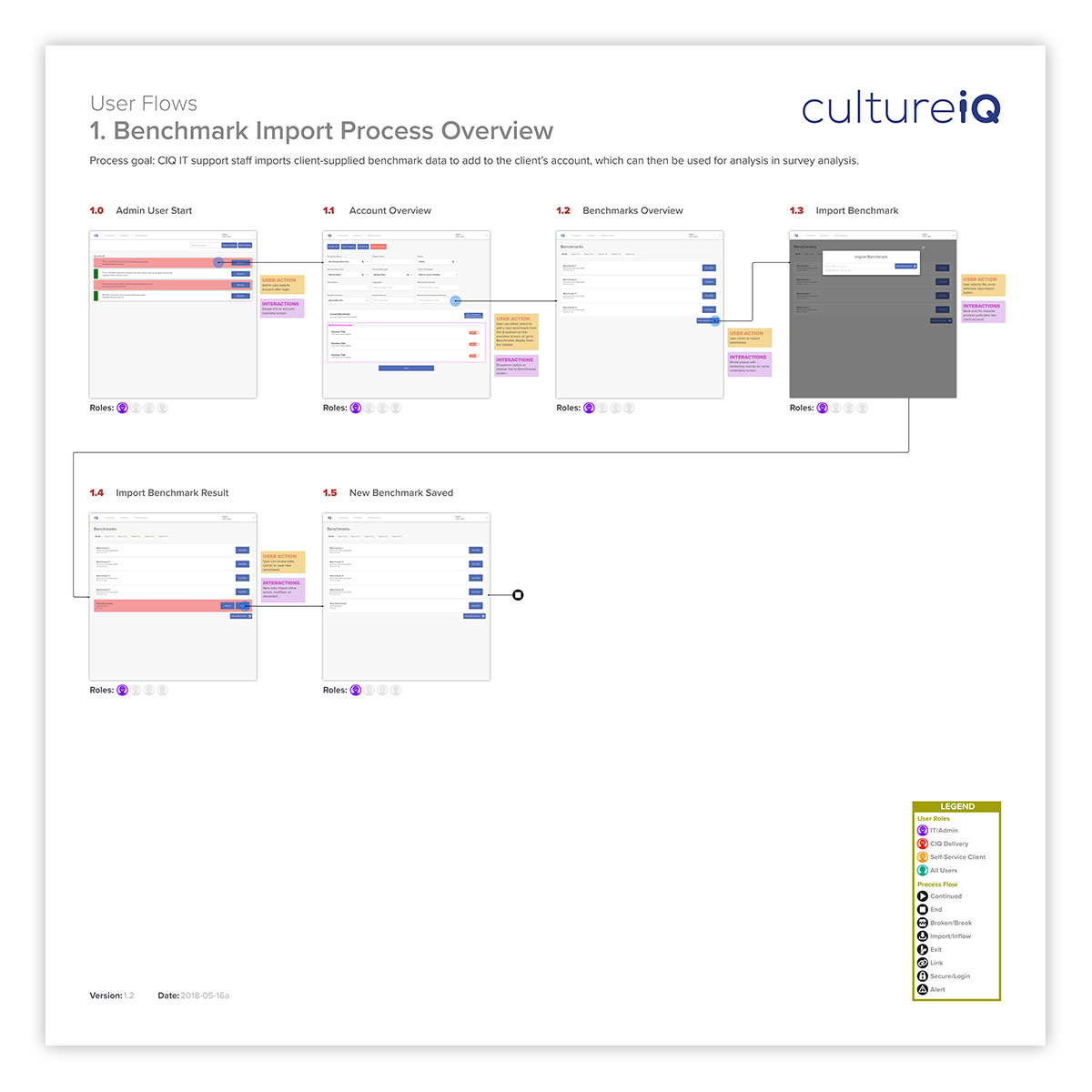
Understanding staff activities is also a critical component of customer service. Here, the process of importing benchmark comparisons for use in survey analytics by delivery team staff is mapped. This analysis can help to find sticking points, and speed up the process, which ultimately helps with client satisfaction.
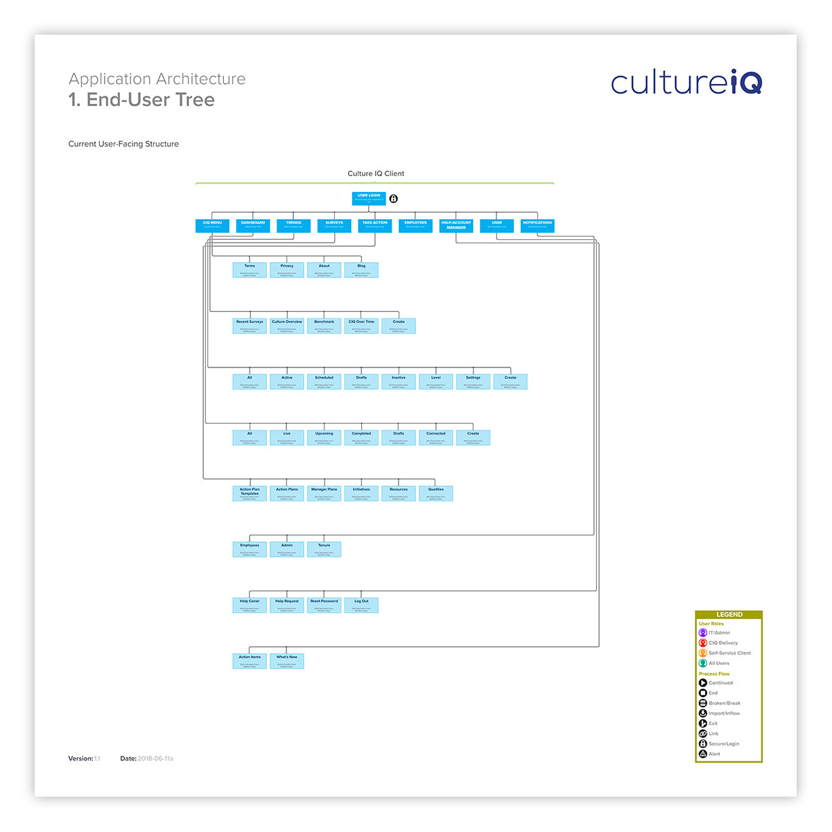
A visual representation of a application’s (or Website’s) information architecture (IA) tree is a good way to quickly see the organizational hierarchy. Here, the process is mapped from the top level navigation. This can help to uncover redundancies, sticking points, and other challenges in the current organizational structure.
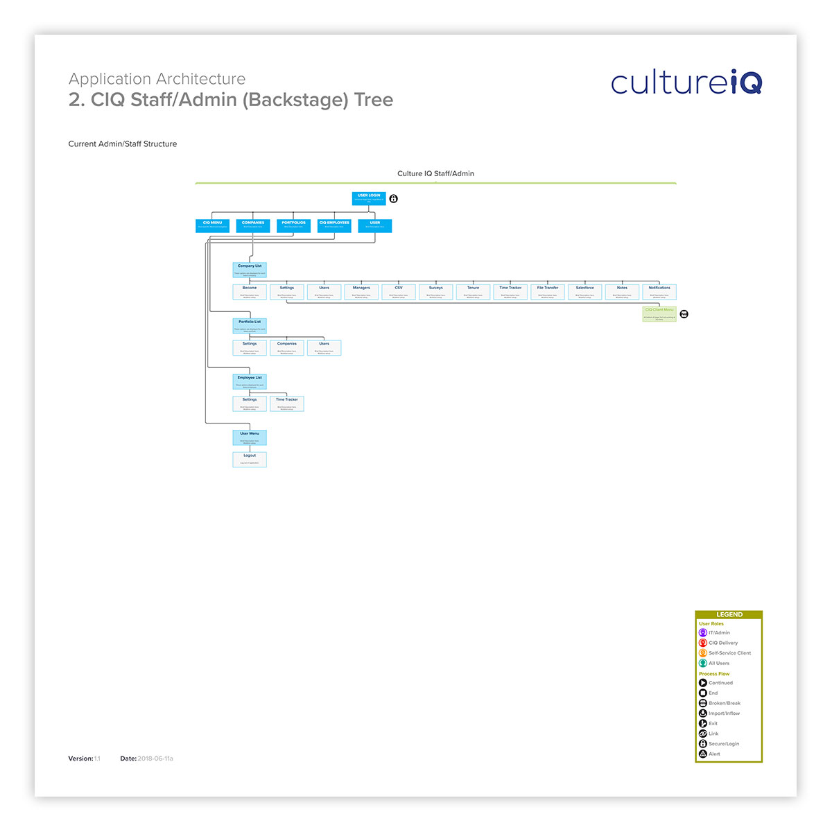
Mapping staff the staff IA is also helpful. Especially when an application or Website grows organically, what may have been simple at first can quickly become complex, especially for new team members. Here, the current staff functions of the application are mapped.
