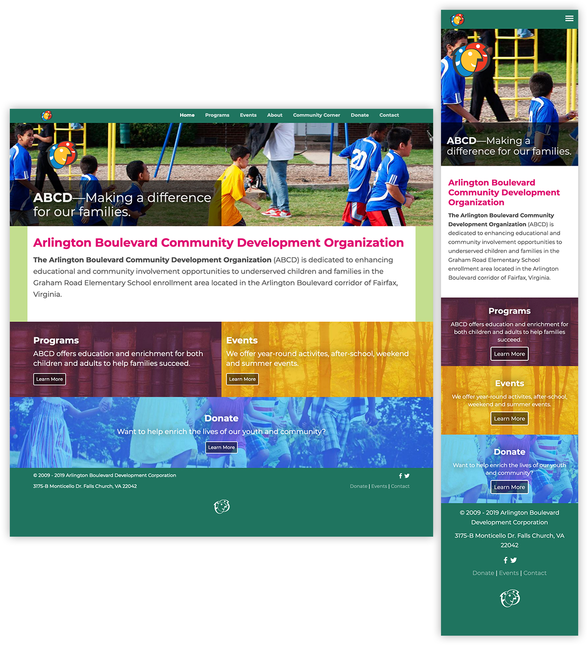
Arlington Boulevard Community Development Organization (ABCD) is a volunteer-run endeavor serving the local community. They provide after-school activities, training and language instruction, as well as community outreach partnering with local organizations and government agencies. To build greater community awareness of their mission and resources, their online presence needed enhancement and expansion.
To address the design challenge, a user-centric approach was employed to make the most of limited resources. This included special consideration to textual content, since the community ABCD serves often speaks little English, and the number of languages represented—as well as editorial support—would preclude effective multilingual content. For the authoring experience, the site also needed to be user-friendly for quick updating. On the technical side, the careful balancing of visual content and acceptable performance on limited-resource platforms using responsively served content would be required.
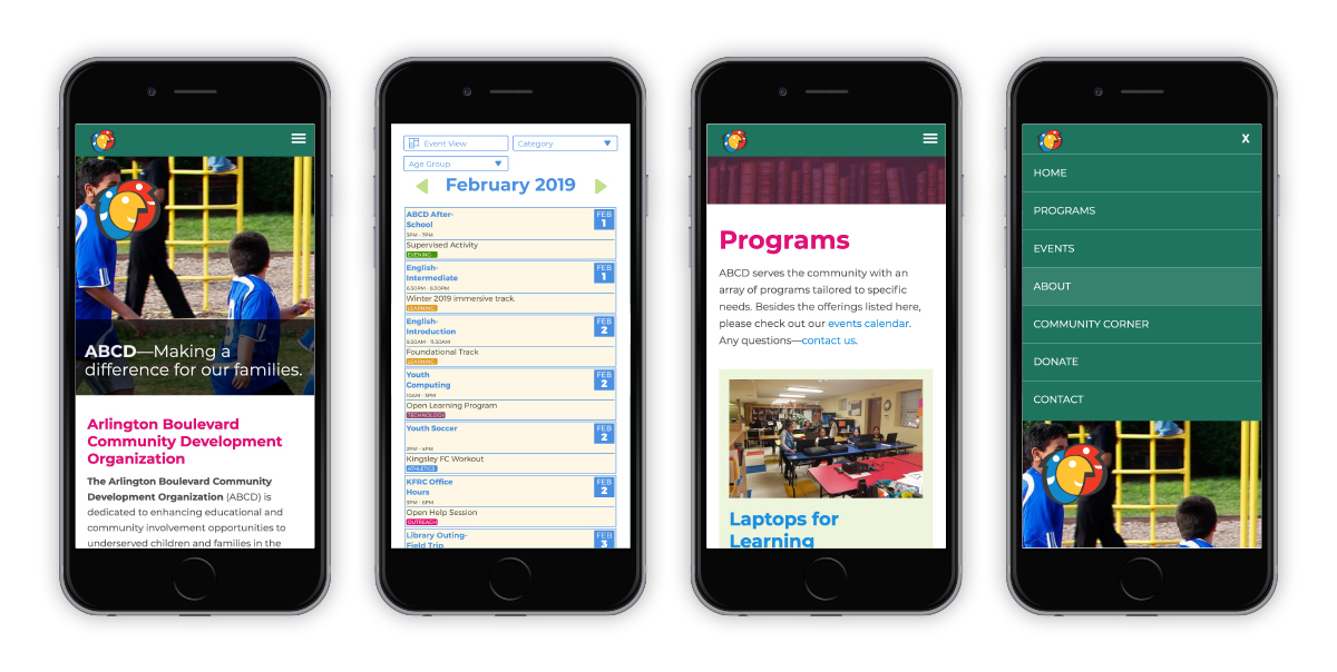
Mobile screens of ABCD Website, showing multiple content types and the mobile site menu.
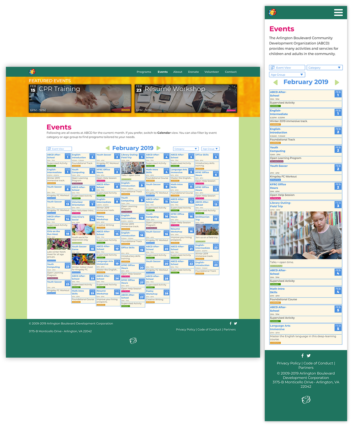
Due to the large number of events held at ABCD, an alternative approach to calendar displays was devised. This shows the default view, with all events for a given month shown. Users are able to filter this based on selected parameters.
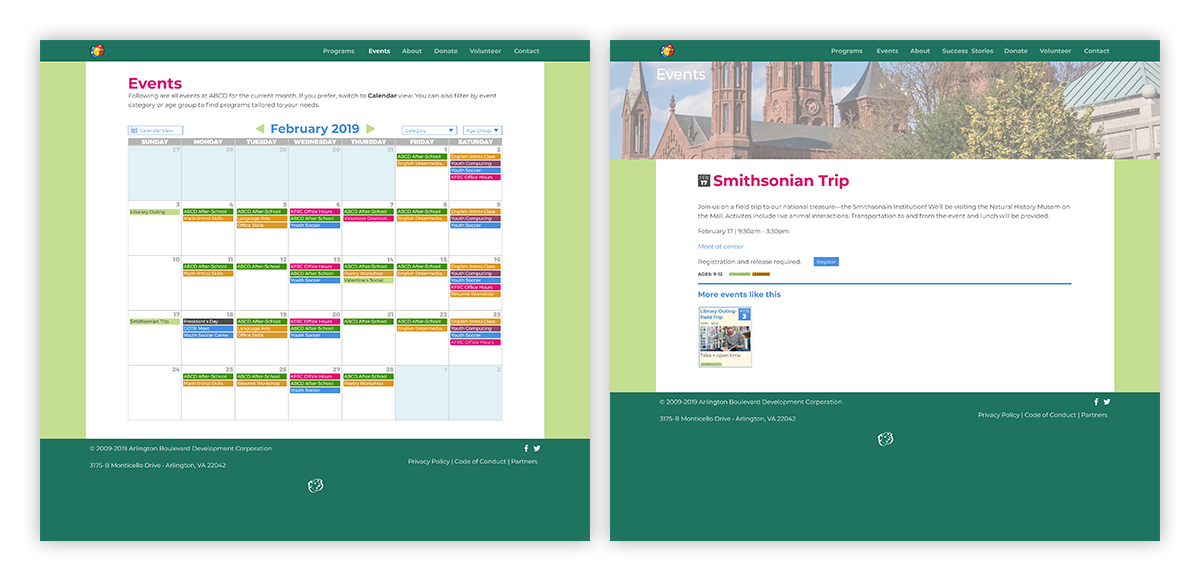
Alternate calendar display and featured event. In this calendar display, listings are shown in category tag color for easy visual association. In the featured event display, relevant event details, such as location, time, and registration requirements are shown in a clear and consistent manner. In addition, similar upcoming events are automatically displayed. For events that are part of a series, the other dates for the given time frame (calendar month by default) are shown, and link to these.
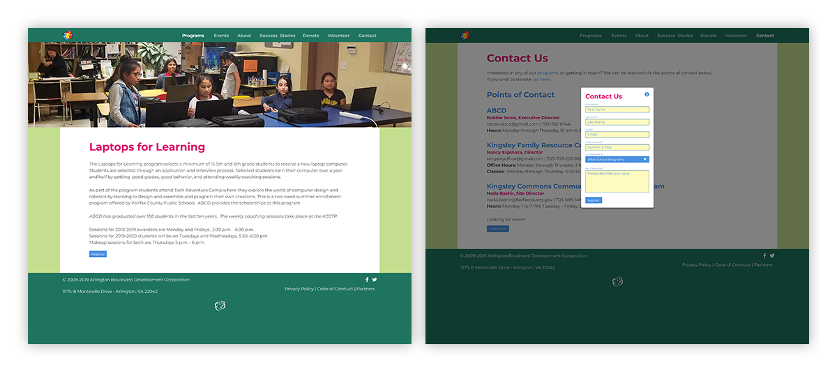
Individual program display, and contact form popup. Since many users of ABCD services don't use email, alternate methods of contacting staff are shown by default. For those that need online support, a concise, user-friendly popup form is provided.
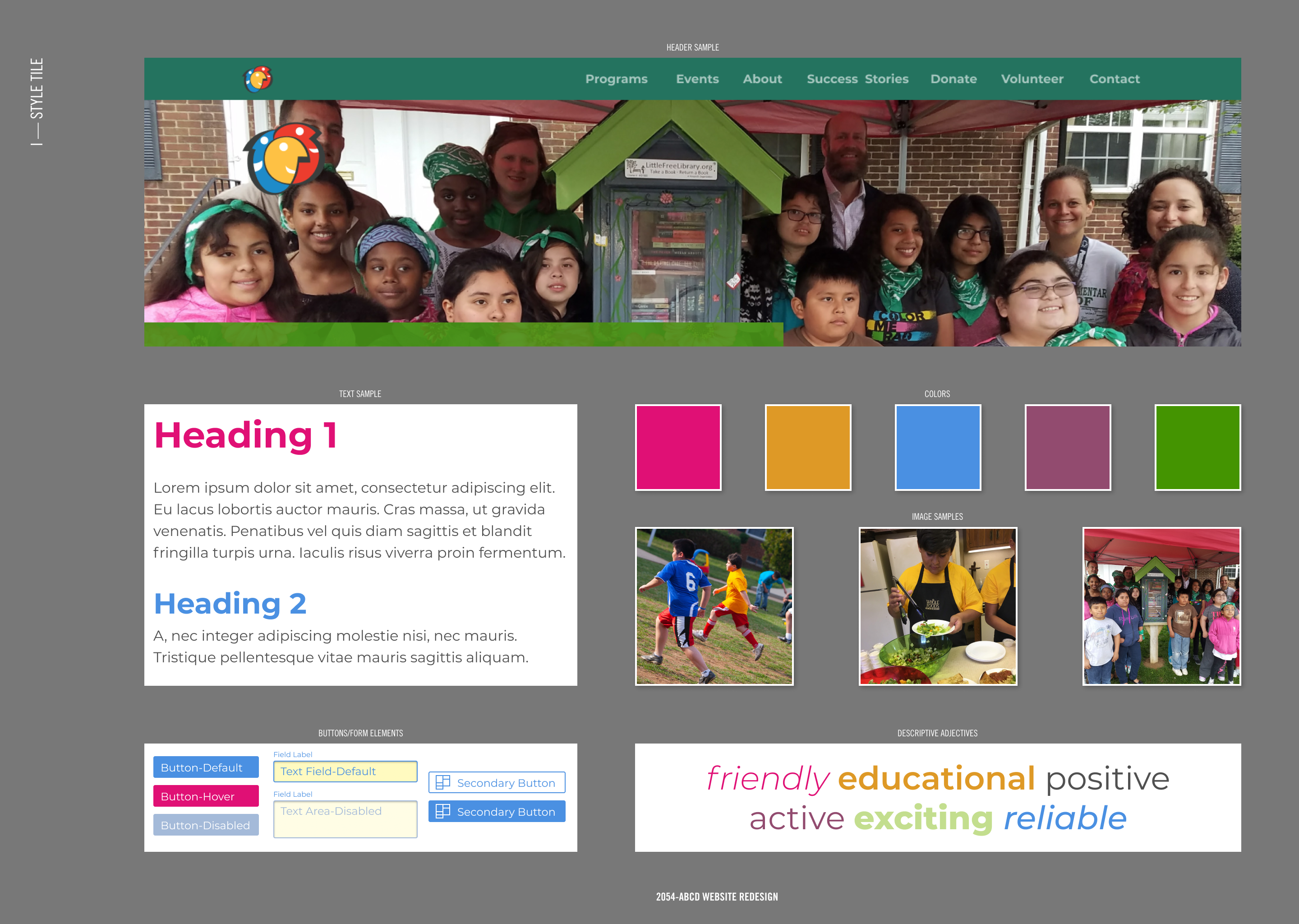
Site design style tile showing page elements and experiential concepts to secure stakeholder buy-in.
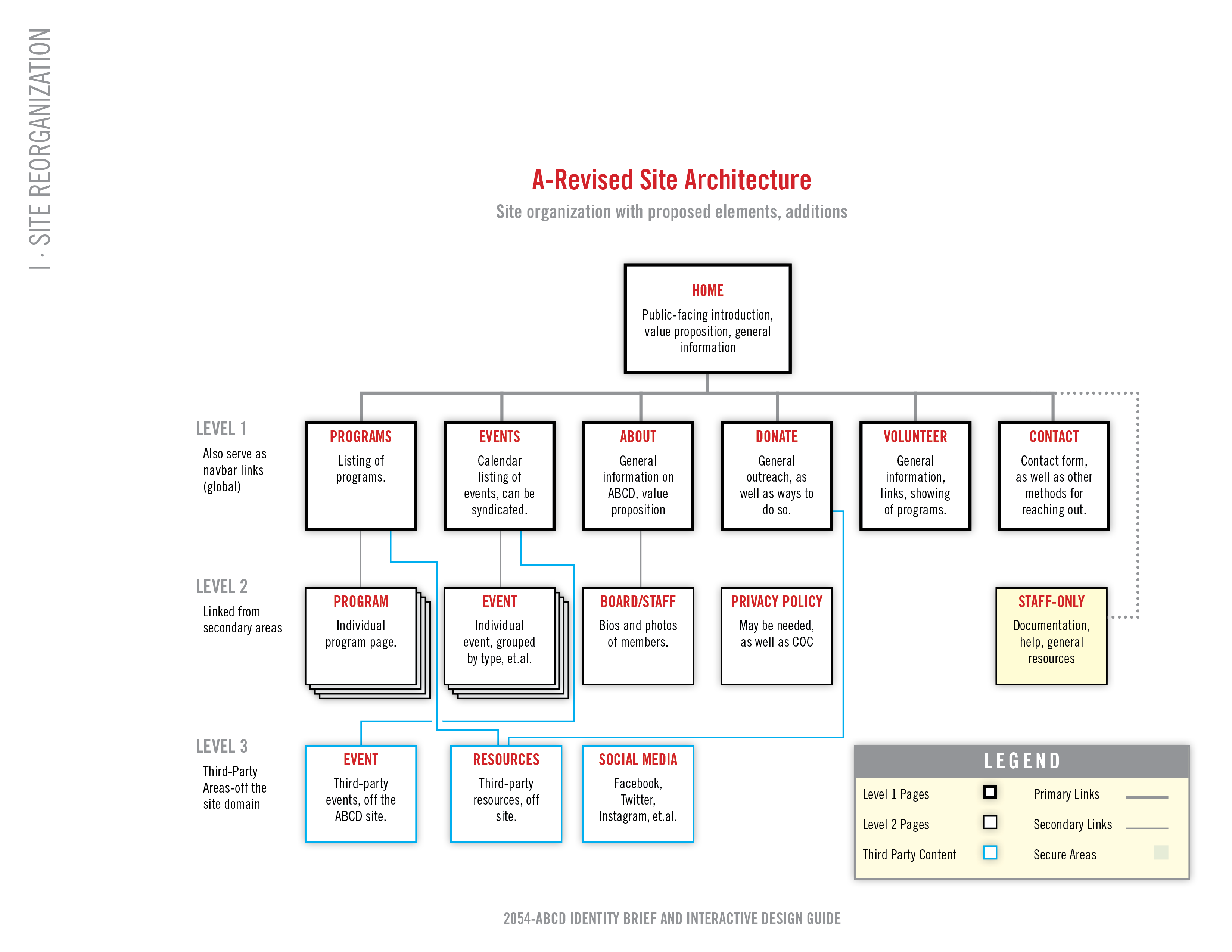
Information architecture tree showing site structure and hierarchy. An essential tool for planning effective content strategy and user-centered site experiences.
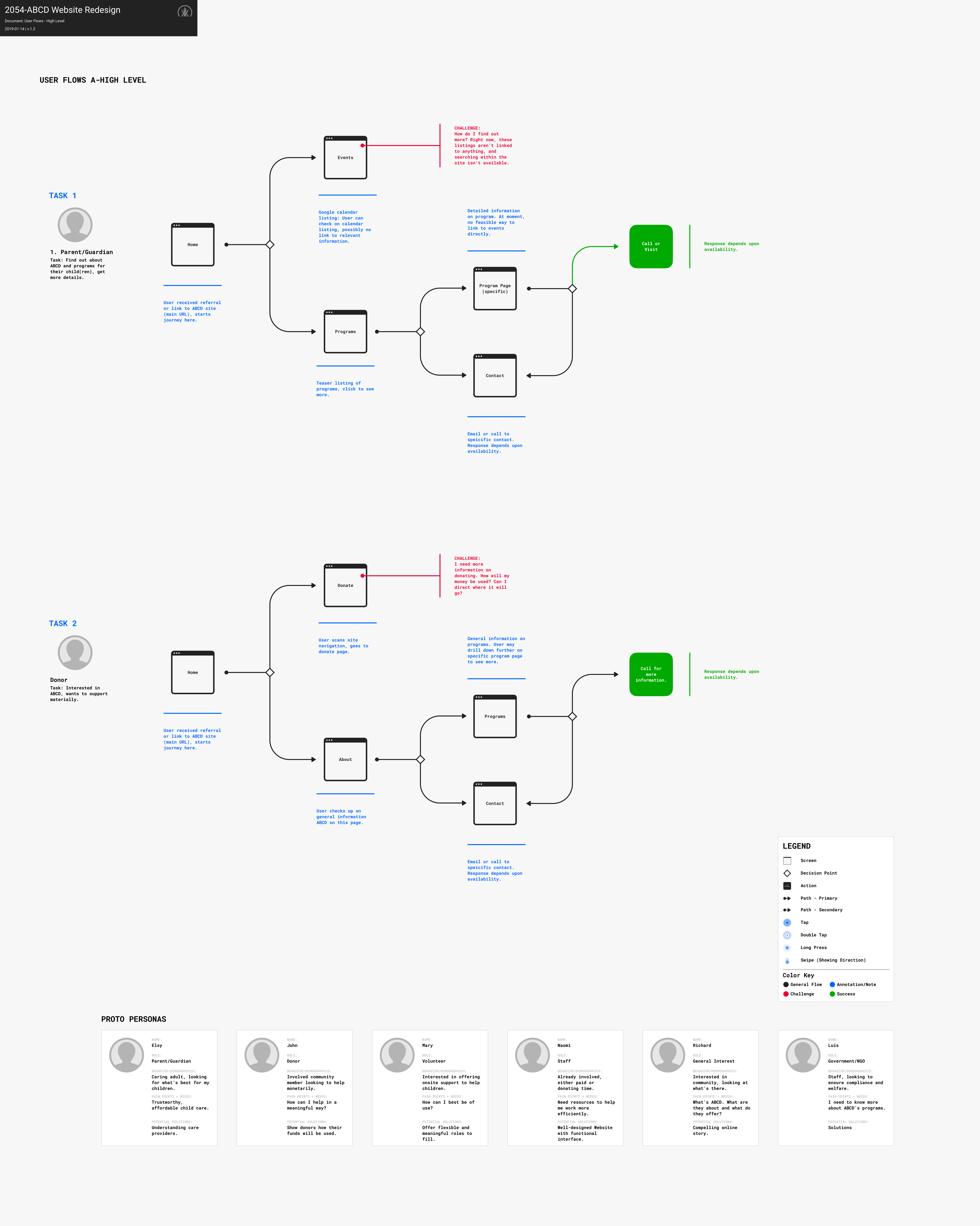
High-level user flows, showing representative tasks for select proto personas. Due to budgetary constraints, dedicated user research was not possible, so approximations were utilized to build experiences to model.
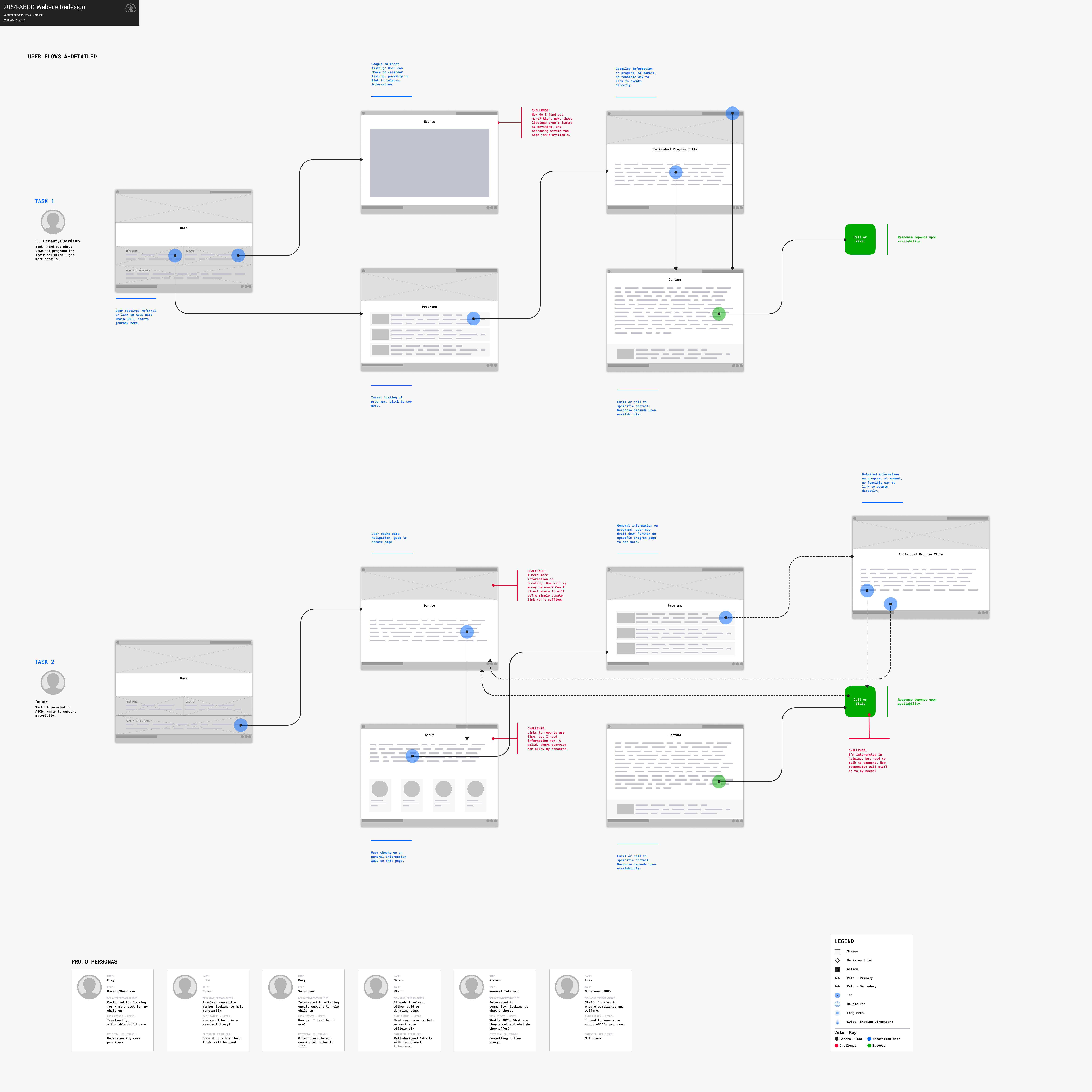
These user flows are carried further, into detailed interaction mapping based on tasks. Outlining this process helps stakeholders visualize possible sticking points and frustrations, and helps to inform content strategy.
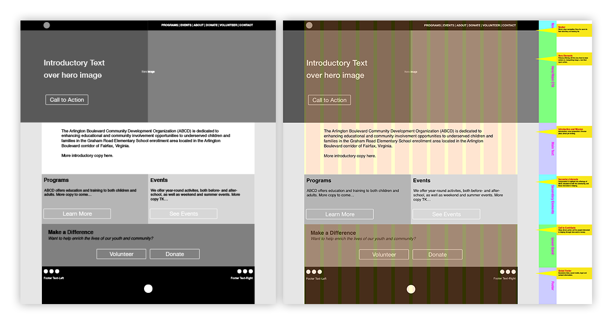
Content wireframes for homepage—showing multiple layers. These help facilitate discussion of content strategy, as it relates to the overall user experience, by separating visual design elements from the underlying content and regions. This allows the discussion to focus on the underlying structure and overall strategy.

