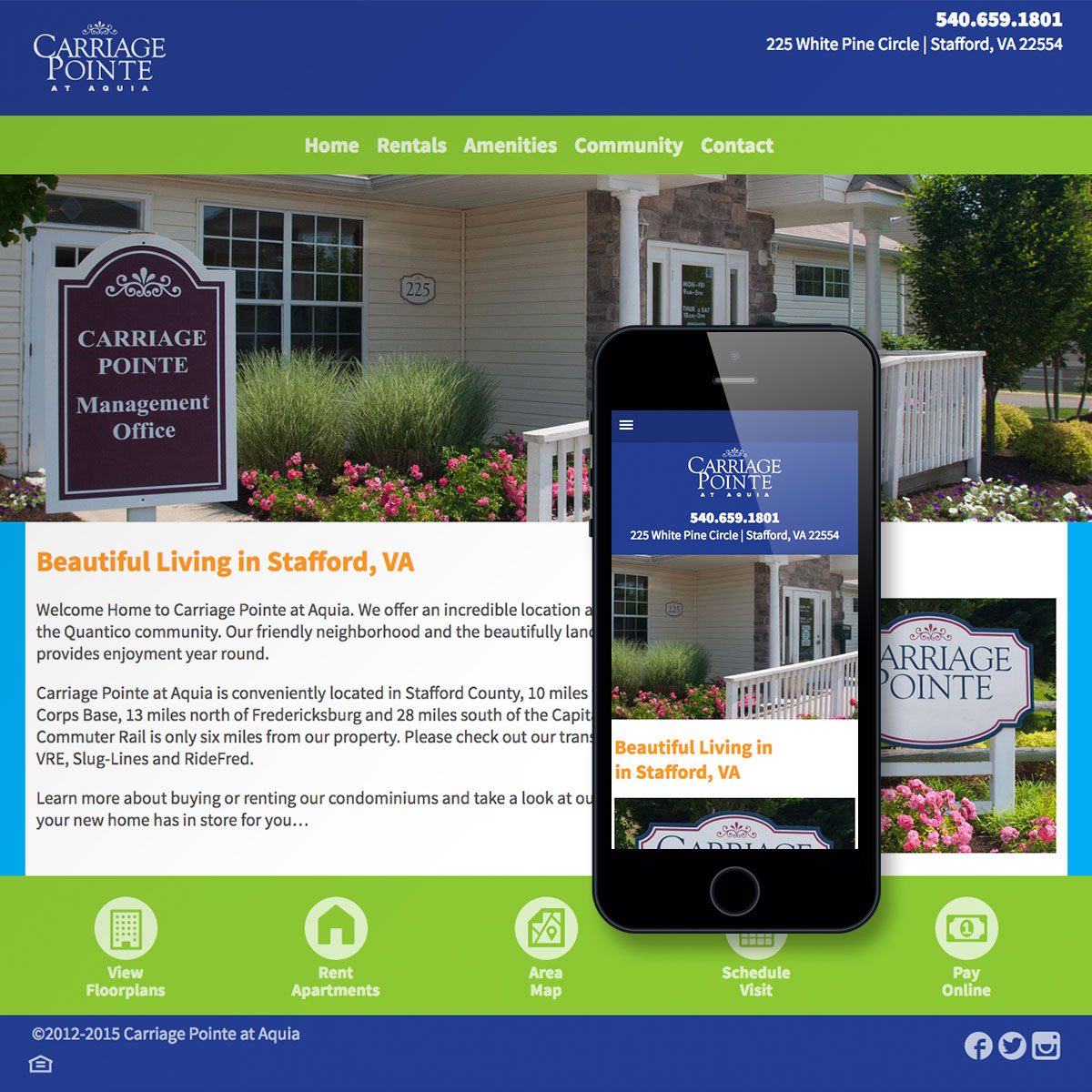
Carriage Pointe was in need of a Website redesign, as well as being mobile-friendly. The site was redesigned from the ground up, with new colors, typography, photograpy, and text. Planning for limited bandwidth requirements was key--and responsively served images (generated on the fly within the system) allow a image-heavy design while not overtaxing mobile devices. By planning mobile-first, and incorporating fluid layouts, the finished site delivers a high-quality experience to all device users.
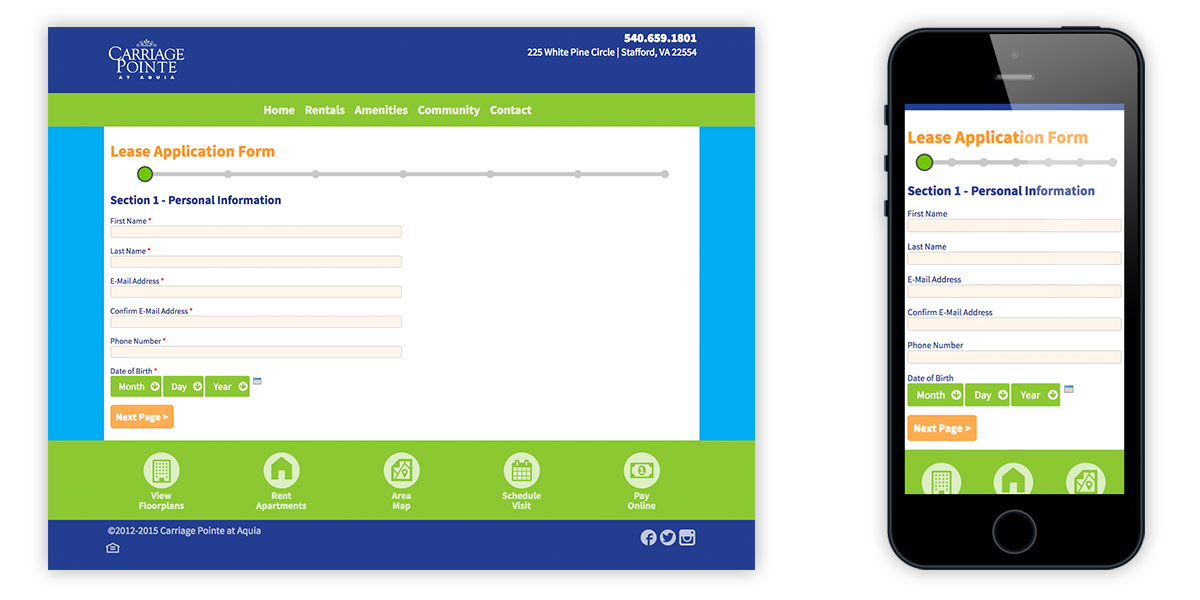
An often overlooked detail of many sites is form design, especially long-form layout. This can be a serious user experience (UX) design pain point, and requires careful design. To avoid overwhelming users, a graphical progess indicator shows their rate of completion.
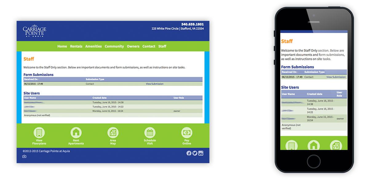
For site administration, there is a staff-only area displaying reports of users and form submissions, as well as the ability to post needed files and other resources for easy, yet secure access.
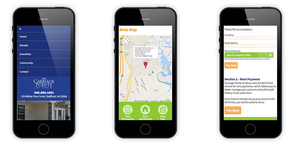
Mobile screens showing site navigation (open), Google Maps integration, and online payment using two methods.
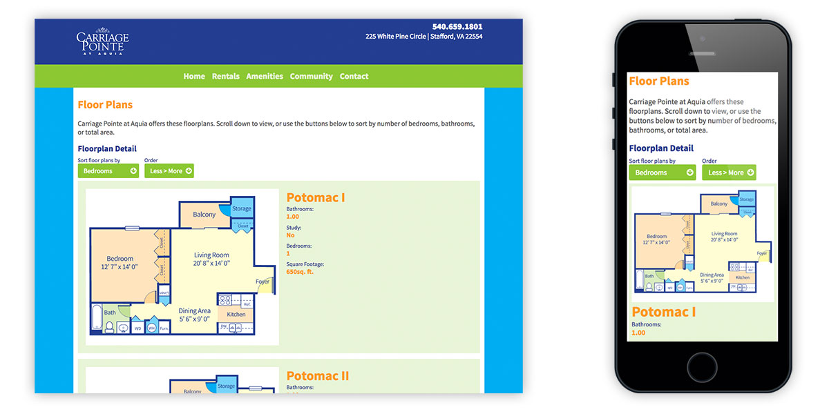
To allow prospective residents to easily compare apartments, a sortable floorplan format was devised. Like the rest of the site, it is fully responsive.
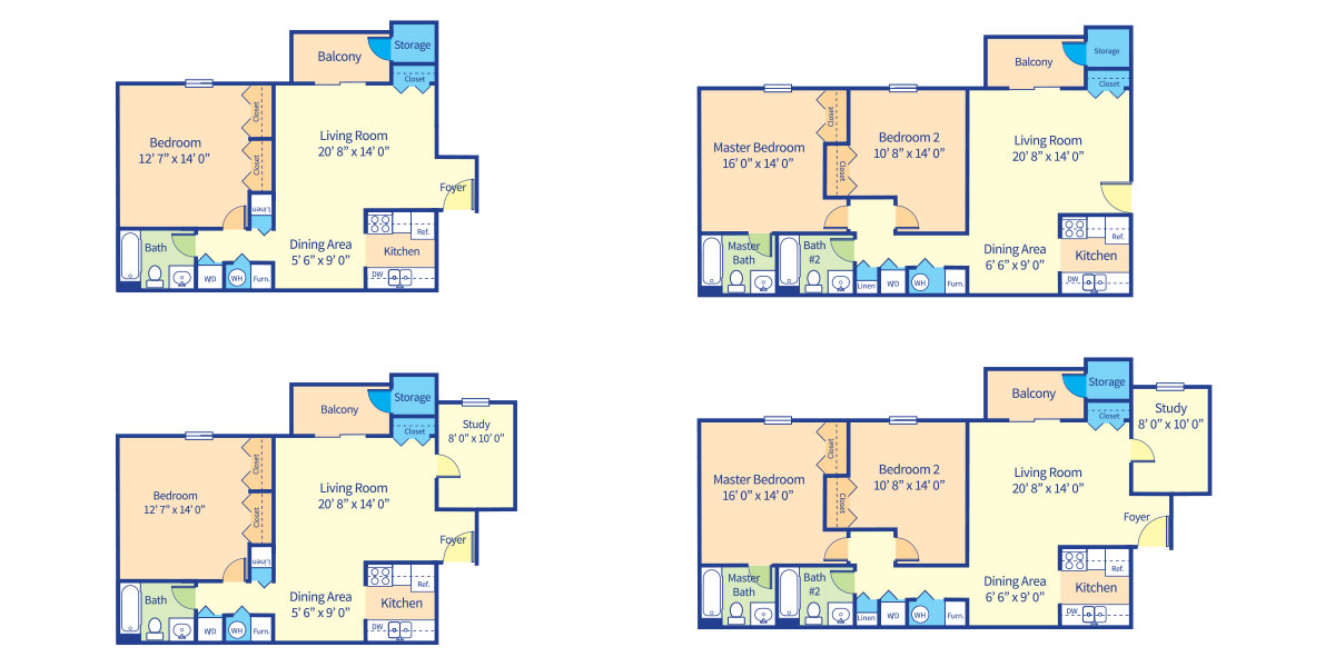
New custom floorplan redrawings were required to conform to design and branding guidelines, as well as display properly in all sizes. Vector artwork eliminates the need for responsively sized images and multipliers.
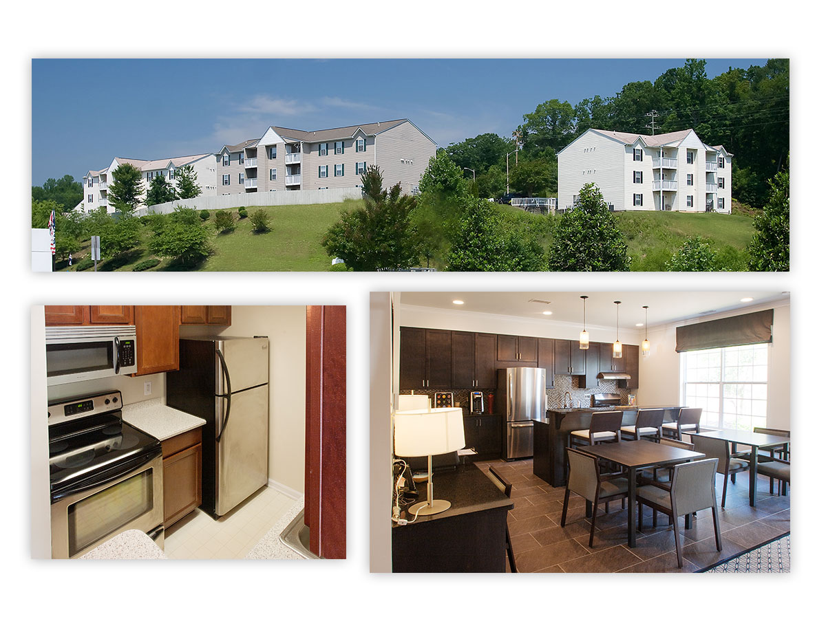
Content is the most critical component of any Website, and imagery is vitally important for real estate sites. Here, post-renovation custom photography was done concurrently with site design and development.
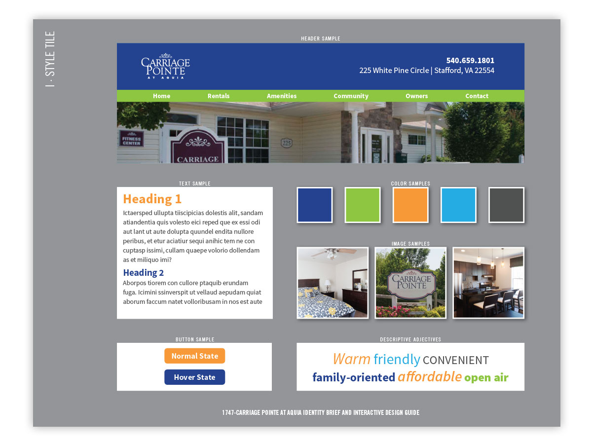
Style tile highlighting major design patterns and elements for the site.
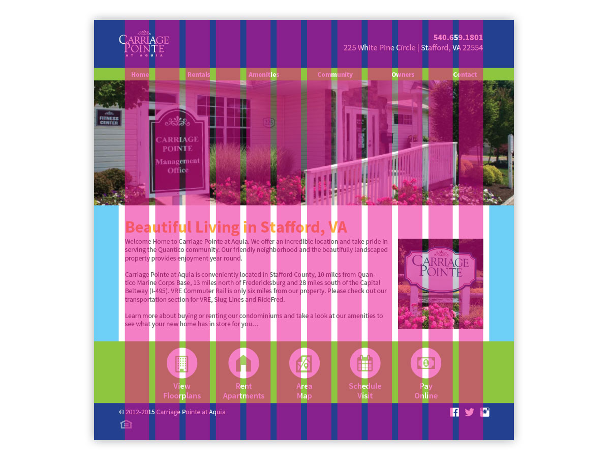
Solid design only comes with good planning. To ensure consistency, a fluid column grid layout was employed.
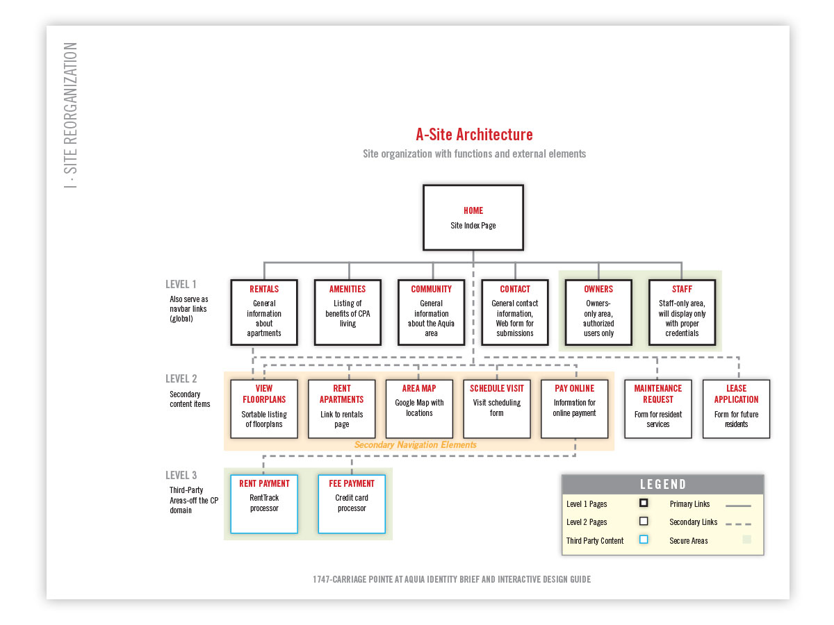
Site architecture, showing user flows and layout patterns.
