
Website design, branding and illustration for the leading government-focused Drupal conference in the United States. For 2018, a new program was introduced in order to boost visibility and reach, as well as making conference collateral more recognizable and coordinated across media.
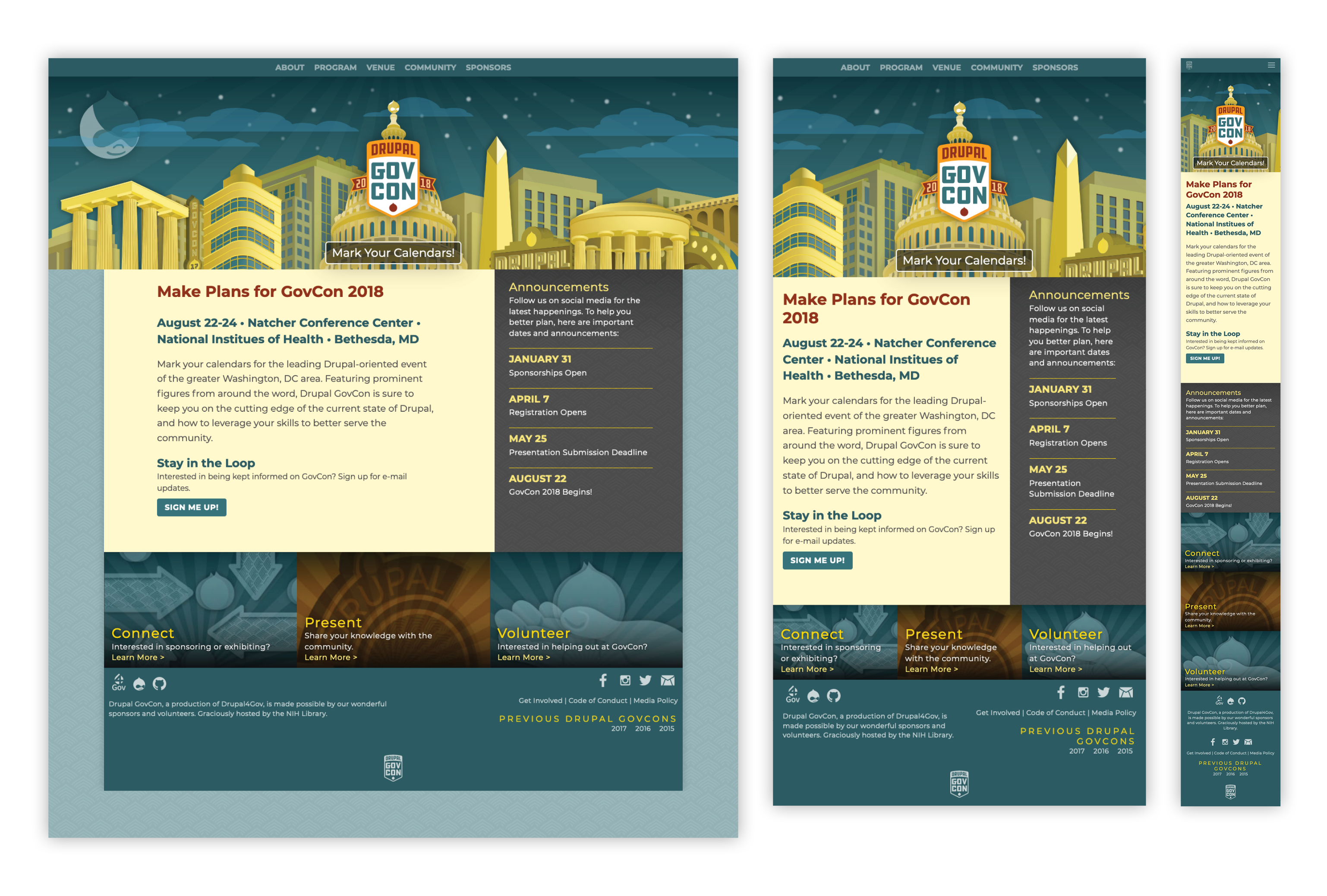
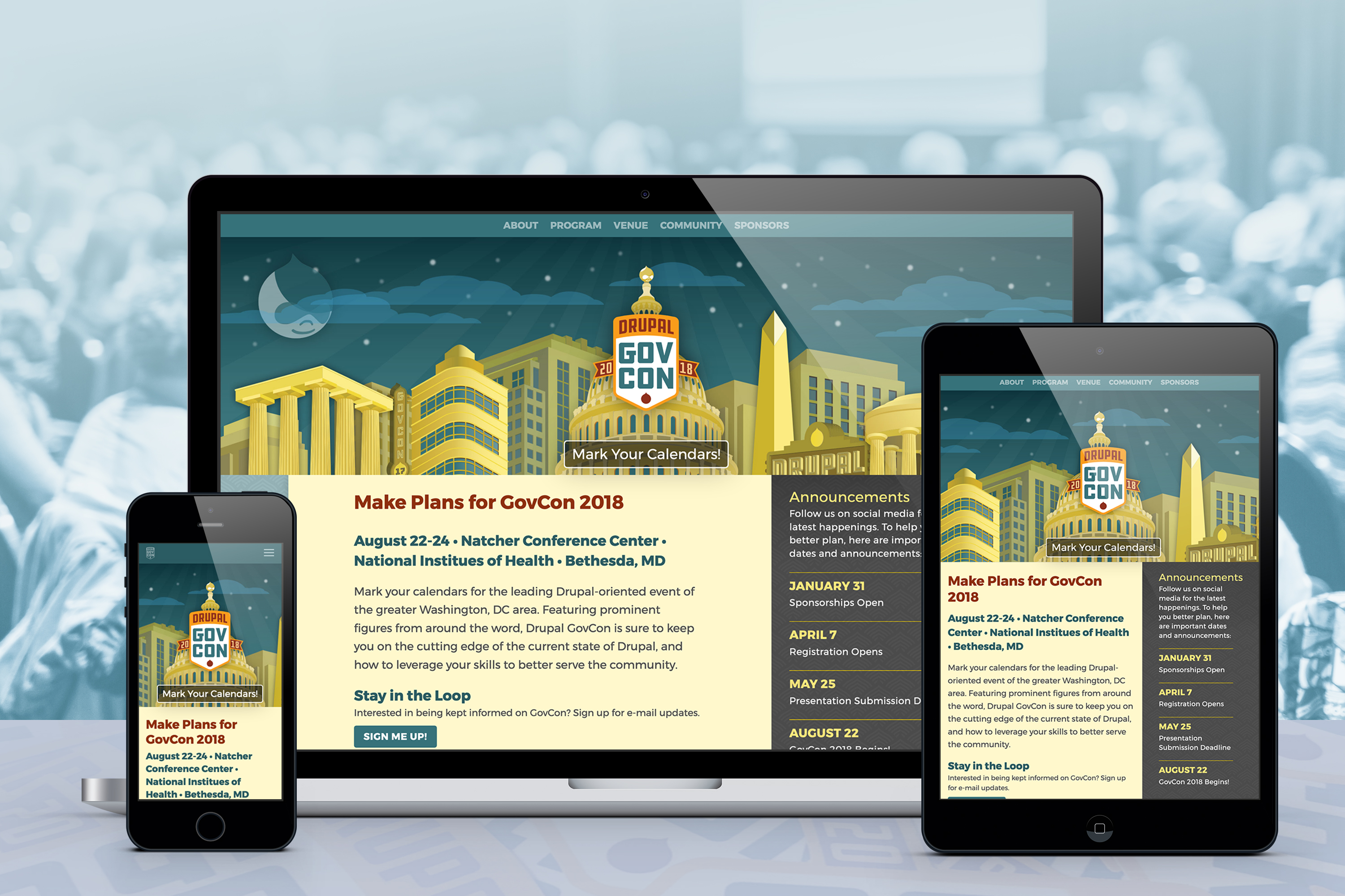
Conference website homepage/splash layouts. In setting this pattern, a new template was devised that could easily be updated from year to year, with branding being updated, while main content elements remain constant. This responsive display demonstrates element stacking and presentation in multiple viewports.
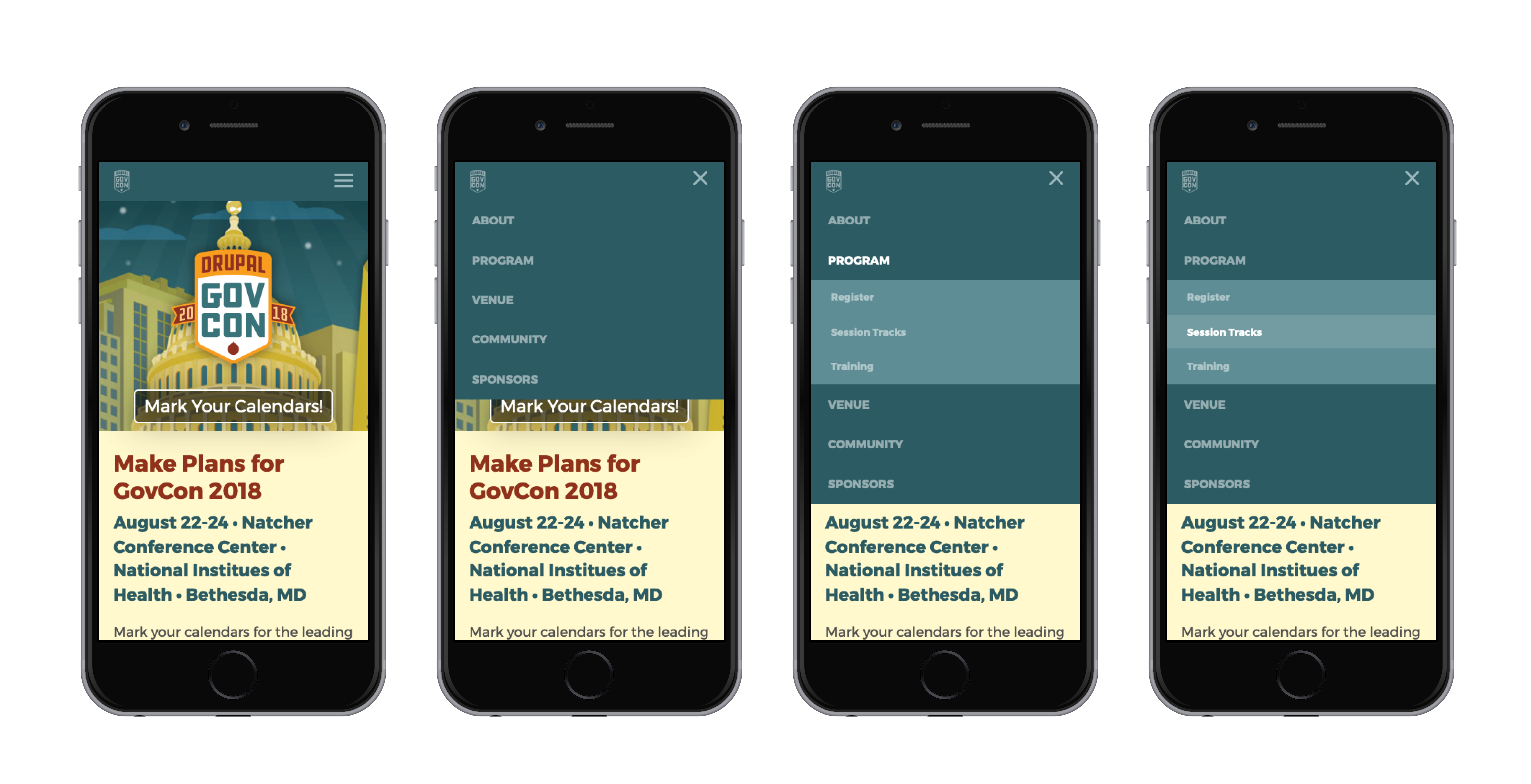
Clarity of navigation is essential to proper wayfinding. Here, conference website mobile navigation patterns are shown moving from default to second level selected.

In an effort to speed site building on the all-volunteer team, full HTML + CSS styleguides were explored. Here, they also double as layout guides for the internal pages, with persistent header/branding elements that maintain brand consistency and clear navigation throughout the site, even for site visitors coming to specific content via third-party referrals.
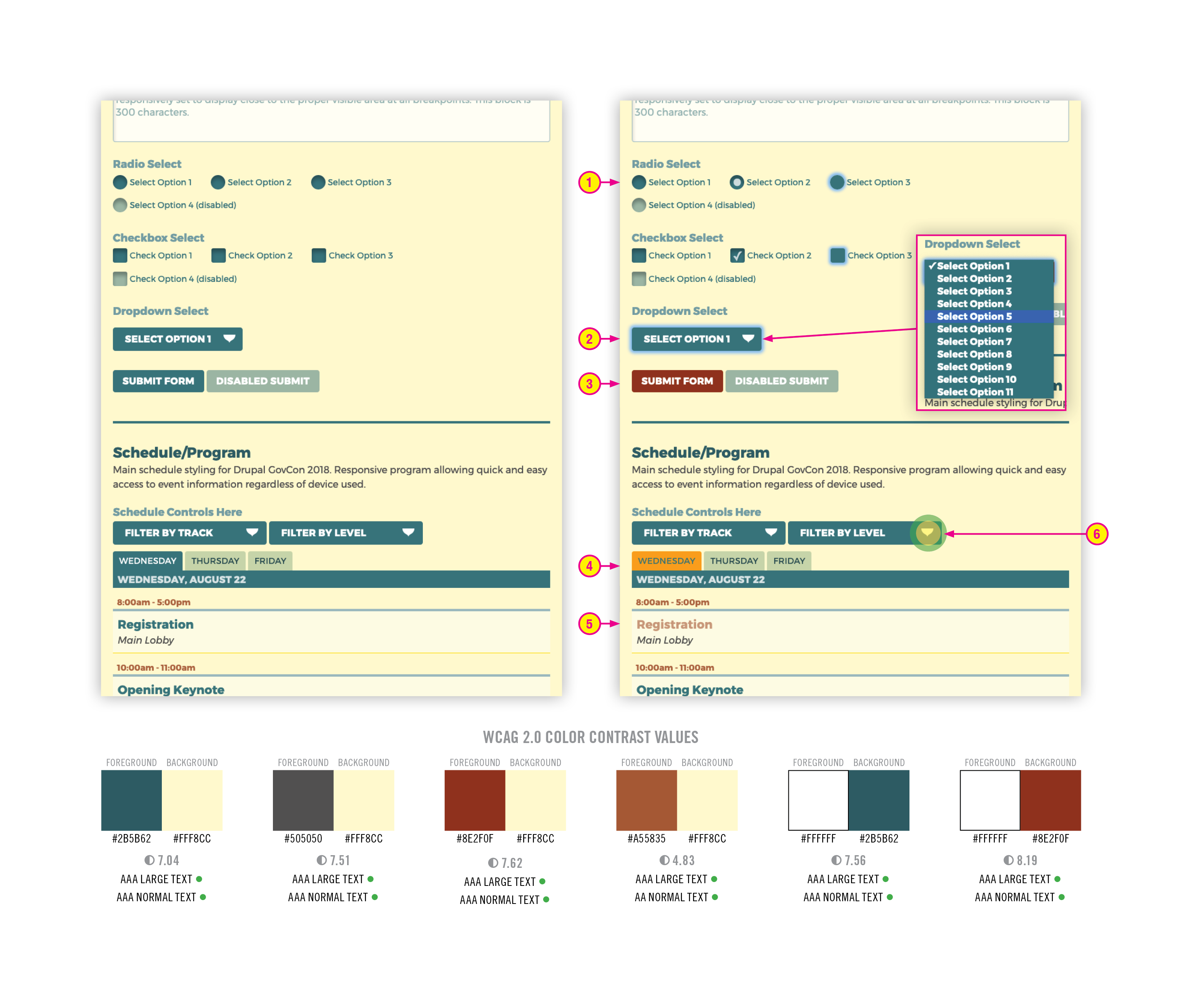
Consistent and accessible interaction design is vital to the website and application experience. Here, form elements are shown in their default state (left), and various interaction states (right). To provide a full experience for all users, WCAG 2.0 AA accessibility guidelines are adhered to, not only in the underlying live semantic code, but with color contrast (below the elements). Special attention is paid to: 1: Radio and checkbox elements. Pure CSS modifications are made to increase the tap area for mobile users, as well as the target size (40/60px highlighter shown in annotation 6). Default, checked, and focus states are shown, and will work as default-styled HTML form elements for users with blocked JavaScript. 2: Select element, shown both in focus state, and expanded, still employs appropriate color contrast for browsers that require it. 3: Hover and disabled states for submit buttons are shown. These states also apply to select and button elements. 4: Schedule day tabs shown in hover, and default states, to give user a firm indication of interaction states. 5: For events, rollover/hover interactions are clearly indicated. 6: Tap areas and spacing are verified to allow appropriate spacing, making form and input interactions more trouble-free for mobile device users.
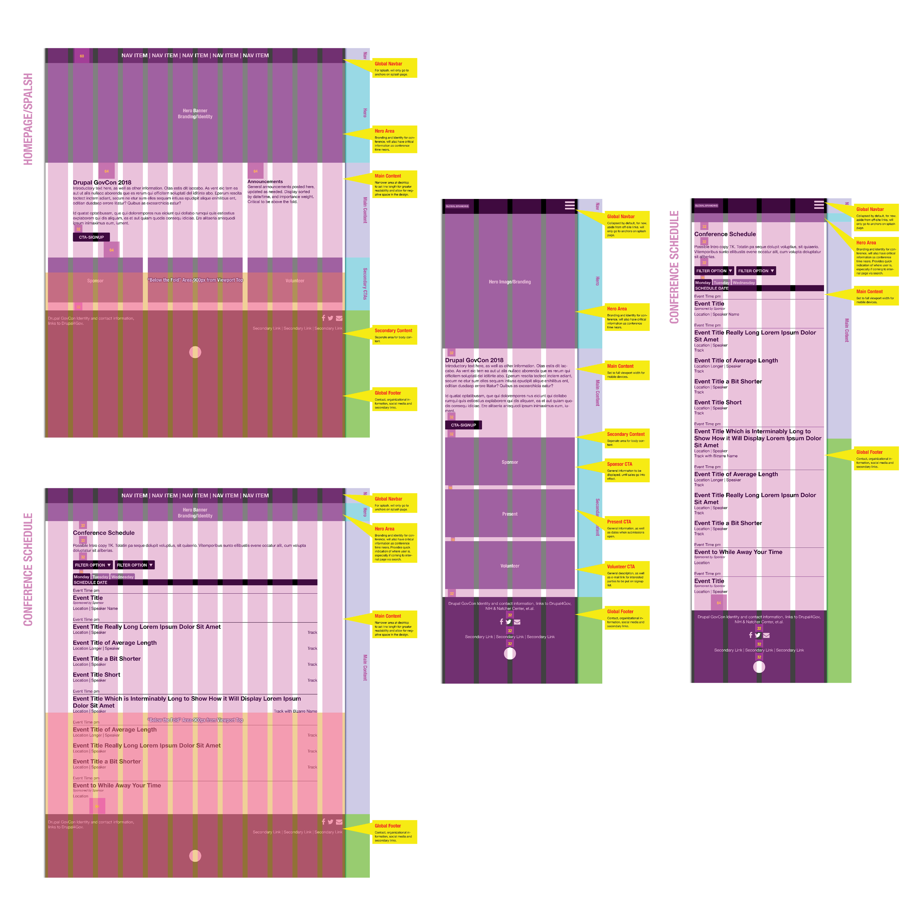
Layout, organization, and vertical rhythm are documented via annotated wireframes, showing clear content regions, layout patterns, and content-first displays. Here, the homepage/splash and main conference schedules are shown.

An important element of effective website organization and content strategy is information architecture. Here, site content and organization is clearly displayed, as well as third-party elements. This helps team members uncover user pain points, and suggest possible reorganization of site content to improve user flow.
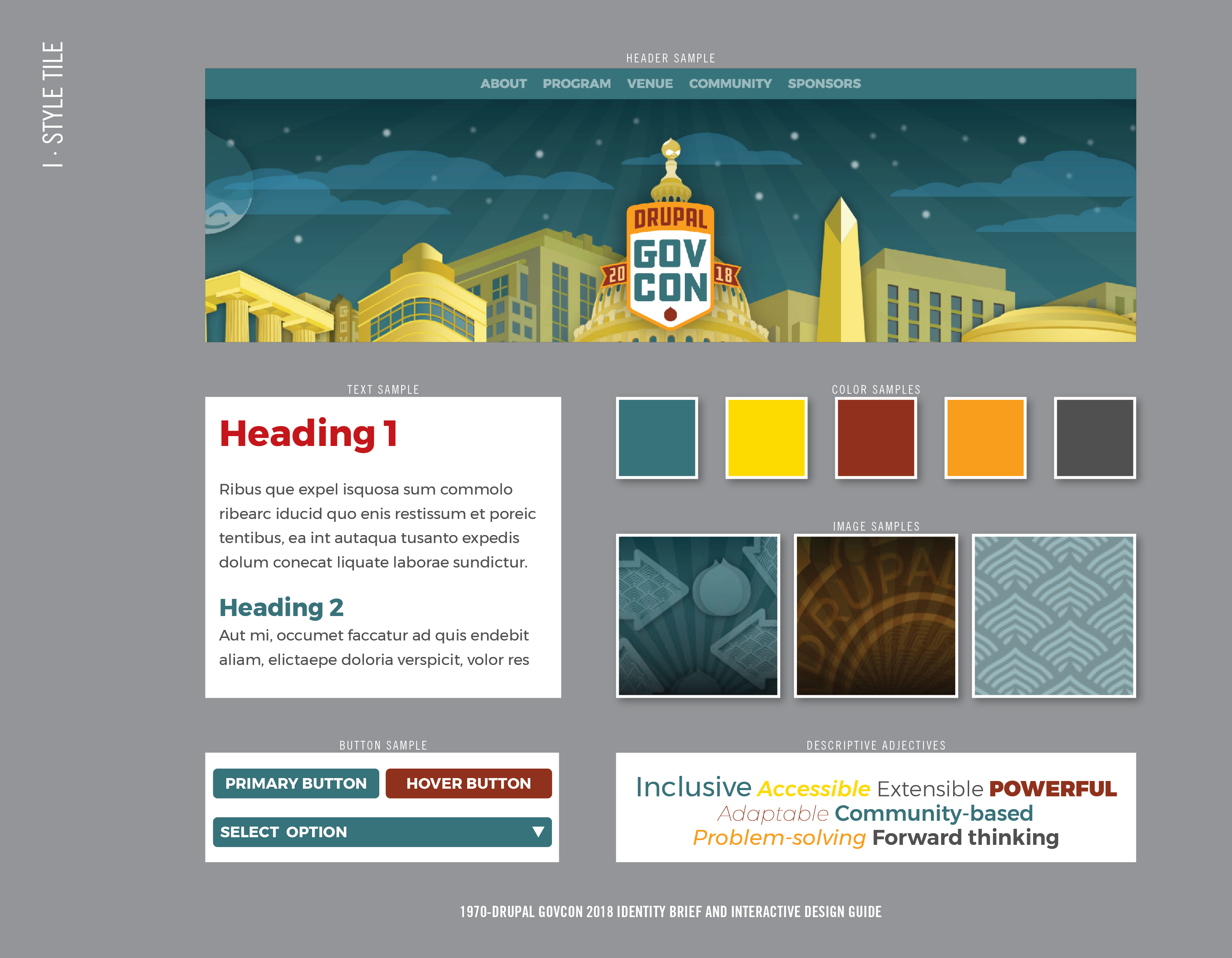
Style tiles are handy elements to secure stakeholder buy-in for design and branding elements. Here, conference colors, descriptors, site elements and typography are shown stripped of distracting elements such as content, allowing people to strictly focus on the design.

Conference logotype design, shown in color, monochrome positive, and monochrome reversed. In order to tie conference identification together, an easily recognizable branding element was created that would display properly in multiple sizes and applications. Special attention was given to the reversed versions, to account for optical sizing differences in those applications, to ensure consistent branding and communication.

Aside from website content, email, and social media, print collateral was also created to boost visibility. Here, custom-designed palm cards are shown to give out at industry events to raise awareness.

For on-site branding and identification, roll-up exhibit displays were employed. Here, welcome area, coding/sprint areas, and sponsor recognition are shown. Since some displays would be partially blocked in some usages, a mockup showing the registration table area is shown, to demonstrate which areas would be clearly visible.

To assist with wayfinding and navigation onsite, custom easel signage was created to guide attendees. A typical sign is shown with live content, and as a proportional mockup with a person to give a sense of relative size and help anticipate readability challenges.
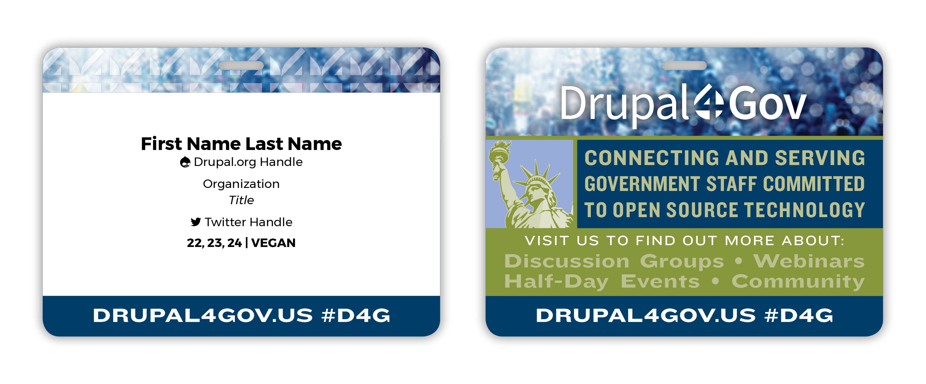
In order to make limited conference resources more adaptable, new badges were devised that could be used at Drupal4Gov events outside of GovCon. Here, the front and backs of preprinted badge blanks are shown, with sample badge output. Moving to this new system helped with registration, where attendees with lost badges could more easily have them replaced, as well as the process removing the need to sort and alphabetize badges at the event.

Tech conference swag is often a valued part of attendance. Here, staff (red) and attendee (gray) shirts are shown, with a design adapted from the main conference illustration elements to work well with silk screening.