
Leader Edge is a Web-based application that helps organizations grow and develop leaders from within their ranks. It does this by providing psychometric assessments which then suggest development activities—many self-directed—based on a candidate’s strengths and weaknesses. This prototype is an enhancement and extension of current SHL products.
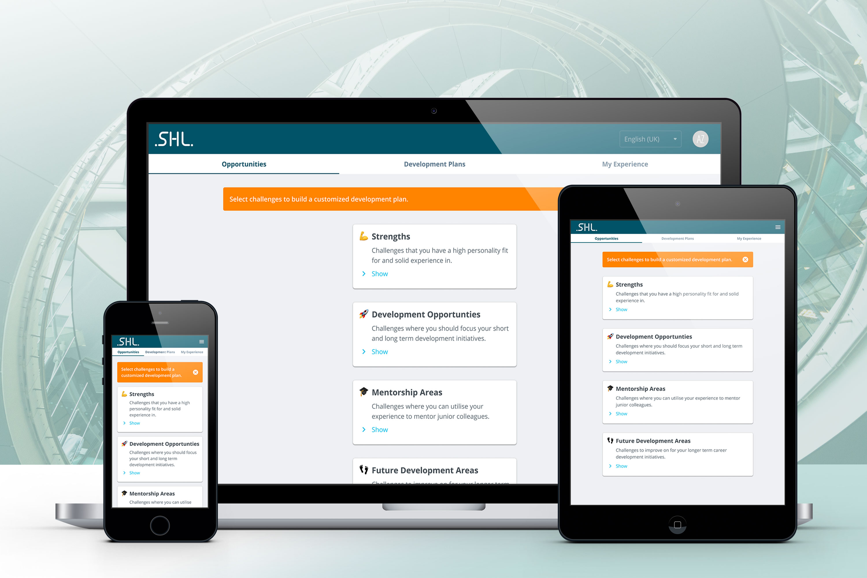
Dektop screens showing different stages in the application. Here, to maintain consistency across device usage, the desktop application employs a narrow, single-column layout format.
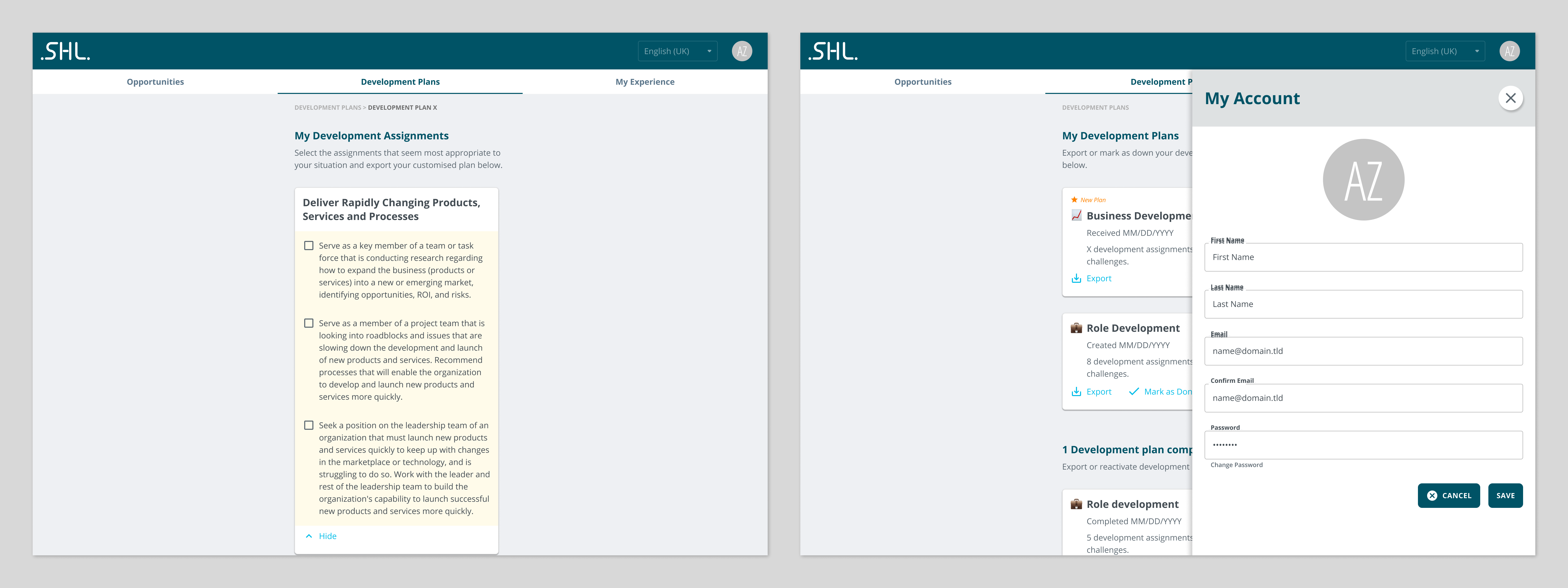
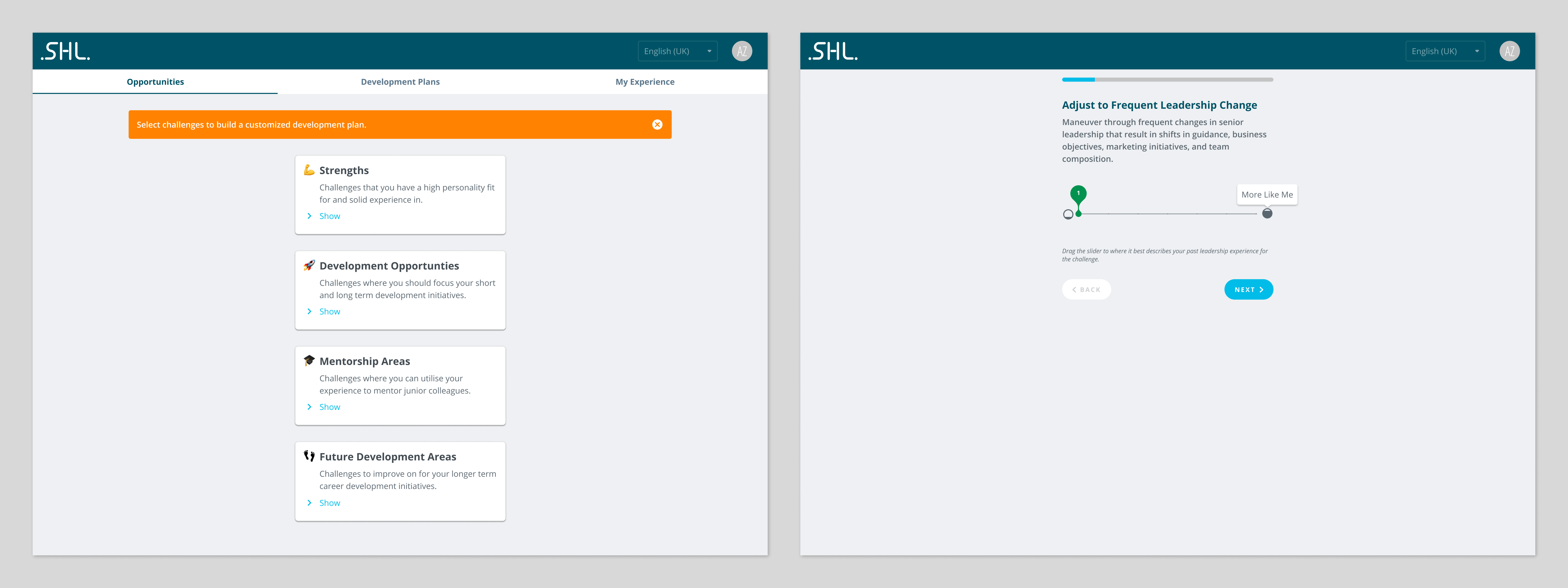
Screen views showing expanded card views, as well as user profile flyout patterns. To maintain consistency, usage paradigms adapt for different devices.
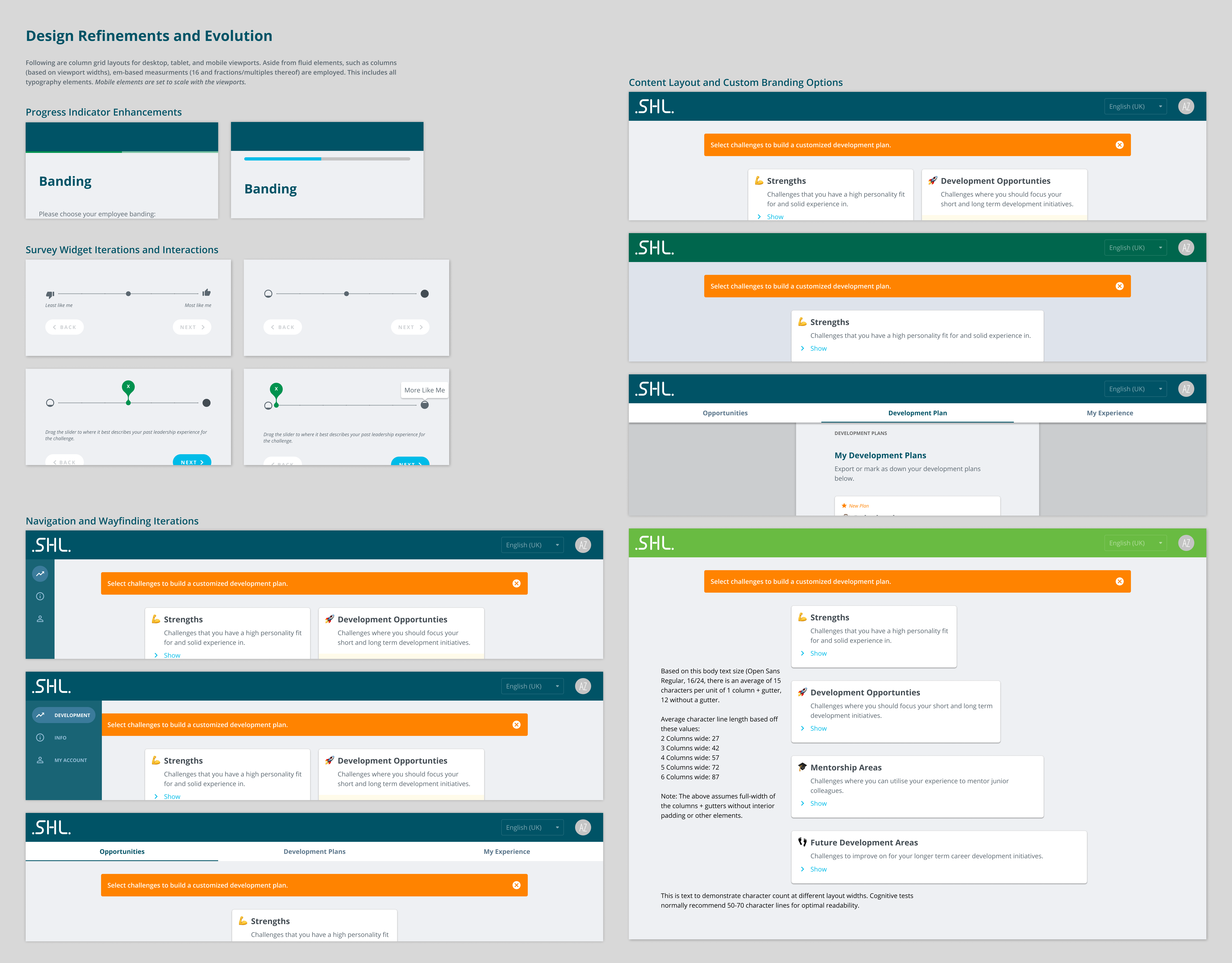
In the prototyping phase, usability challenges were addressed by iterative improvements. Moving from the top left, progress indicators for onboarding and profile process were revised from a subtle bar below the persistent header (which could easily be lost) to an easily read, but unobtrusive progress bar. Below that, iterative improvements were made to the survey widget interface, moving from stock iconography—which may not be reflective of the question, to more general custom icons. In addition, elements that may not be readily apparent to some users were assisted with static text, as well as tooltips. At the top left are iterations showing different layout patterns—with tests for two-column layouts for desktop, as well as differing widths and added containers. For testing, research was also referenced per line length and cognition, shown in the bottom right. In addition, client-selected custom colors are demonstrated. At the lower right are evolutionary improvements to the application navigation and wayfinding. Evaluations of user testing, as well as information architecture reviews helped guide this.
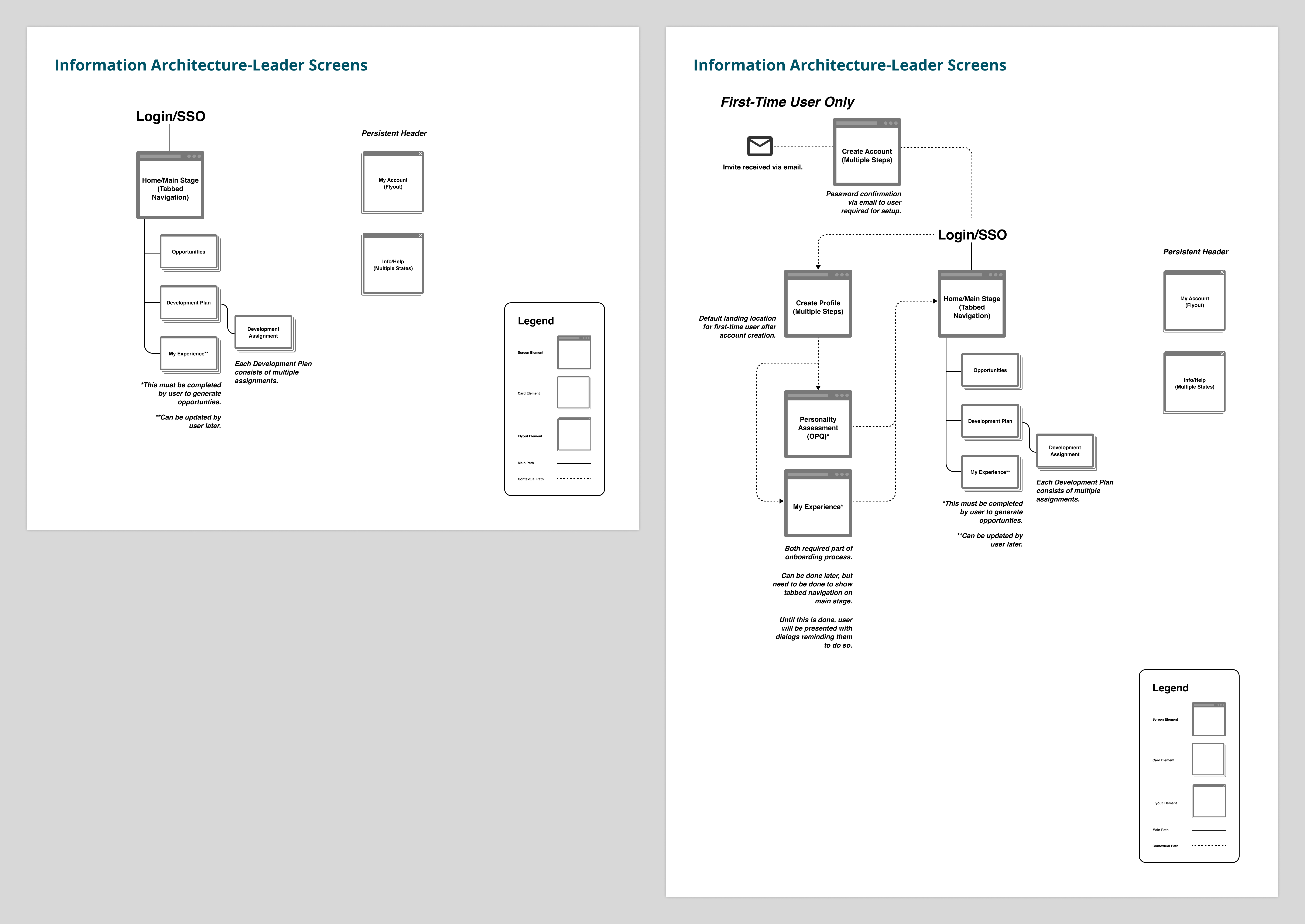
To gain a deeper understanding of the application, an information architecture review was undertaken, to uncover organizational challenges. Here, the general layout of the leader screens, as well as the elements of the user onboarding process are diagrammed.
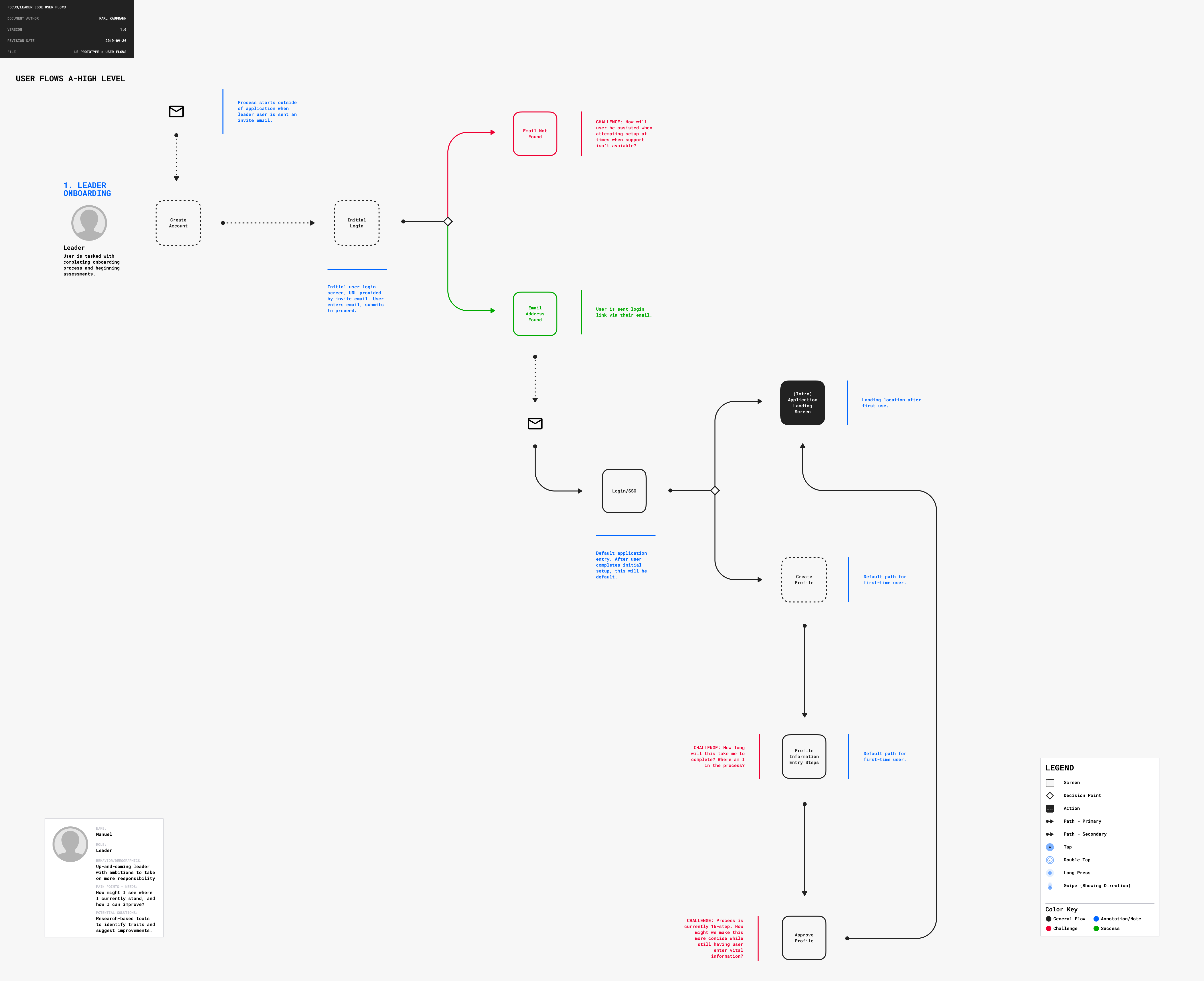
From the outset, a user-centered design process was employed. Shown is a high level flow for the leader onboarding process, showing decision points and sticking points in the user flow.
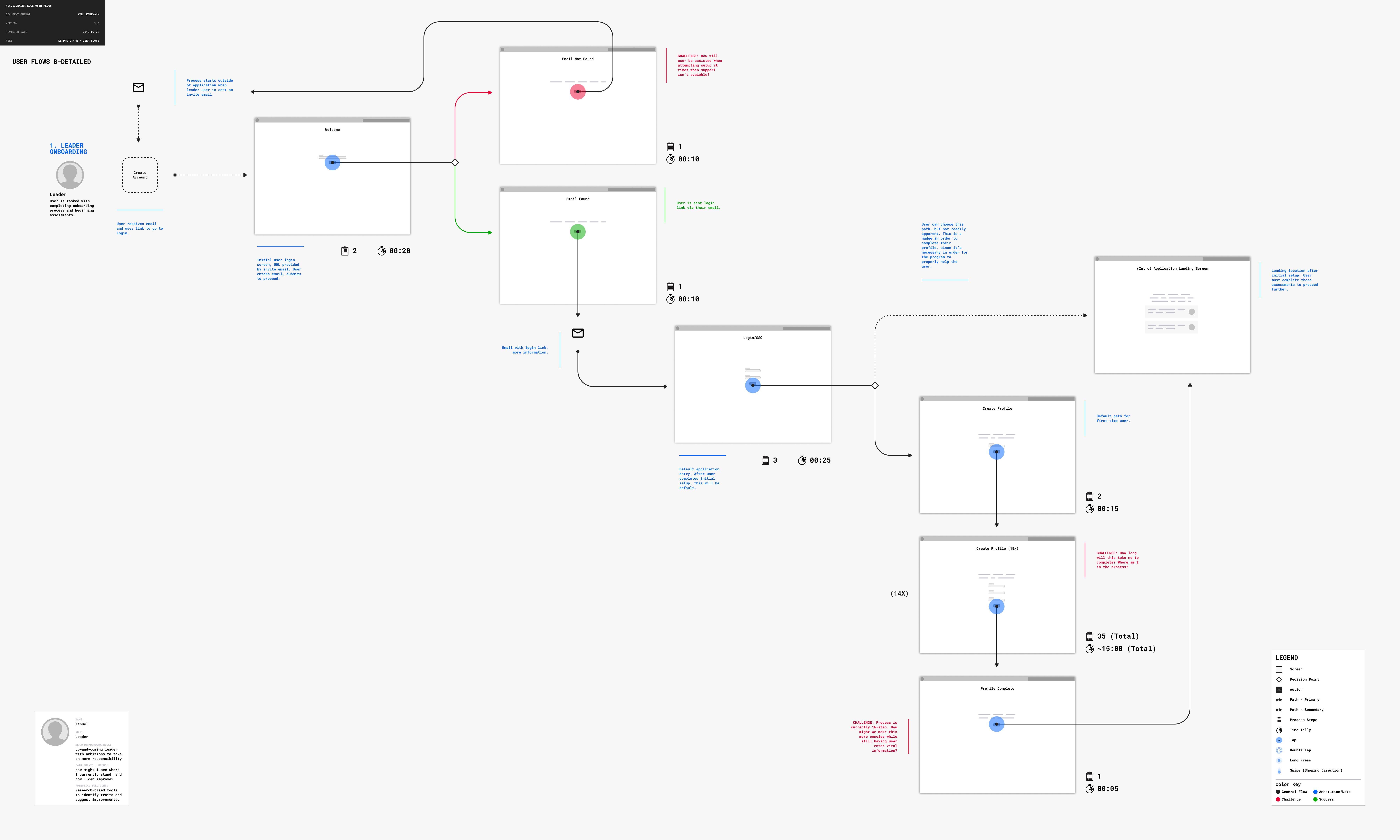
The leader onboarding user flow is further explored in detail here—application state thumbnails are added to the onboarding process, to help guide what key elements and tasks the user needs in order to achieve a successful outcome.
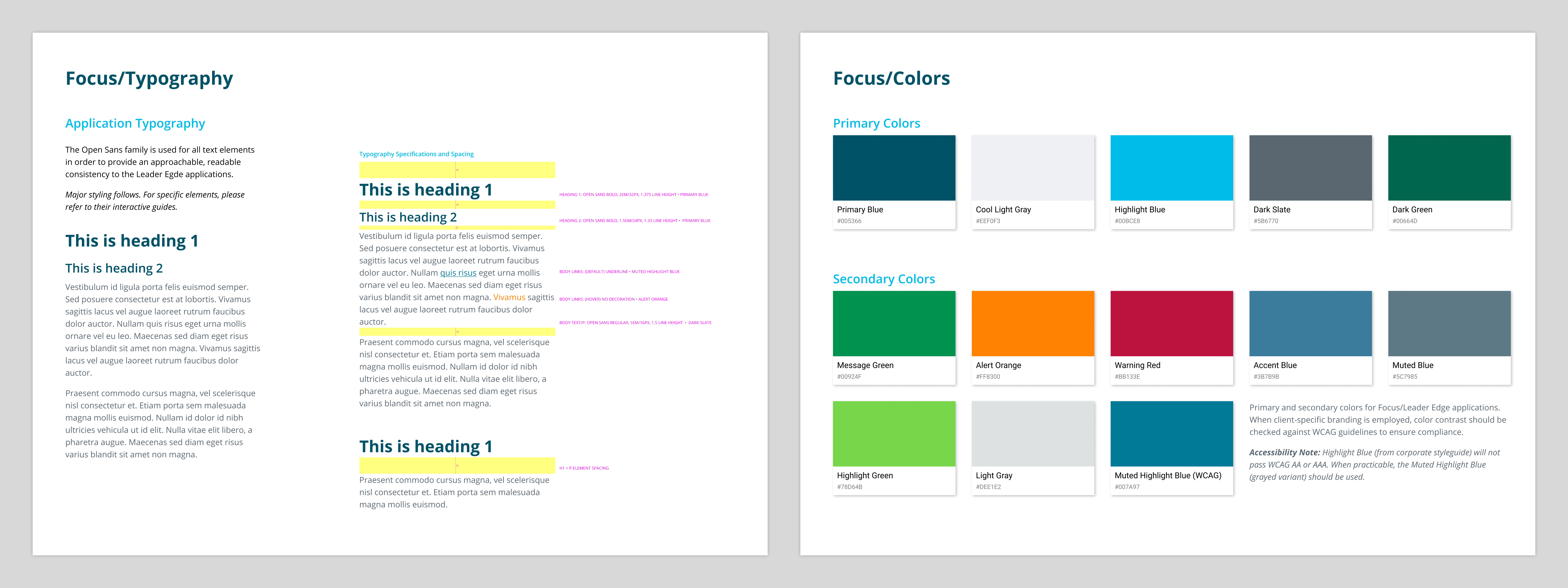
Clarity and focus of the application were designed into every aspect of the application, starting with typography and colors. Here, a detailed guide shows typographic usage and contextual spacing, as well as use of SHL branding colors. The palette was expanded to ensure accessibility compliance, shown here with deeper alternates for some low-contrast challenges.
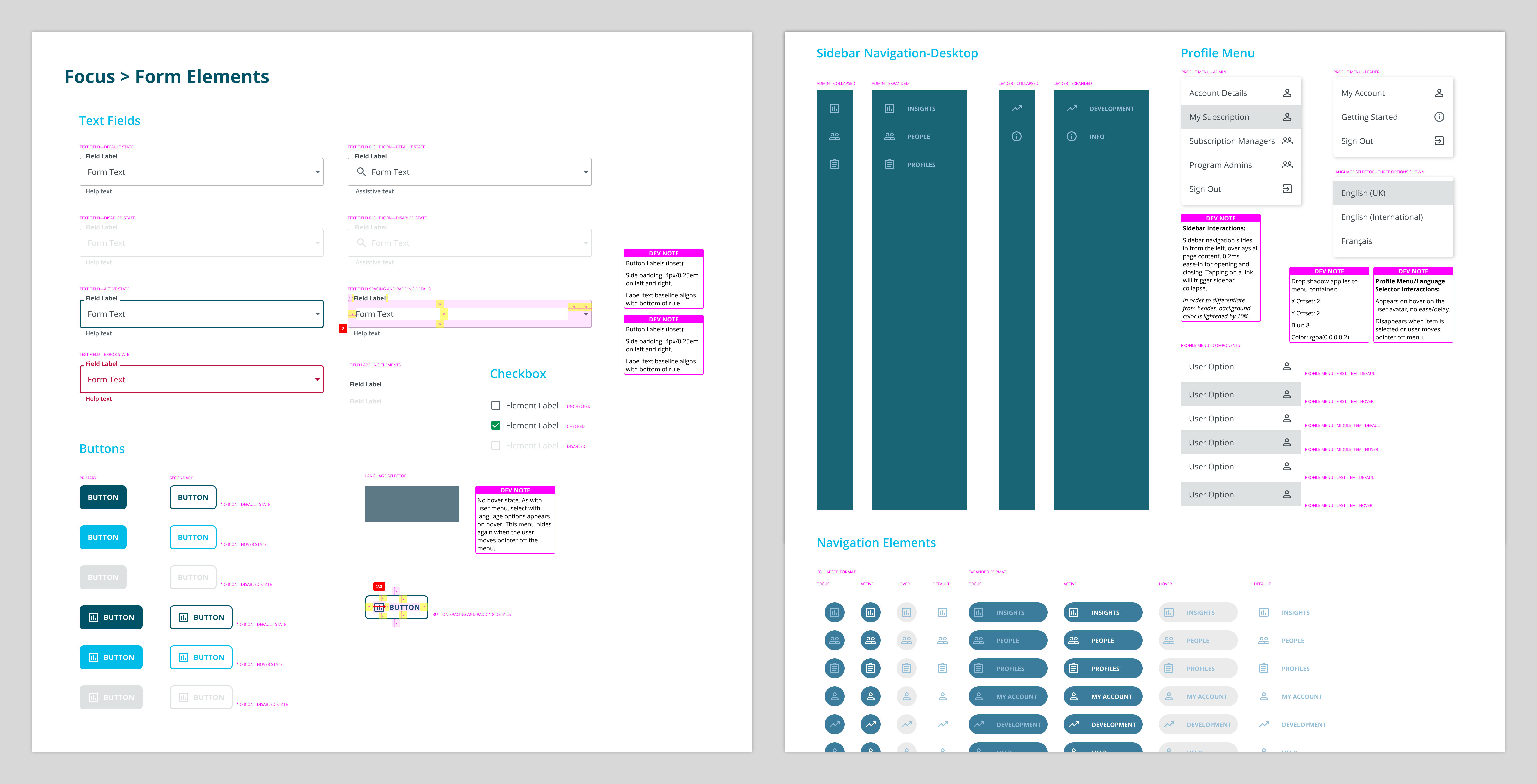
To ensure accurate design communication and consistency during development, as well as allowing for rapid iteration, a detailed component library was set up in Figma. Shown here is a sampling of form elements, navigation, and popup menu elements. For elements requiring it, detailed developer and interaction design notes are included, as well as spacing and padding demonstrations.
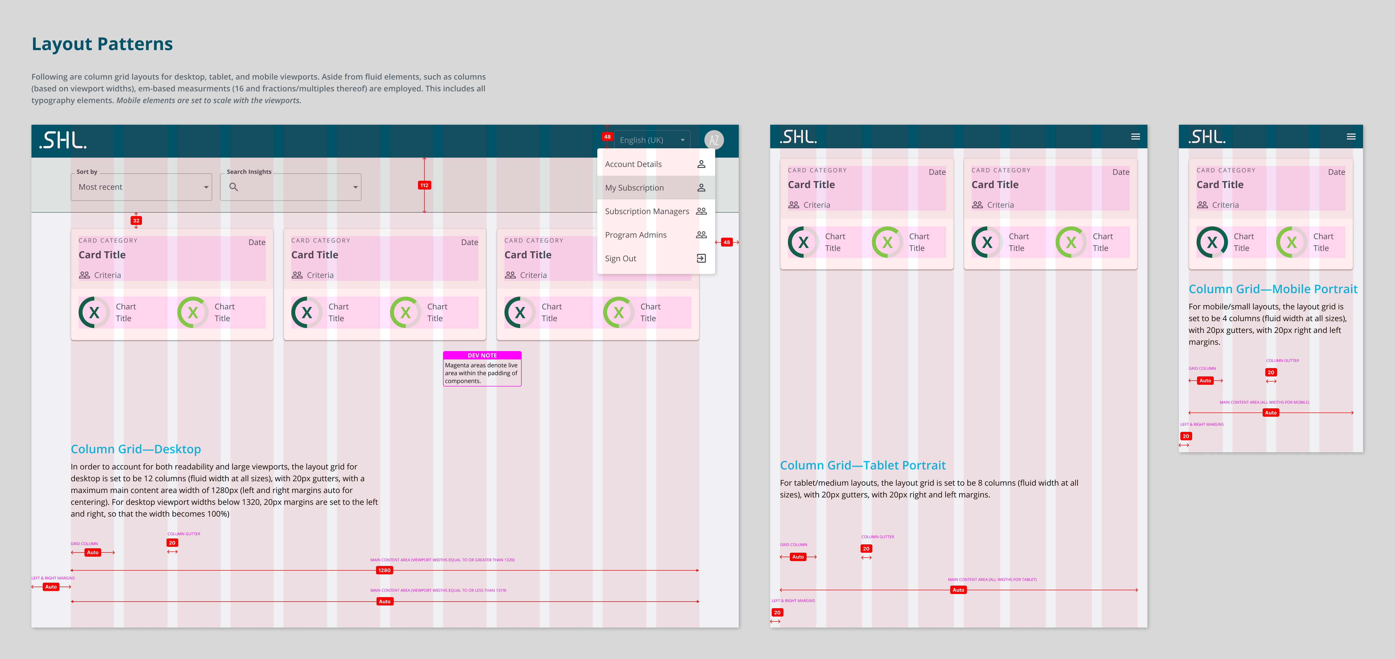
Here, accurate design communication is shown for layouts in different device breakpoints, complete with spacing, vertical rhythm, and other annotations. Elements common to application administrators and general users are shown.
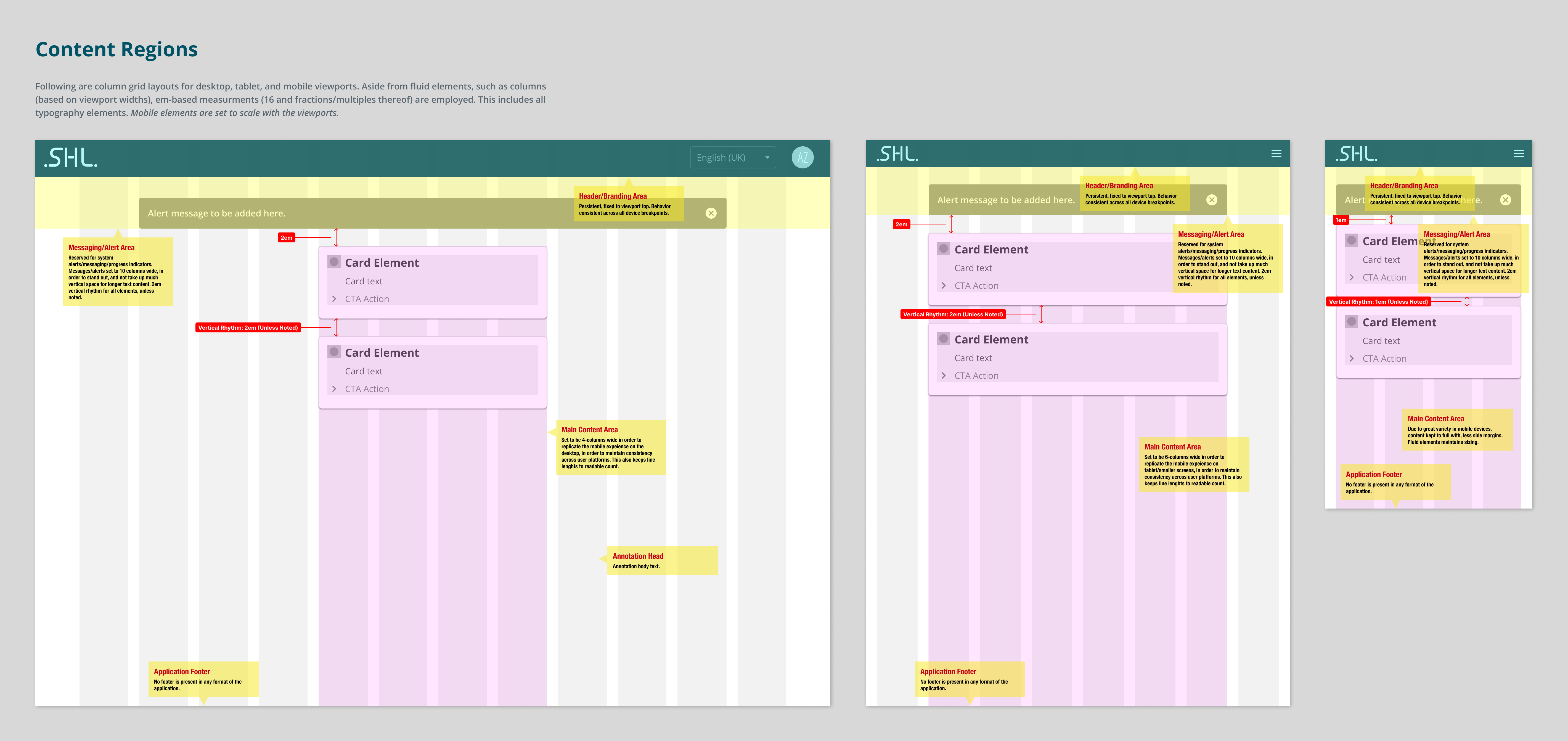
Annotated wireframe layouts communicate content regions within the screen display, showing vertical spacing patterns, as well as annotations for necessary items to ensure design consistency.
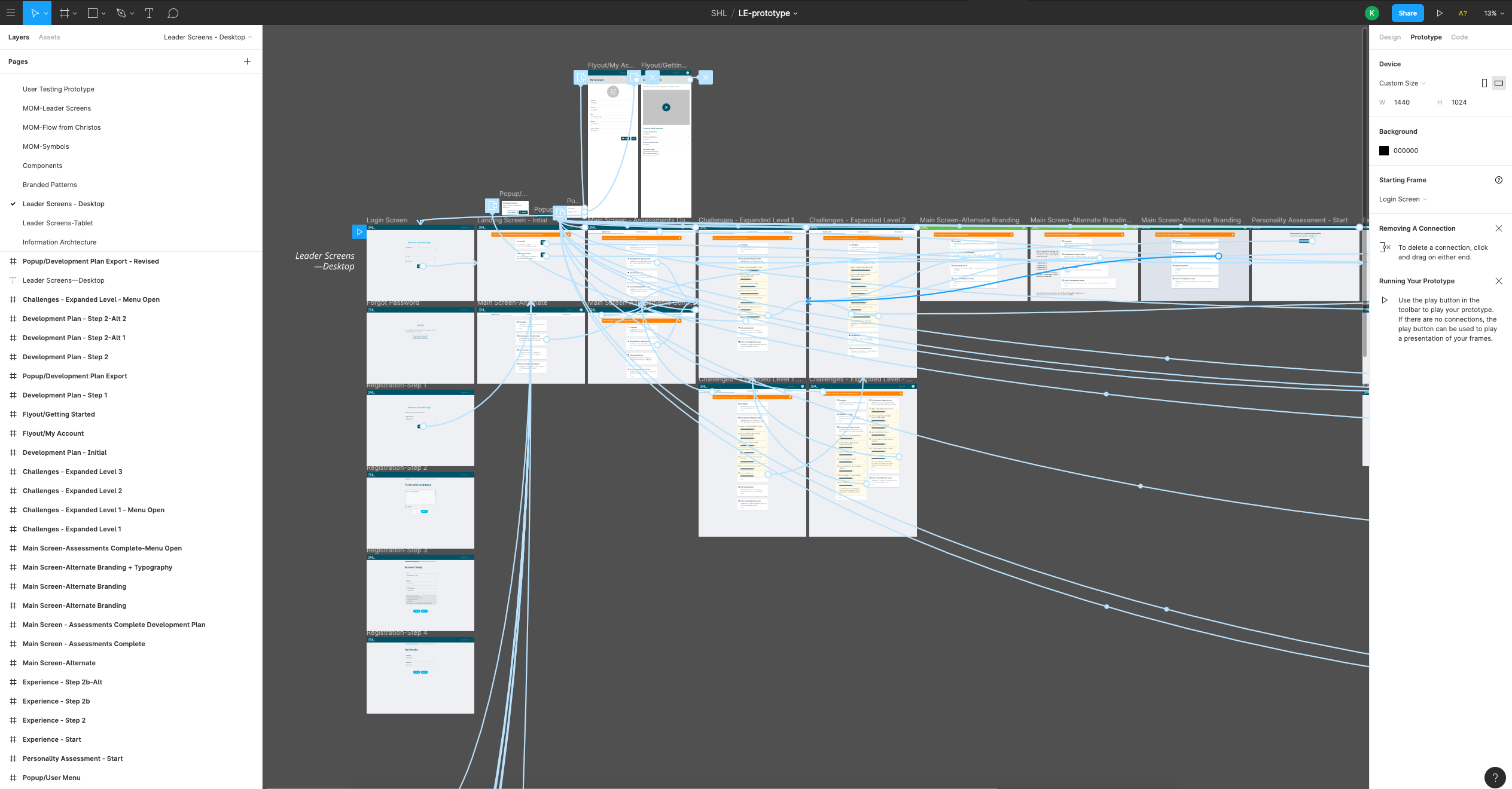
A high-level view of the desktop interactive prototype in Figma. This view shows the links to the multiple screen states used in the testable prototype, which allowed rapid iteration based on testing feedback.