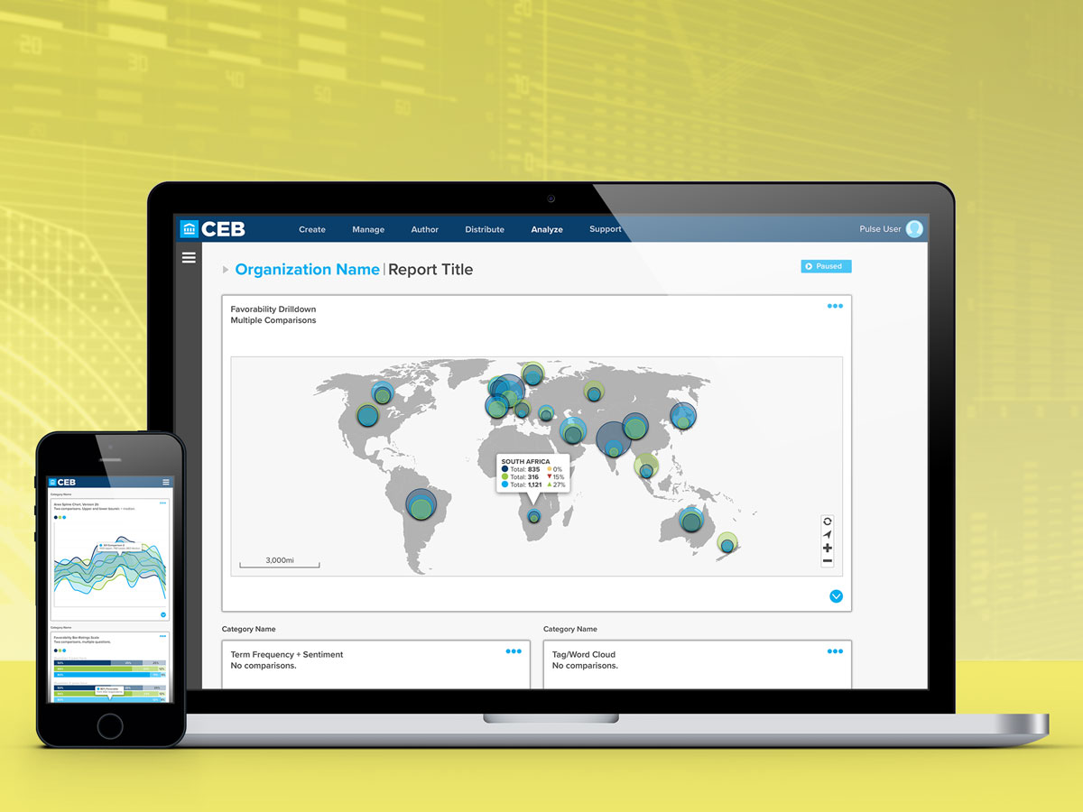
Pulse is a custom Web-based software-as-a-service (SaaS) application serving human resource (HR) professionals in the tasks of creating and distributing employee surveys, and then analyzing the results. Engaging data visualization displays would play a major role in helping HR professionals tell their story.
These designs focus on a future-facing state, where user feedback and anticipated needs are integrated into an iterative process. Features, and overall design, are then added to the application as validation, development, and business needs permit.
Besides features, user experience played a large role in the application design, which was validated through a continual process of review on the distributed team, utilizing clickable prototypes to demonstrate the interactive nature of the evolving application. Since end-user skills varied widely, an approach of designing for the novice, but giving expanded tools to power users was employed.
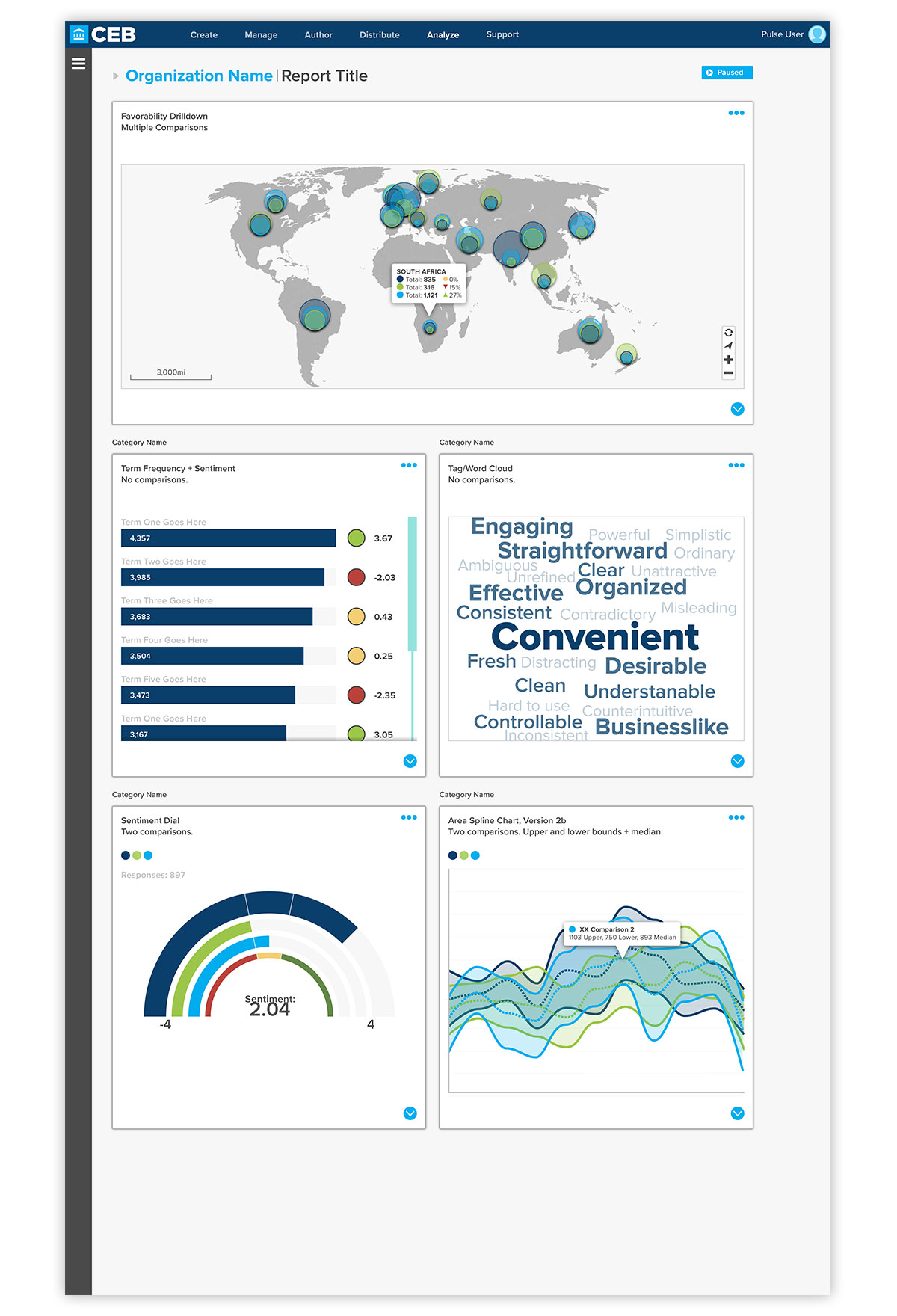
Full-page view of a data analysis screen. A card-based paradigm is used to allow team members to customize data displays in order to best present their data. In order to allow users to focus on the data, all extraneous information has been moved into collapsible sidebars, which display contextual content based on the section of the application they are currently in.
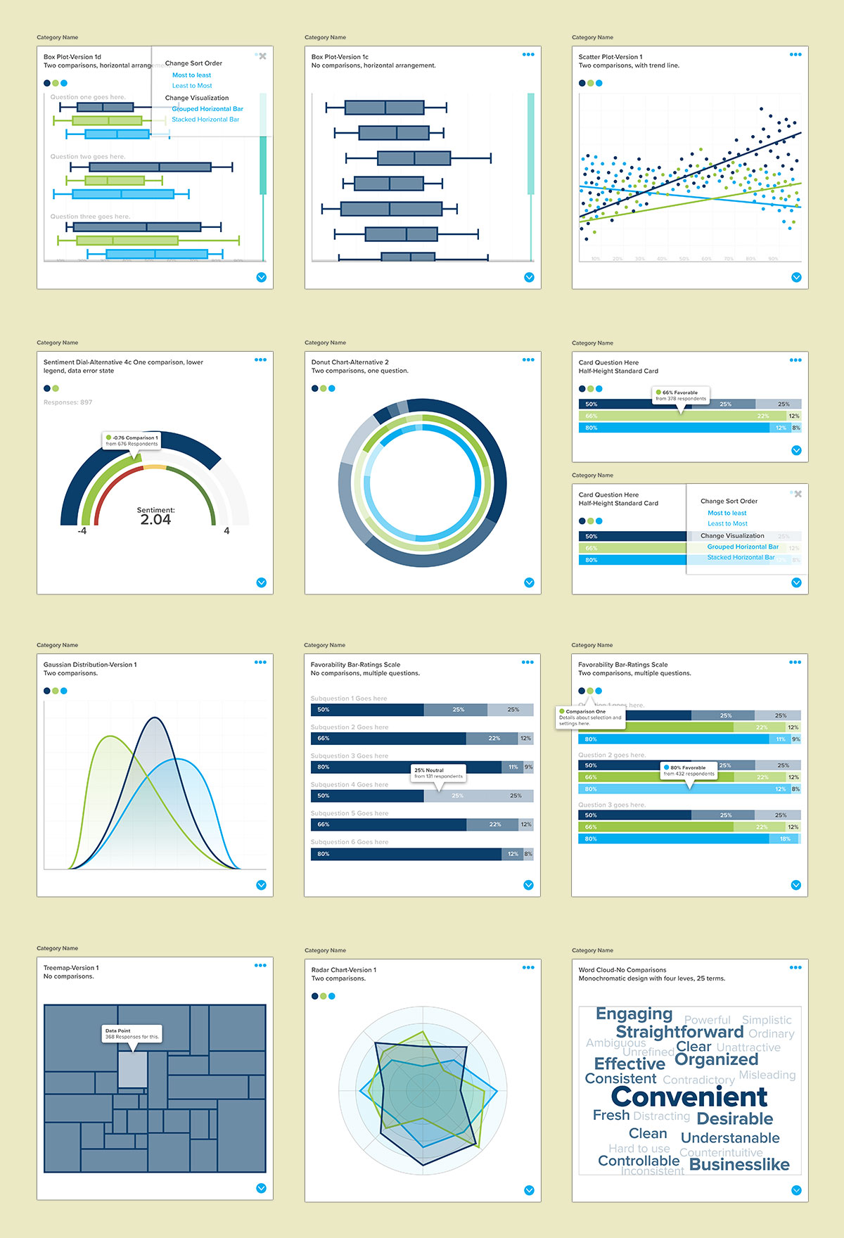
To give users flexibility in telling their data story, a number of visualization types are available for their use. Here, a sampling of types available for the application are shown, both with no benchmarks and multiple comparisons. Also, interactive elements are displayed—to give the user more information, without cluttering the high-level presentation.
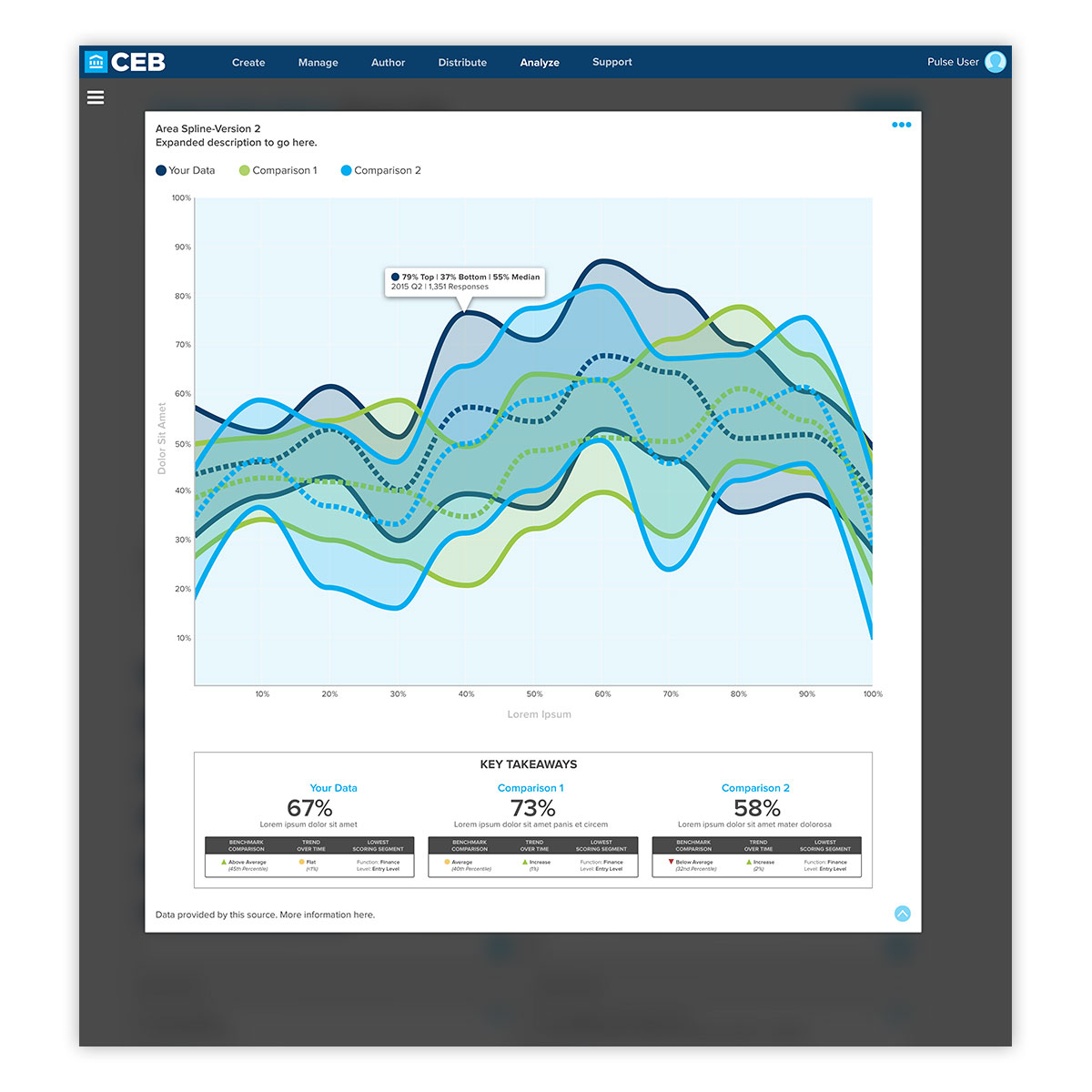
To allow users to drill down and see finer details in the data, cards expand into an overlay display with additional information that would be difficult to discern in the default view.

To allow users flexibility in selecting the date range for their reporting, a custom calendar picker, as well as straight entering of data is available. Besides this, there are also pre-selected date ranges for quick selection.
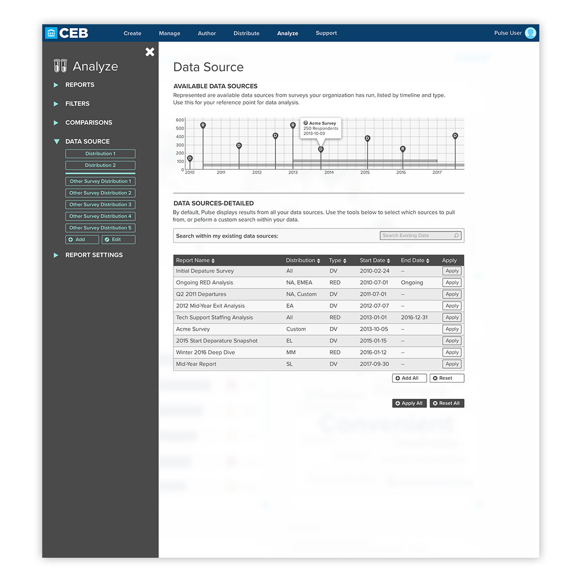
This paradigm extends to selecting sources for data displays, where an interactive timeline showing one-off and active surveys is shown. In addition, existing reports are displayed for quick selection. For users pressed for time, there are quick selects available in the contextual sidebar.
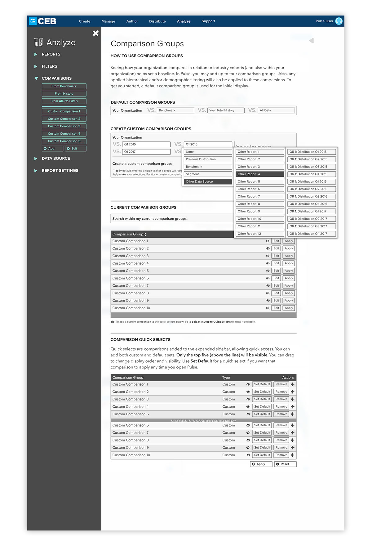
Comparing organizational data against industry benchmarks and an organization’s historical data is key to uncovering trends. Here, an interactive format is available for users to select comparisons, as well as listings of existing comparison groups, as well as quick selects that can be displayed in the expanded sidebar for quick reference. To aid with cognitive load in the user experience, multi-step selects are displayed until the final selection is made.
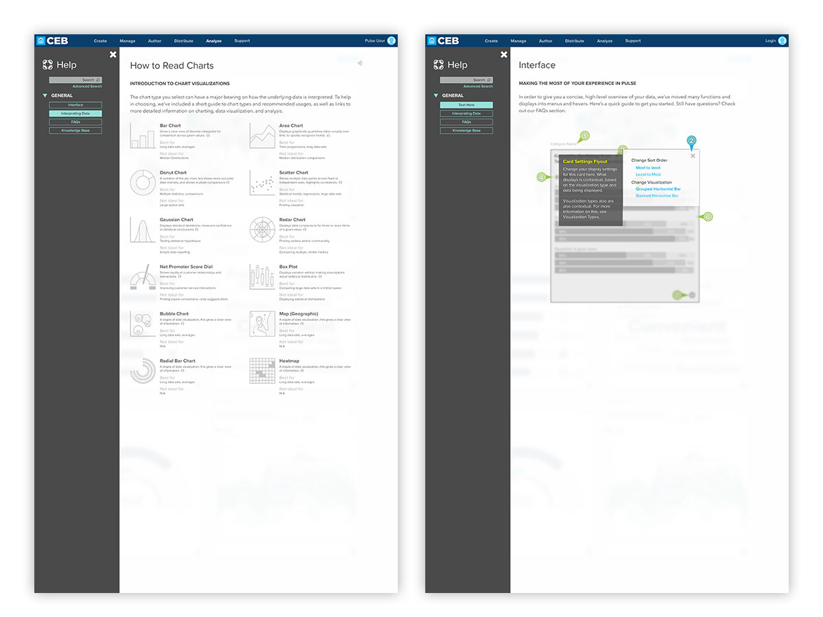
Although Pulse is designed to be intuitive to users familiar with data analysis, the application is leveraged by people of differing occupations and experience levels. With this in mind, the goal of empowering the expert while assisting the novice is displayed here, where help built into the application gives explanations for differing visualization types, as well as an interactive guide to application features.
This is also beneficial to support staff—allowing users of all types to find answers to frequently answered questions, as well as greatly assisting self-service users, who have limited access to a staff representatives.
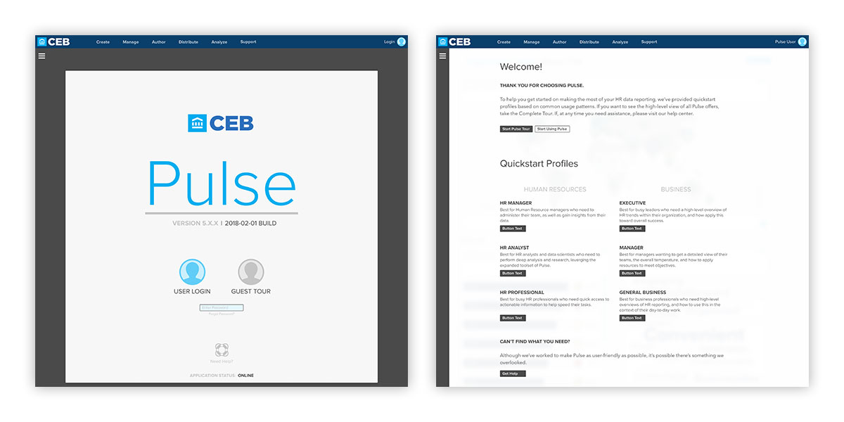
User experience enhancements extend to the login process, where a streamlined, user-friendly approach is on display. Application status and version are on display, as well as an enhanced on boarding process for new users who may not have access to staff-guided help, depending on their account package.
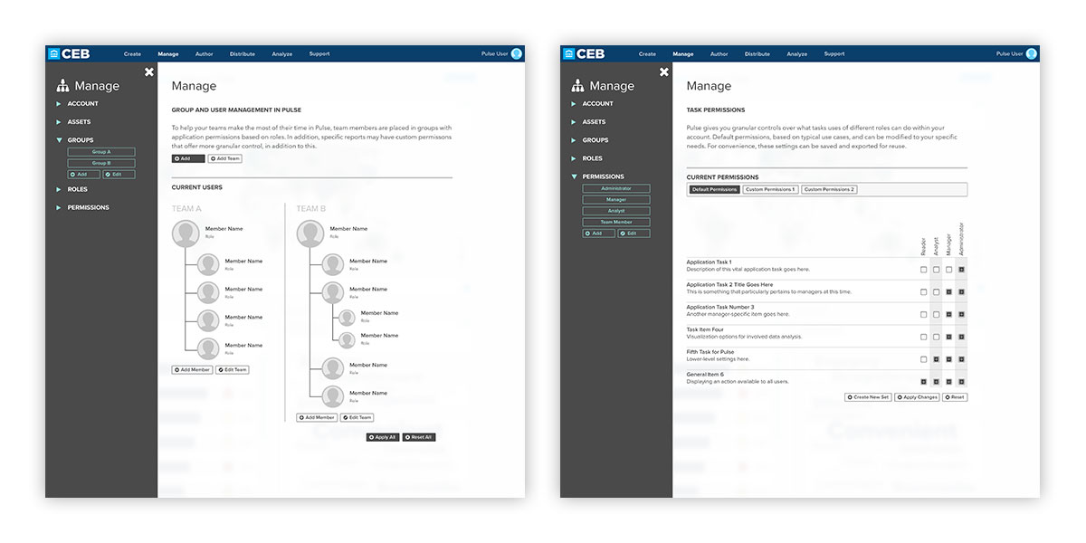
User permissions and roles are vital to information security in larger organizations, and here, the process has been improved with visual hierarchy setup, as well as granular control of allowed tasks per role.
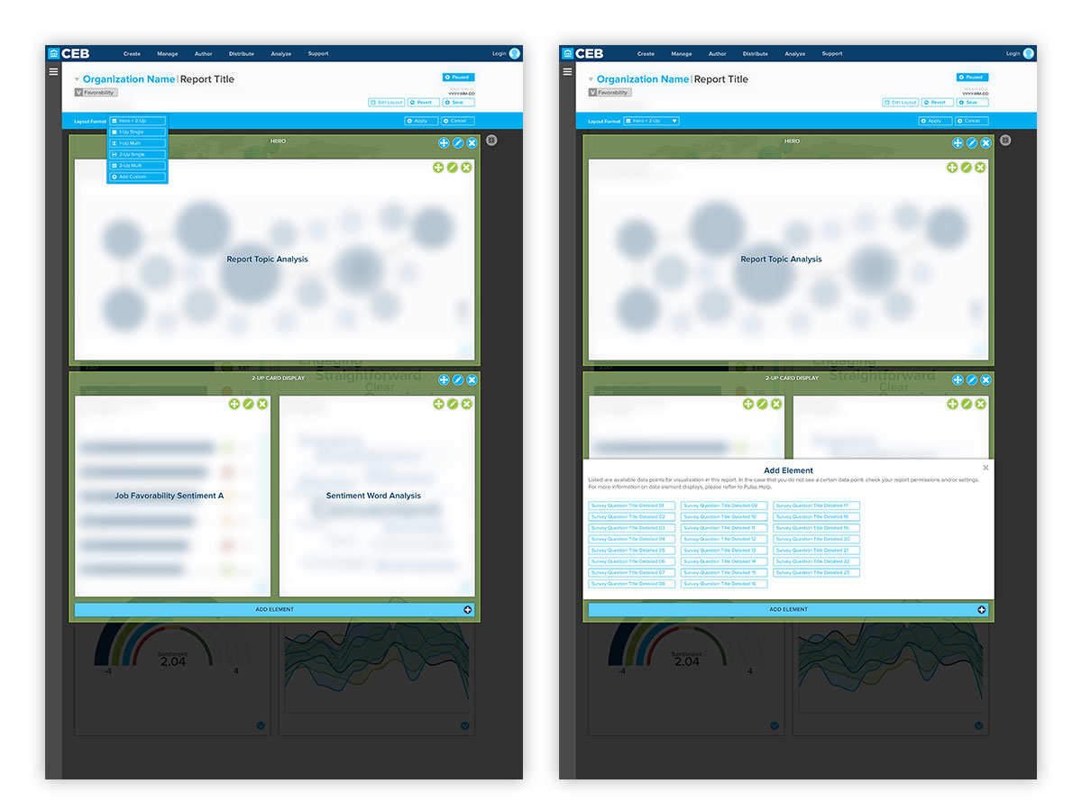
To allow power users and administrators greater control of their application displays, a visual layout builder is available. Here, in addition to default setups that can be chosen, individual visualizations can be rearranged, added, and deleted as needed. Once the customizations are saved, they can be added to presets for that account.
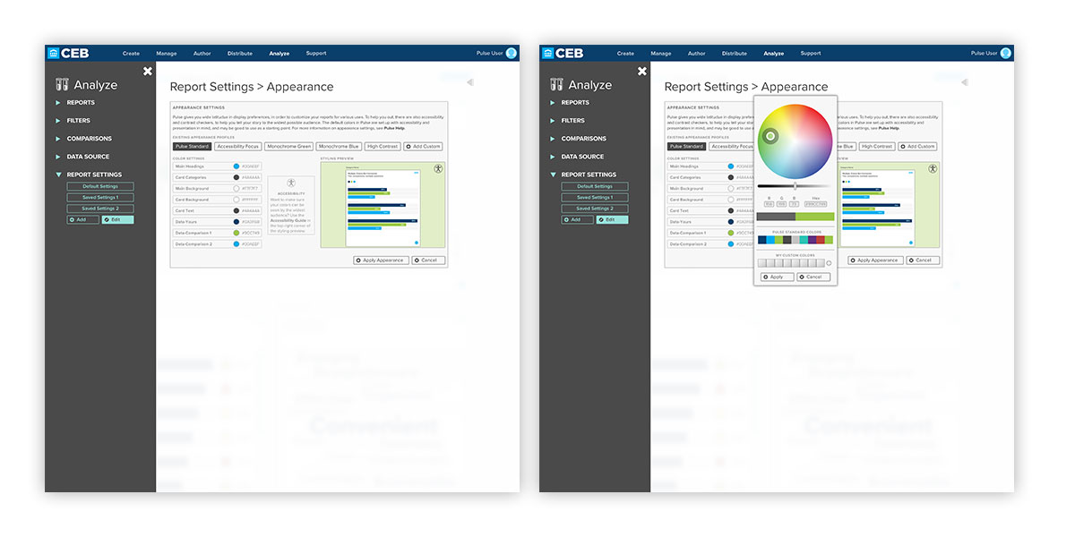
To further allow user customizations, color, typography, and branding can be modified for an account. In addition, to maintain accessibility, there is a built in checker, which suggests acceptable color contrast pairings. These screens show the interactive overlays, which feature a live preview of how changes will look, before saving and viewing the changes in the application layout.
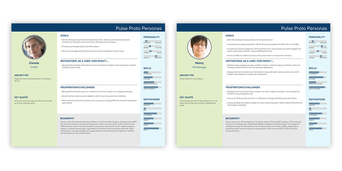
Due to budgetary constraints, a full user experience research program could not be conducted. Due to this, proto personas such as these were employed to advocate for end users, and help install empathy on the product team for what end users, unfamiliar with the application design process, would face while attempting to accomplish their tasks within Pulse.
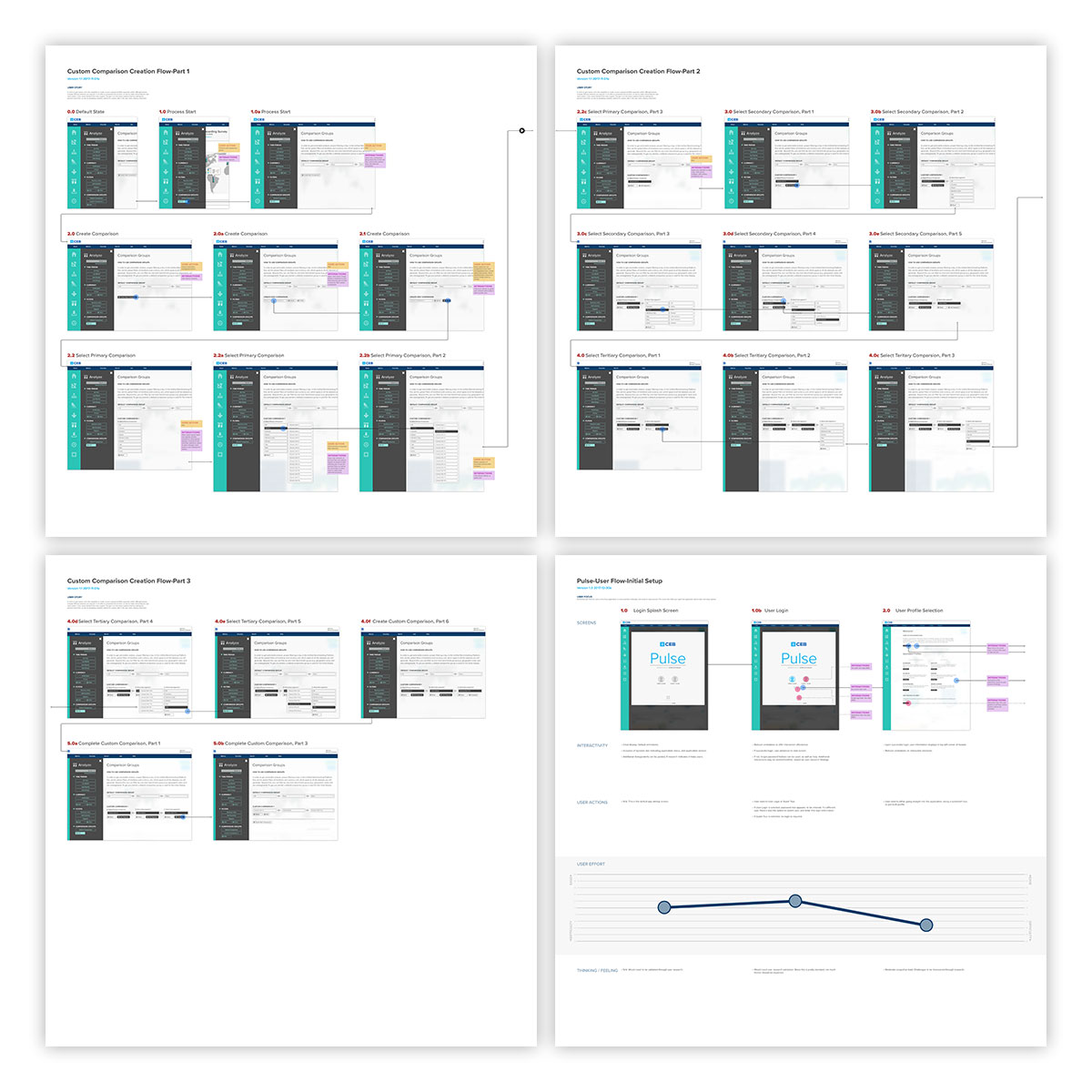
Application flows and journey maps go hand-in-hand with user personas. In addition to interactive mocks, these step-by-step flow help underscore the steps required in a given process, which here are annotated in detail. In the lower right, an interactive journey map is shown, highlighting the user effort required for each step in the process.
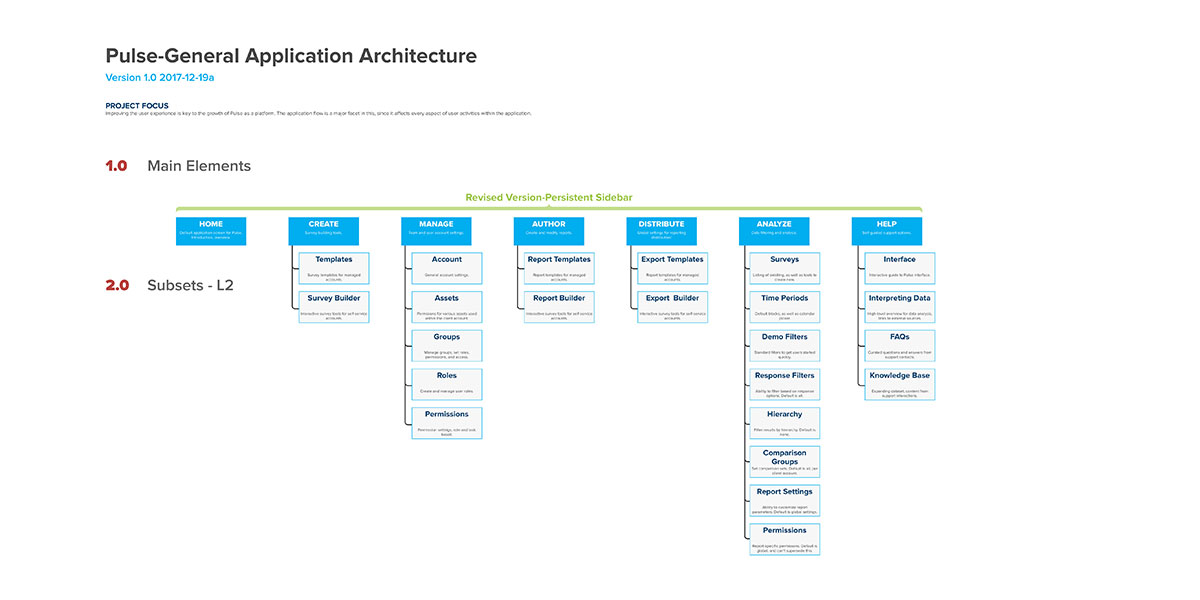
To assist with user-centered design, and content strategy, information architecture (IA) trees are extremely helpful. Here, one step of the application revision is displayed. Having this presented allows the team to see the components of the application, how they relate to one another. This often uncovers hierarchical issues, and spurs discussions on improving efficiency and flow for end users.
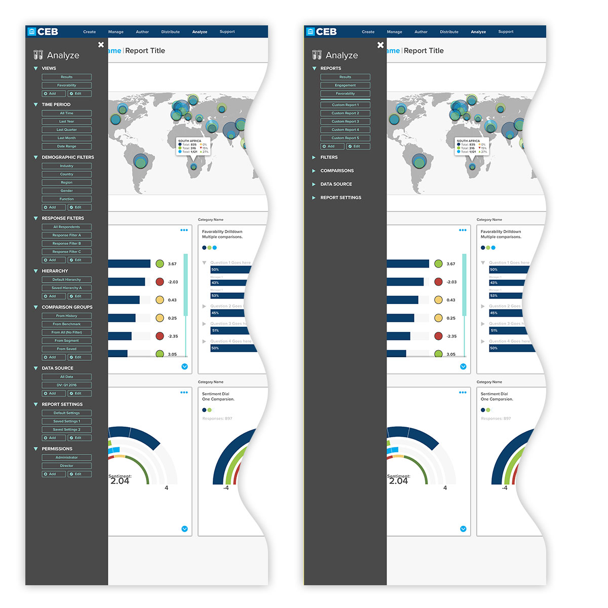
Application design is an iterative process, and this particularly extends to application interfaces. Here, as capabilities were added and rearranged for the Analyze section of the application, the overall process began to appear overwhelming—even for product team members. Interactive prototypes were used to show an expanding and collapsing of sub-elements to cut down on display clutter and avoid the paradox of choice presented to users.
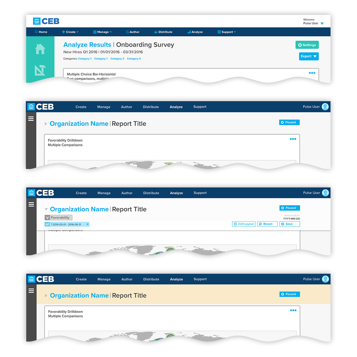
Moving to interactive comps helped show challenges between feature needs and display real estate, especially on the standard-issue laptops and low-resolution screens many end-uses would be accessing the application with. Here, at top, an earlier iteration of the application header is shown, complete with the older collapsed sidebar. The lower three show the revised design, where the header and navigation have been combined, reduced in height, and applied filtering display is collapsed by default. If a user applies filters that haven't been saved, the top area is flagged by a yellow background to alert them that there are unsaved changes.
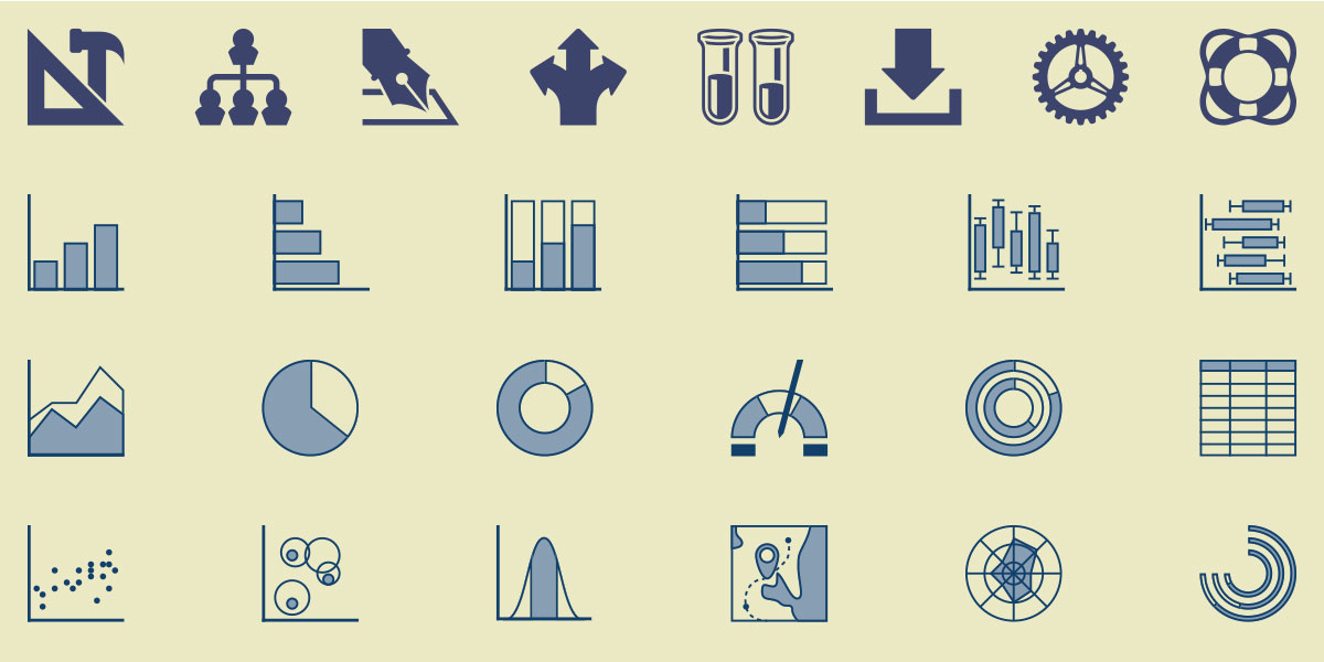
Although many items formerly represented by icons were replaced with text labels, there was still a need for iconography, especially for quick selects and data visualizations, which are often difficult to convey via text, especially for users unfamiliar with data visualization terminology. Here, main application icons are displayed in the top row, and data visualization types in the remainder. Although some universal paradigms are used, those and the custom types were all tested for easy recognizability at various sizes.
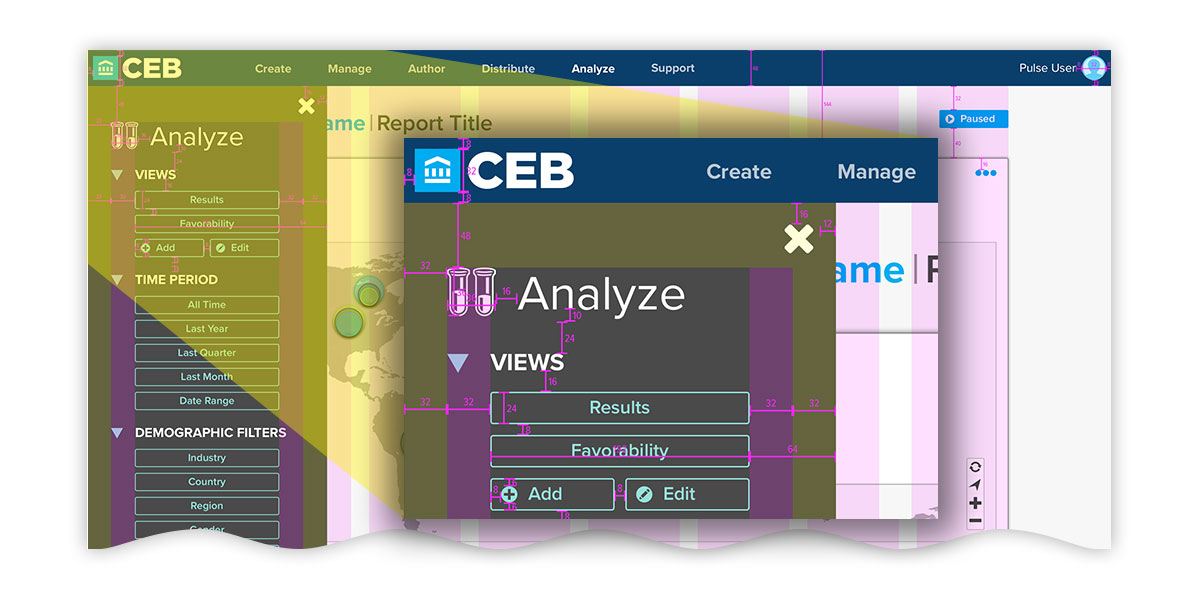
Especially when working with remote teams, communicating design intent can be a challenge, and necessitates detailed documentation. Here, a detail is shown for header and sidebar measurements within desktop display of Pulse. Careful attention is given to adequate element sizing and spacing for those who are using touch devices, as well as visually-impaired users.
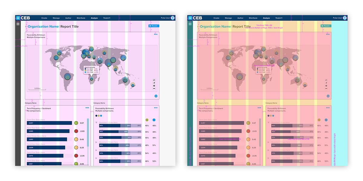
This attention to detail is also shown by adherence to the column grid layout, and region spacing. Here, vertical rhythm, spacing, and overall consistency is underscored in the the spacing, sizing, and relation of individual elements to one another.
