
Owing that this Website is promoting the marquee event of UXPA International, making the project user-centric was imperative. Based upon research of site users and team members who had participated in prior events, existing challenges were addressed well before any design or coding commenced.
Besides being the key marketing tool for promoting UXPA 2016, it would also serve as the on-site program for attendees. This is due in part to the fact that last-minute changes quickly render printed schedules obsolete. In light of this, careful attention was paid to creating a presence that served as marketing and information, in varying settings.
In addition to fulfilling multiple needs of the UXPA community, the site would also have to be user-friendly for staff, since attendee registration, scheduling, and programming would be handled mostly through this Website.
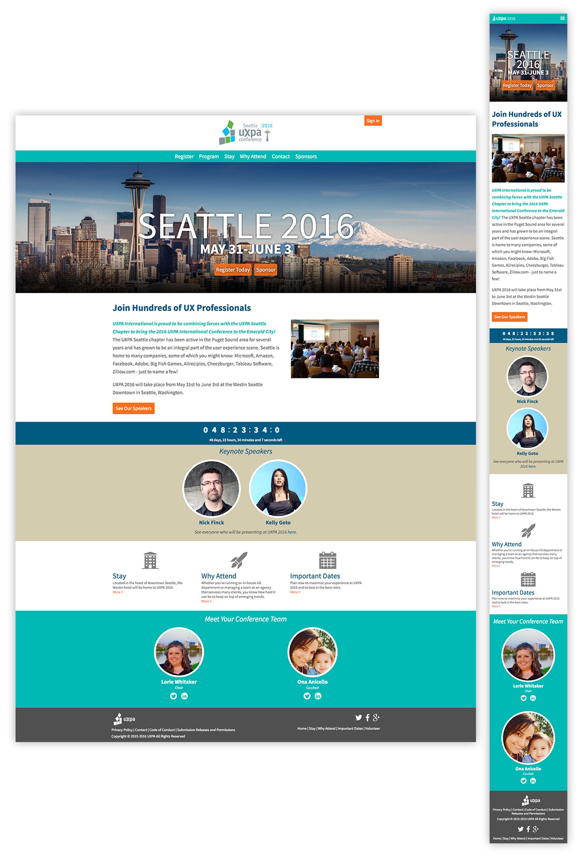
Homepage displays-desktop and mobile. These show the layouts in their entirety, demonsrating the modular design and adjustments between mobile and desktop displays. All bitmap images are responsively served. Symbols are either icon fonts, or placed SVG artwork.
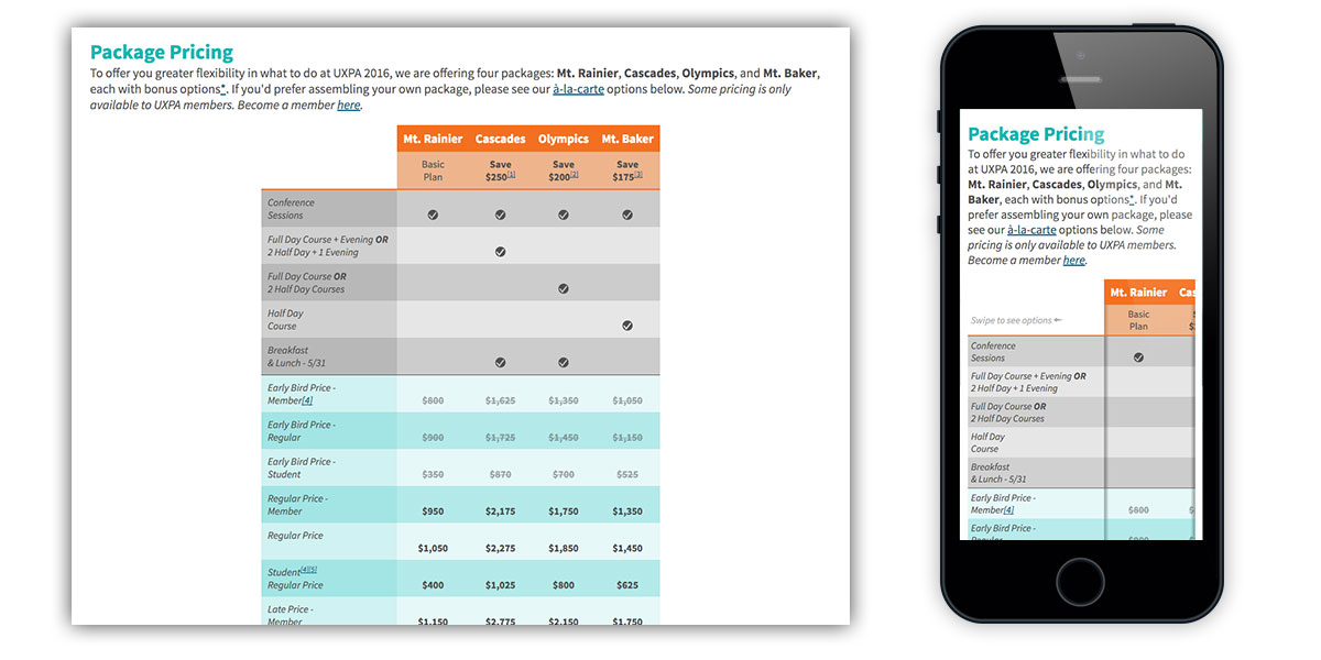
Conference pricing, desktop and mobile views. Due to the variety of options, a simple static table would be insufficent. As a result, Zurb Responsive Tables were employed in order to give mobile users a full experience on smaller screens. Subtle affordances, such as column shadows and brief helper text instructions display at mobile view to help users navigate.

Critical to the user experience, and success of the site was online registration. Here, careful design of user interface elements ensures easy navigability, as well as customized radio selects to give mobile users ease for handling the process—and boost accessibility—while on the go.

Confernce locations are a key selling point for an event. Here, team-selected attractions, as well as the main venue, are displayed on an interactive map, where elements are highlighted via taps or hovers on either the marker or the description. Custom marker icons and enhanced mobile display are key elements.

In order to give conference attendees the most up-to-date information, the program was to be online-only. As a result, careful attention was paid to balancing features and performance, especially for mobile. Here, typography and color are used to separate events, and location links are tied to appropriate floorplans to help attendees get to where they need.
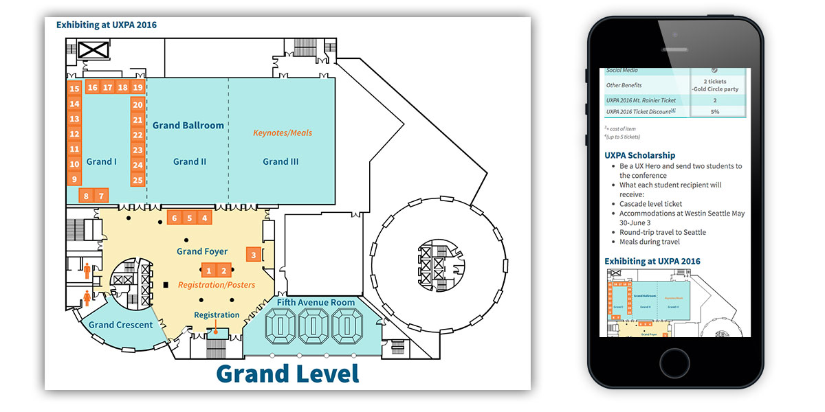
To assist sales staff, sponsorship offerings were listed in an online prospectus, and also offered users the ability to purchase online via the payment portal.
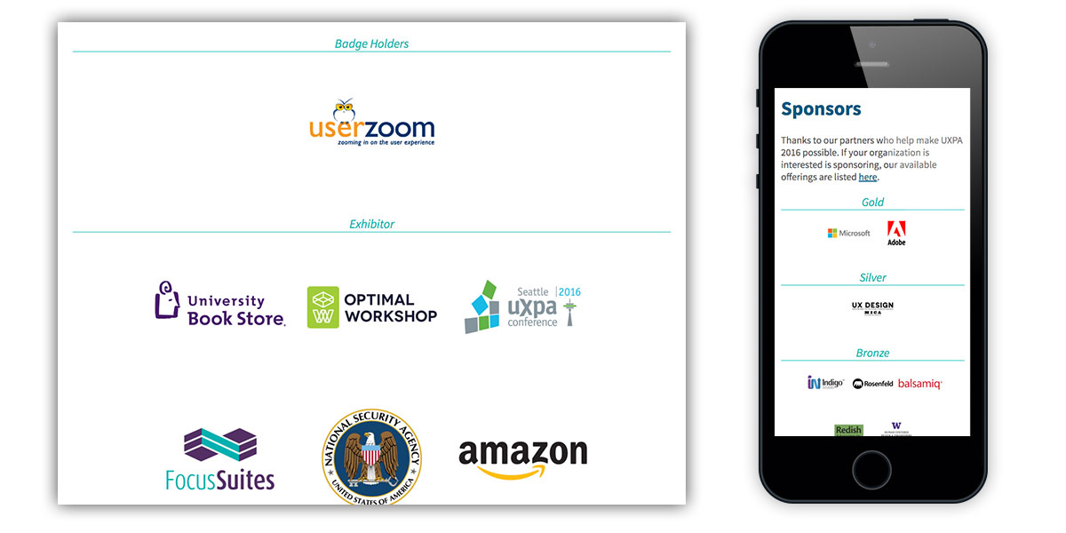
To give conference sponsors adequate representation, custom displays were created to displays sponsors by level. This was optimized for clean presentation at mobile, as well as for exhibitor display.
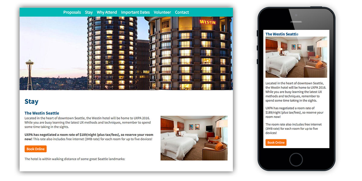
To help prospective attendees in their travel decisions, a complete conference hotel description, as well as links directly to online booking, was provided.

Industry experts, as well as keynotes, are the primary draw of professional events. Here, a comprehenisve visual listing of all presenters allows users to easily scan who will be there. These are linked to detailed biographical pages, where the presenter's event(s) are dynamically linked, for easy reading.

Critical to stakeholder buy-in, and creation of the visual design, are style elements. The style tile allows all team members to see color, typography, images, widgets, and other elements both alone, and how they tie into the overall visual design.
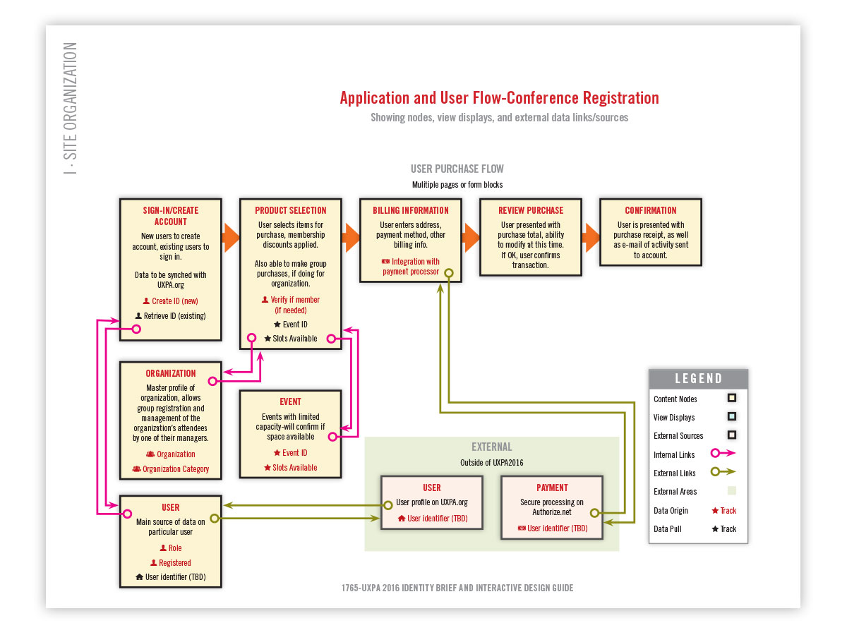
Flow diagrams are a critical part of understanding, and serving user needs. Here, a prospective user purchase, as well as the elements involved, is mapped out in detail.

To help visualize and plan for underlying processes, data flows are mapped out here. This was of crictical importance for UXPA 2016, since the site needed to validate memberships against the UXPA.org main site, and also communicate with third-party payment processors. Taking the extra time to explore processes before development work allows potential issues to be anticipated for, and dealt with, before problems occur.

Online tools such as InVision (used here) help to speed up client approval by allowing rapid iteration before a single line of code is written. Here, a detailed, functional prototype is shown, which was shared with team members across the country to test functionality in real time. Actionable feedback was quickly generated to refine the design and application architecture.

Often neglected, IA (Information Architecture) trees help to visualize how users access information, and in turn inform content strategy for the optimal user experience. Here, element hierarchy, and their relation to one another, is mapped. Although time consuming, the investment returns handsomely through a highly-functional Web experience.

Wireframing is another critical element of good site design. Here, major elements are shown, devoid of visual design, or the distraction of images or live content, in order to focus on content strategy, hierarchy, and user needs. This structure allows rapid iteration in order to achive good site design and functionality.
