Corresponding with the updates to the Voice of America (VOA) Studio Tour, the accompanying Child Tour materials were also in need of a refresh. Loosely based on the “Mike” figure from the previous series, a detailed study was made on increasing interest in the child tour program through compelling design. Being that the main art would be an illustration, studies were made on classic cartoon art—in drawing style, typography, and the color palette. This was adapted into the layouts to give a more informal, inviting feel to the pieces, as well as encourage participation of the child users. To add to the retro feel, the pages of the Reporter’s Notebook were designed to give the feel of the time-honored lined pages on yellow stock.
Due to budgetary constraints, the finished print pieces would need to available for print-on-demand using VOA’s existing digital printing equipment. In light of this, the Junior Journalist on Assignment piece (poster) was converted from a multipage document to a 11" x 17" (open) tabloid format that folds down to pocket-size for easy distribution. Similarly, the Junior Journalist’s Reporter’s Notebook was designed to use Circa bindery, which not only conveyed the feel of traditional spiral-bound notebooks, but also enabled quick assembly and modification, on demand.


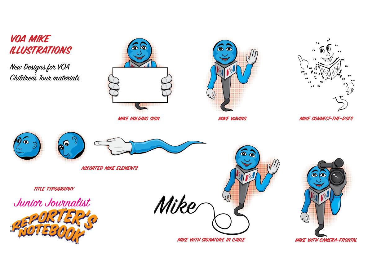
Various poses and treaments of Mike character, as well as typographic treatments and customizations.

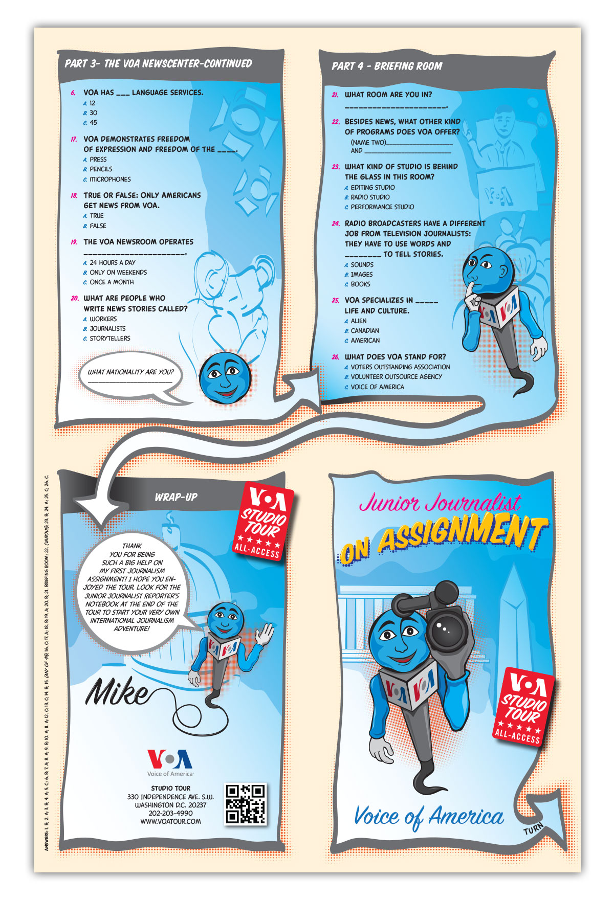
Page sampling from Reporter's Notebook.

Junior Journalist on Assignment Poster/Foldout Page 1

Junior Journalist on Assignment Poster/Foldout Page 2

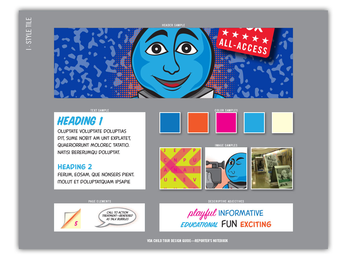
Style Tile showing typography, color, page elements, and image handling for the project.
With future projects for this series in mind, all illustrative and design elements used in the program were vector-based, allowing easy editing, resizing, and recoloring, if needed.
