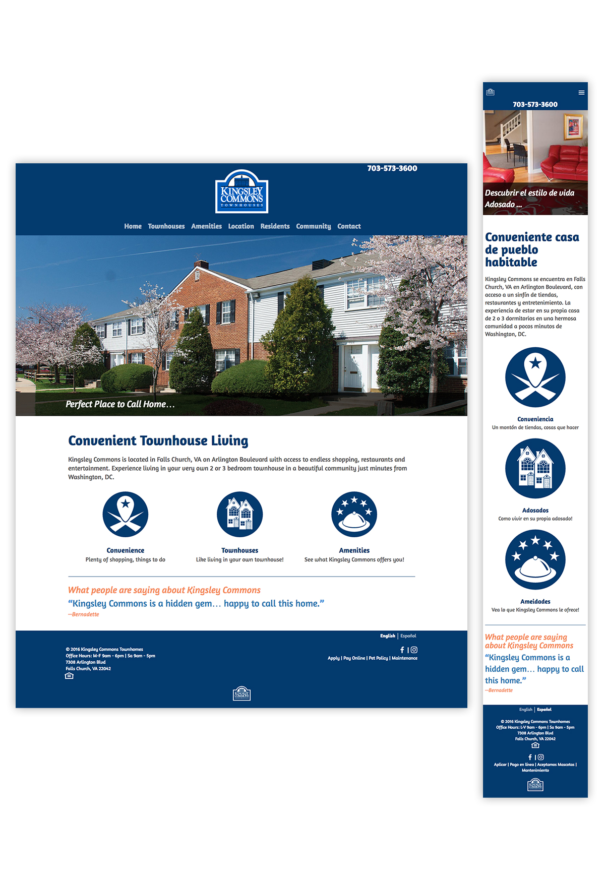
The Kingsley Commons Townhomes Website redesign addresses two challenges—giving mobile users a full experience, as well as serving a multilingual user base. Here, clear, minimal navigation and layout are utilized to showcase the content, and give prospective residents a good impression about the community, well before they ever visit in person.
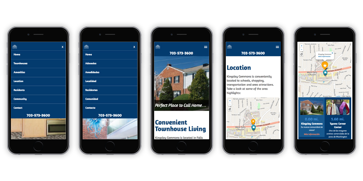
Mobile layouts and navigation-Spanish and English. User-centered content strategy dictated clear navigation patterns and clear interaction affordances.
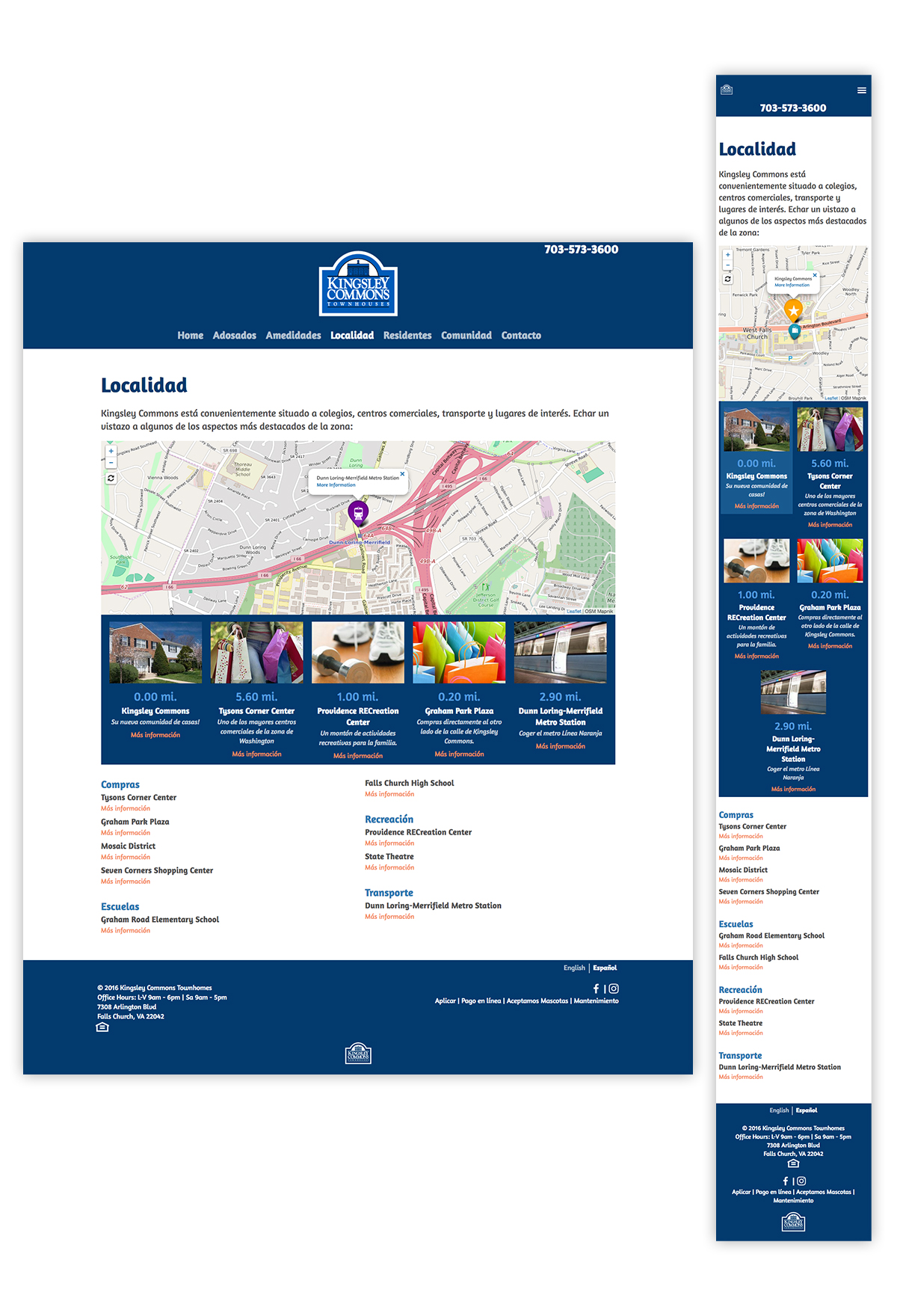
Since location is a primary consideration for prospective residents, interactive mapping is used to demonstrate the convenient location of Kingsley Commons, as well as neighborhood attractions.
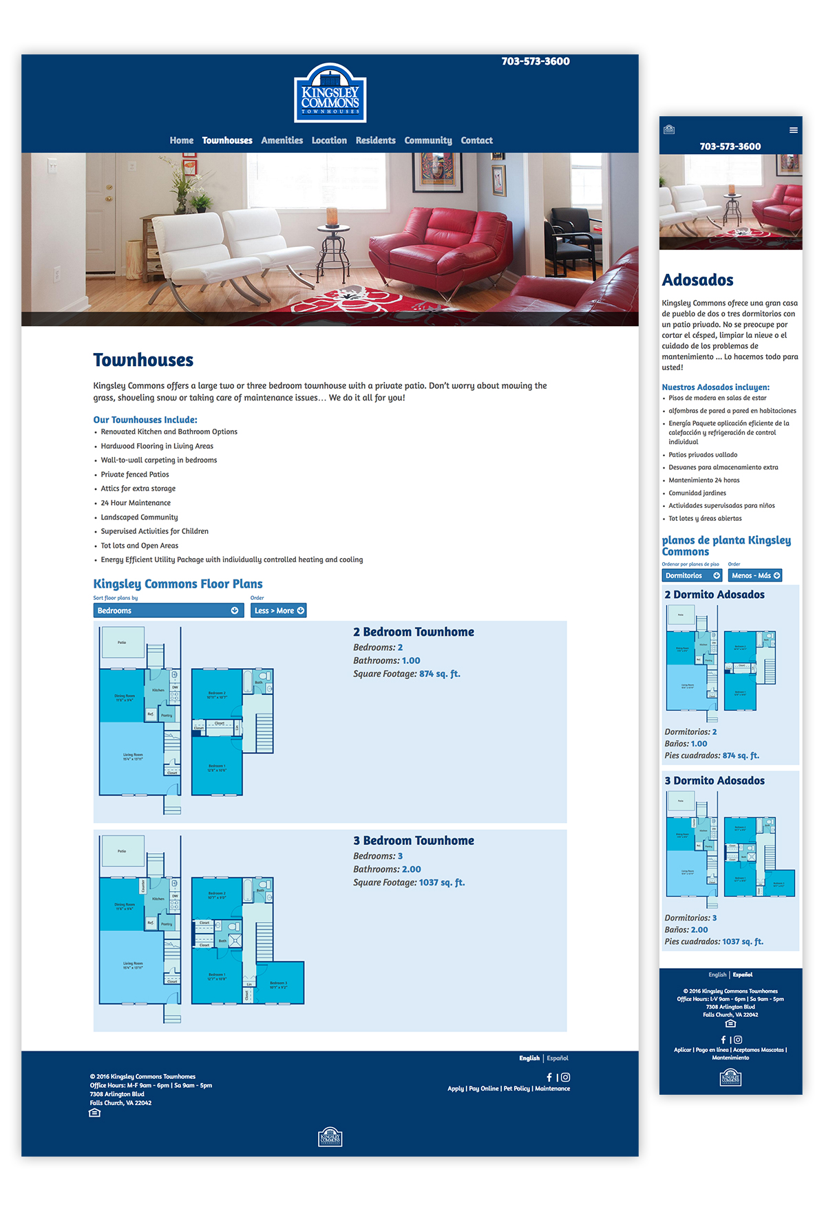
To give prospective residents a clear picture of the offerings, a sortable floorplan display shows listings based on user preference. This artwork is custom branded, and resolution-indepenendent, which gives mobile users the full experience.
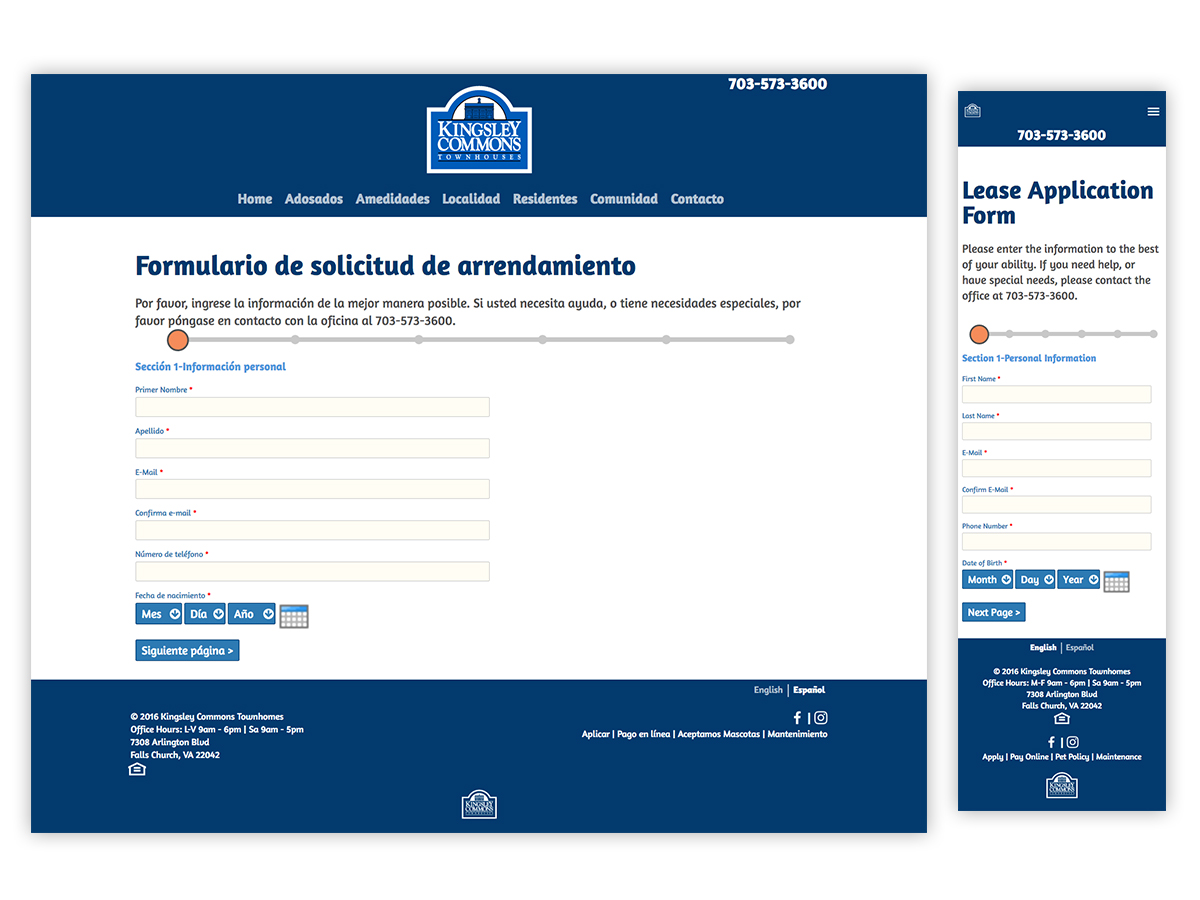
Form design—a critical part of the user flow for many sites, is often overlooked. Here, careful attention is paid to clarity, as well as incorporating progress bars and other elements to help users successfully complete their tasks.
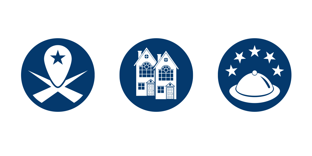
Due to the multilingual nature of the content, universal iconography is critical to navigation. Here, custom designs are used for the primary calls-to-action on the homepage.
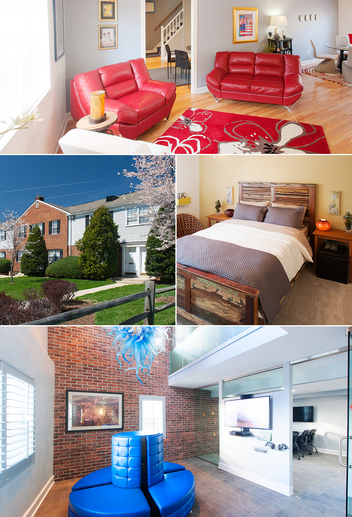
Good site content is of paramount importance. Here, custom location photography is used to highlight the property.
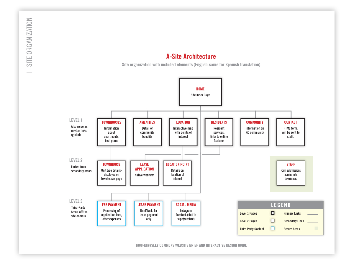
Information architecture is a critical element of Web design and content strategy. Here, the final Website layout hierarchy is shown.
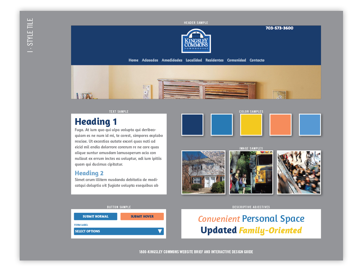
To secure team buy-in for the branding and identity early in the process, style tiles were employed to show elements both separate and integrated. This format allows quick and efficient review.
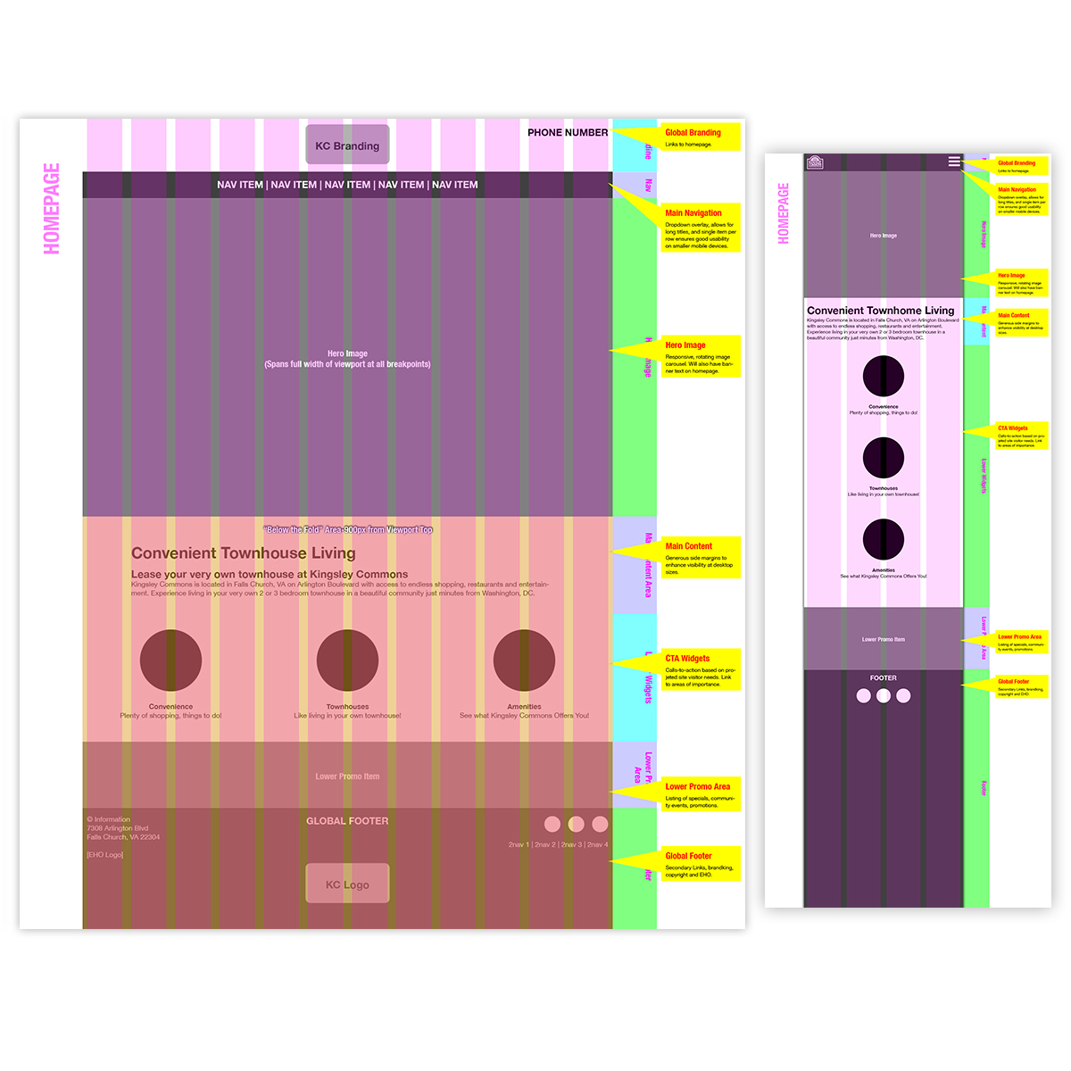
Wireframes are an essential part of the Web design process. Here, desktop and mobile layouts for the homepage help both to plan and visualize content strategy for different use cases and devices.
