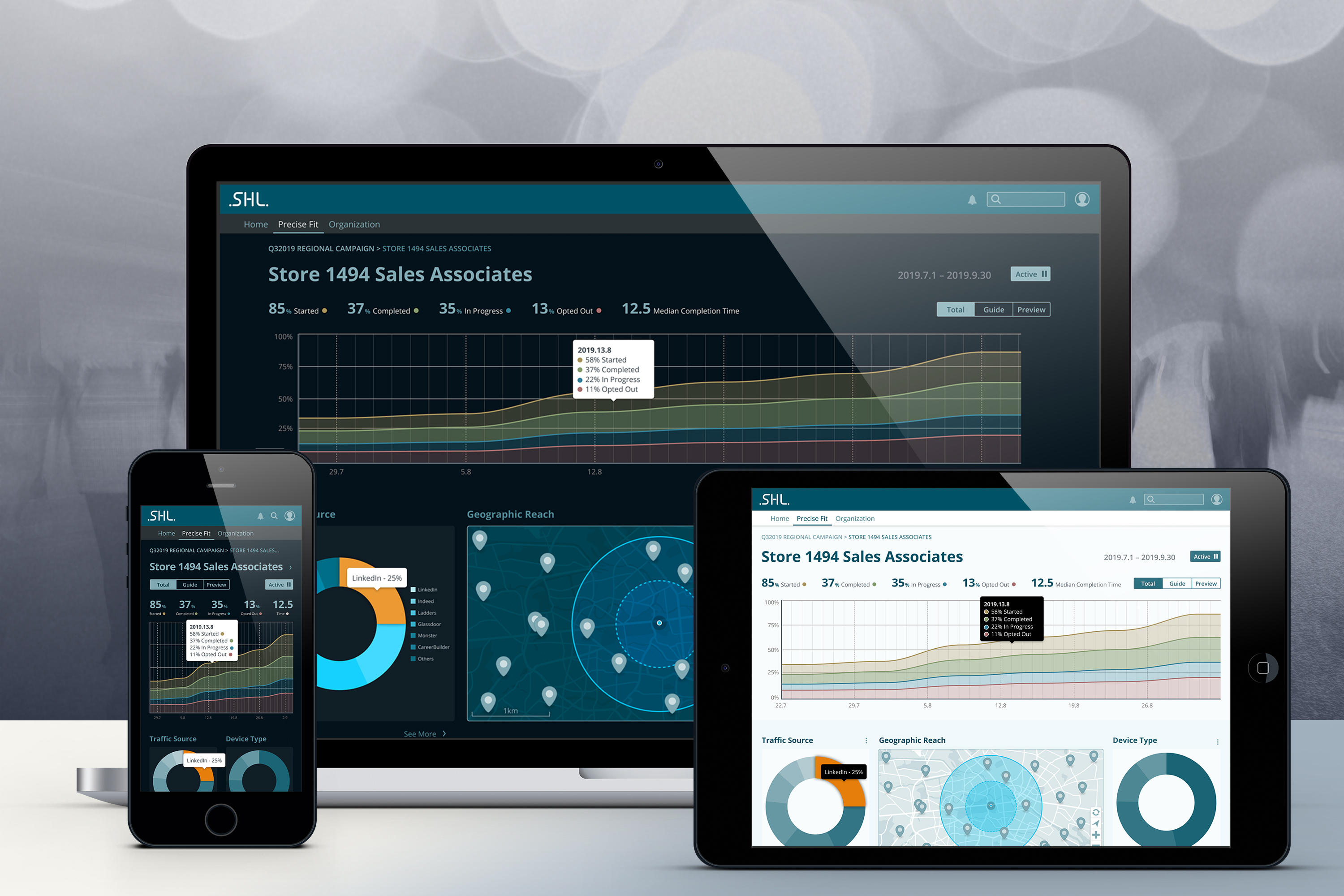
Precise Fit is a software as a service application that helps organizations assess job candidates during the hiring process by use of online tools. Although only involved up to the wireframing process of the application revamp, following are explorations of a future hiring manager experience.
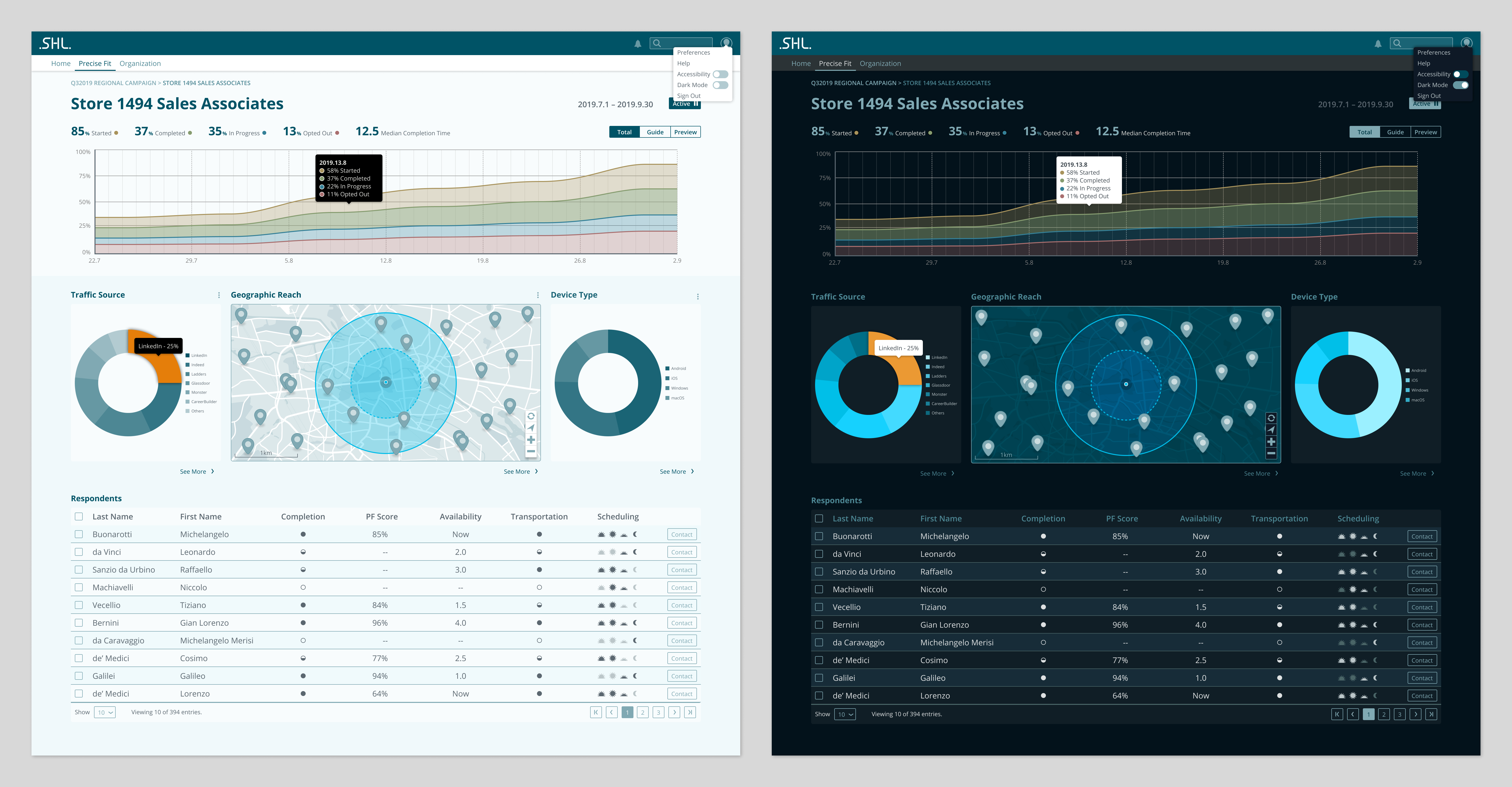
Desktop display of hiring campaign in light and dark modes. For readability and concise communication, a monochromatic color palette is utilized. This helps busy hiring managers focus on the content—not distracting presentation—to aid rapid cognition.
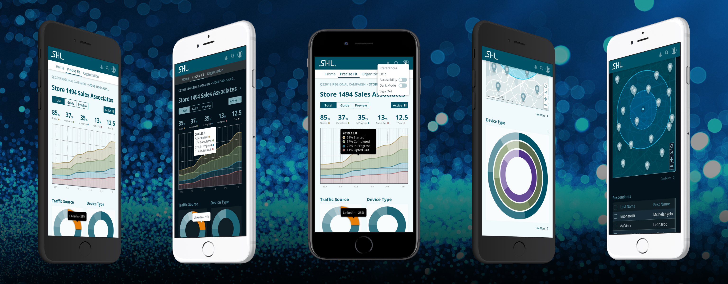
Although the core user base for Precise Fit will be normally accessing the application via desktop applications, a mobile-first approach was taken for the explorations. Here, various screen displays in light and dark mode are shown.
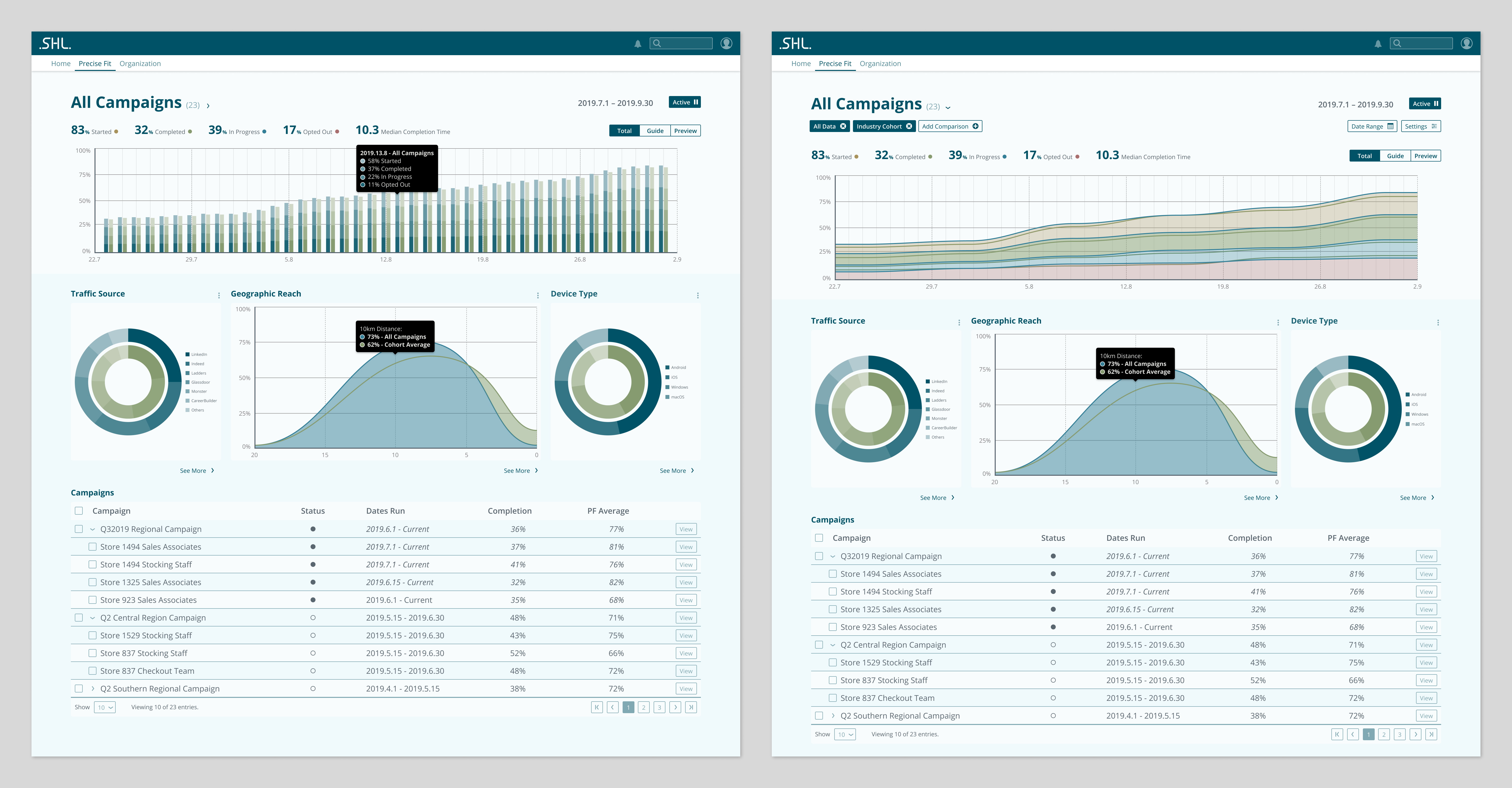
Consistency of content and wayfinding are evident in the landing page for Precise Fit. In these views, the default collapsed filter view (left) is compared to the expanded view (right). This functionality is collapsed by default in order to cut interface clutter. Since comparing geographic reach of various campaigns would be difficult to conceptualize on map overlays, Gaussian distributions are utilized to allow quick comparisons. The hero visualization shows multiple options—and highlights the complexity of data displayed.
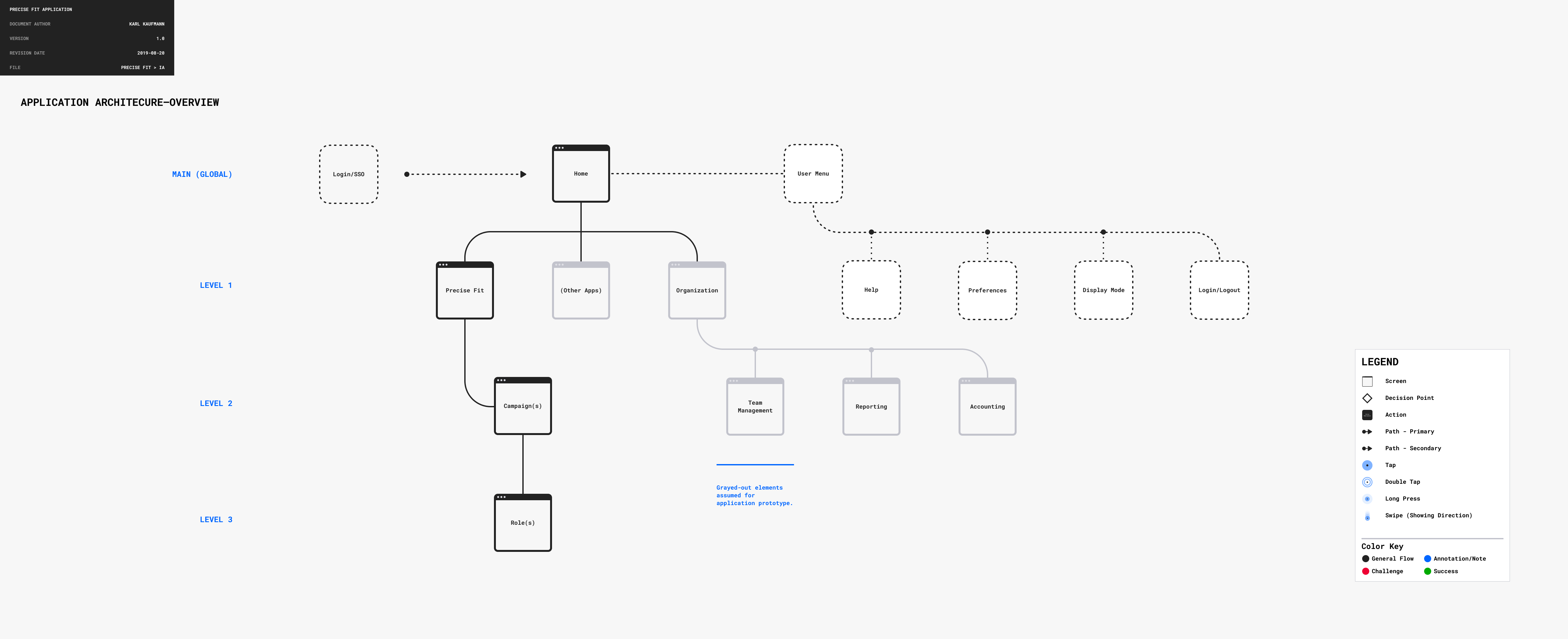
To gain a deeper understanding of the application, an information architecture review was undertaken, to uncover organizational challenges. A revised future state of the application structure is shown here, cutting many duplicative elements.
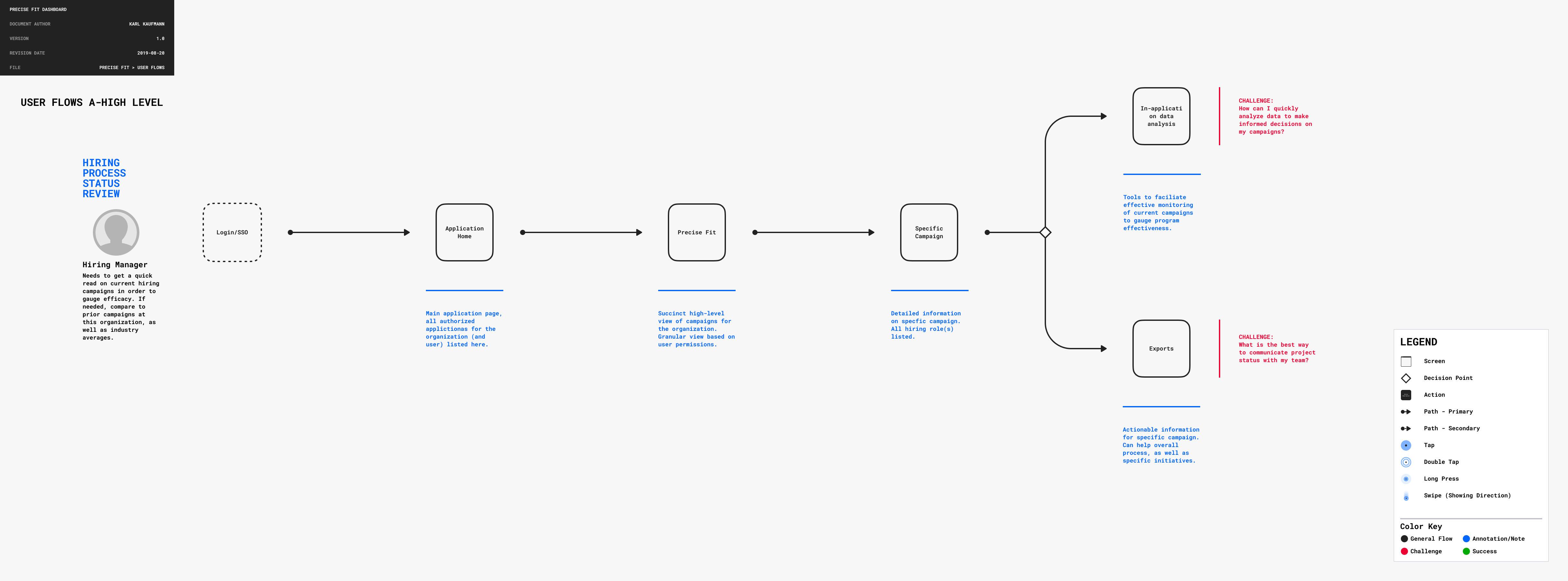
In undertaking a user-centric approach to the redesign, the tasks of a busy hiring manager are mapped in this high-level view.

Here, the hiring manager’s journey is further mapped, taking into the account the tasks and challenges in greater detail. Thumbnail blocks are used to focus on content flow, not styling.
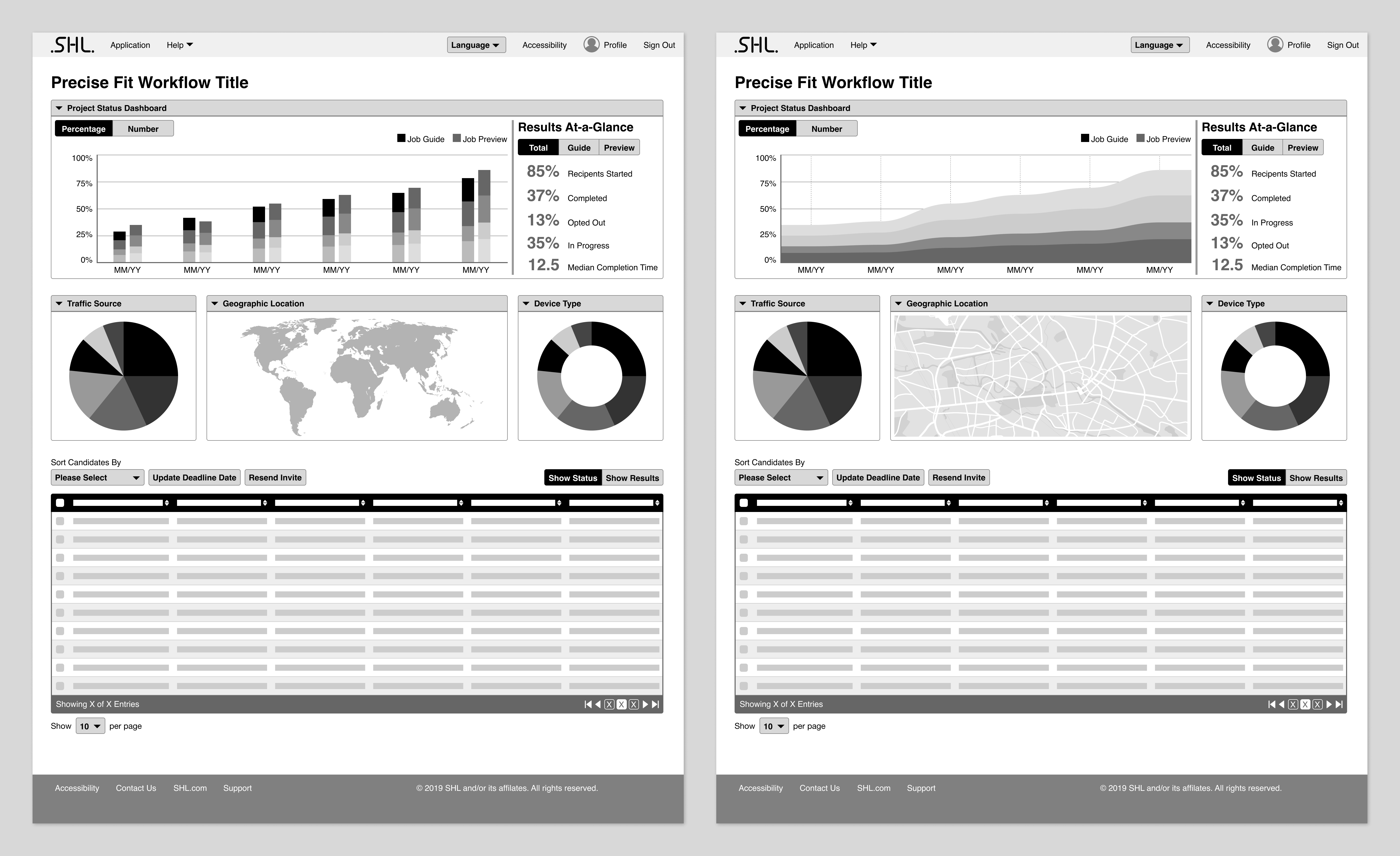
The hiring manager’s needs are beginning to be addressed in these wireframe iterations. At this point, the existing layout elements are being utilized, but patterns are emerging that will inform the evolution and updating of the application.
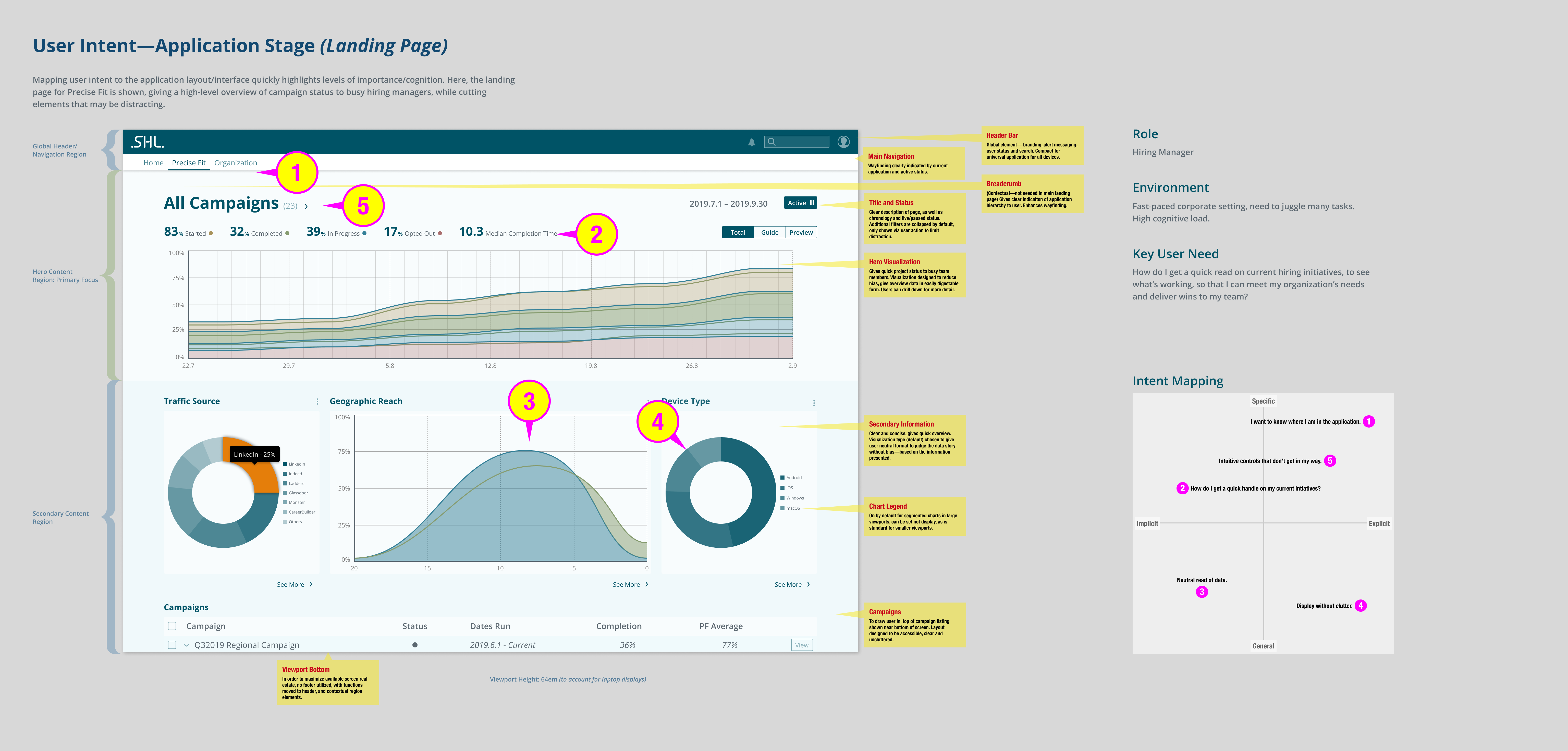
User intent mapping for the application dashboard. Here, user needs and intents are mapped to content areas. This informs the content strategy and hierarchy, highlighting what elements need prominence, and the context in which they do so.
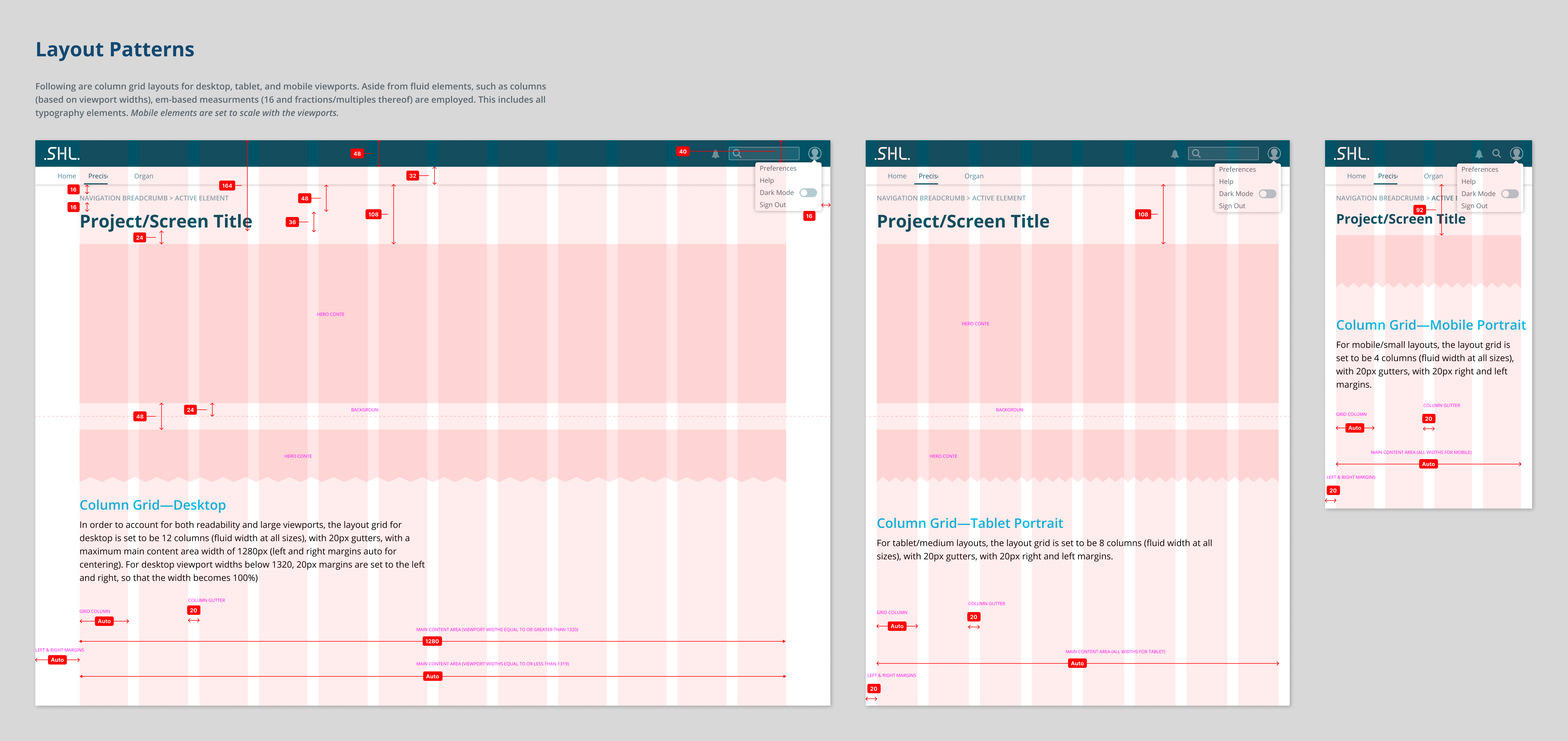
Form follows function—especially in cohesive layout. Here, layout grids, vertical rhythm, spacing, and global elements are shown for multiple devices. This includes demarcation of what elements are fluid, and which are fixed.
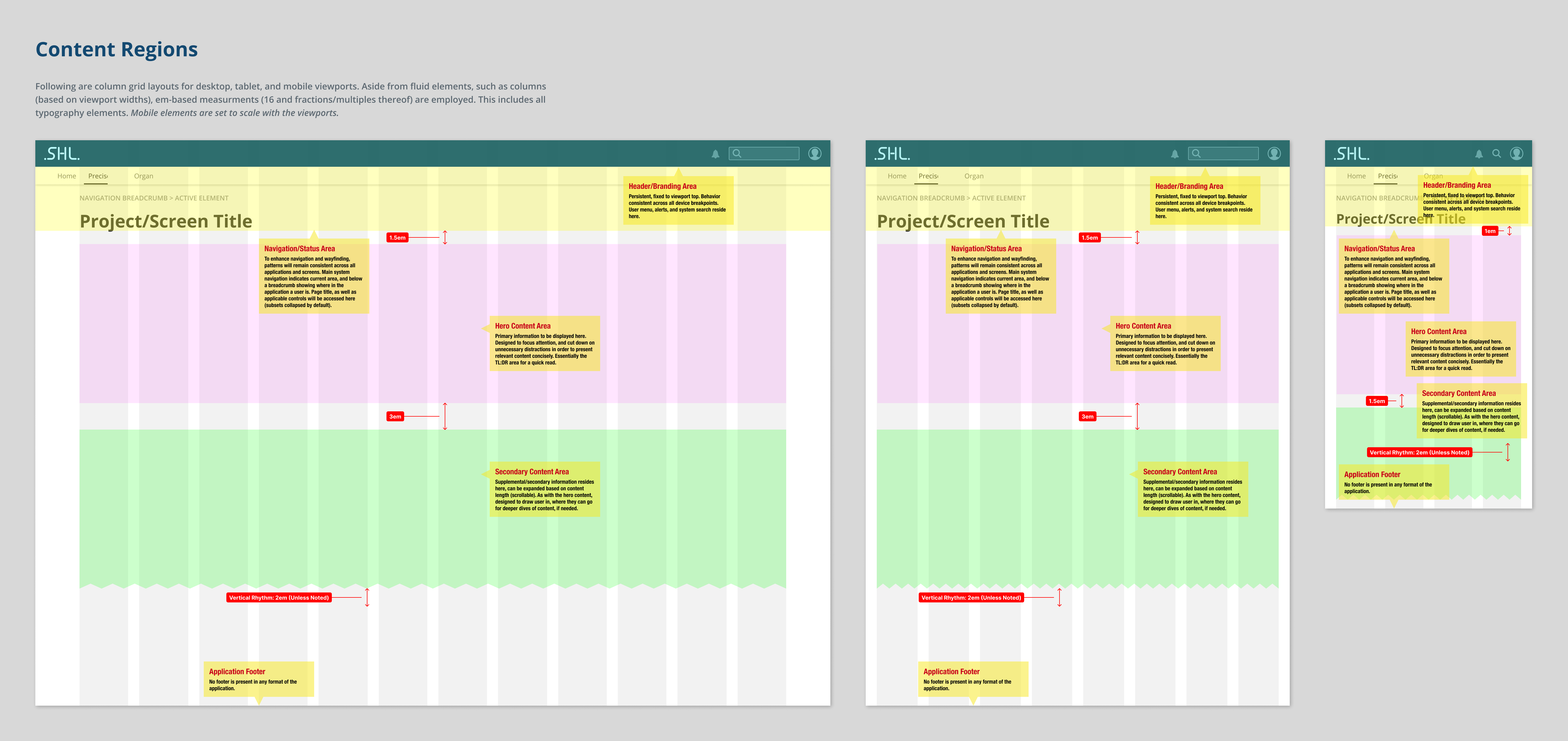
Building upon the layout patterns, here content regions are defined—according to importance and to impart a consistency across all user tasks.
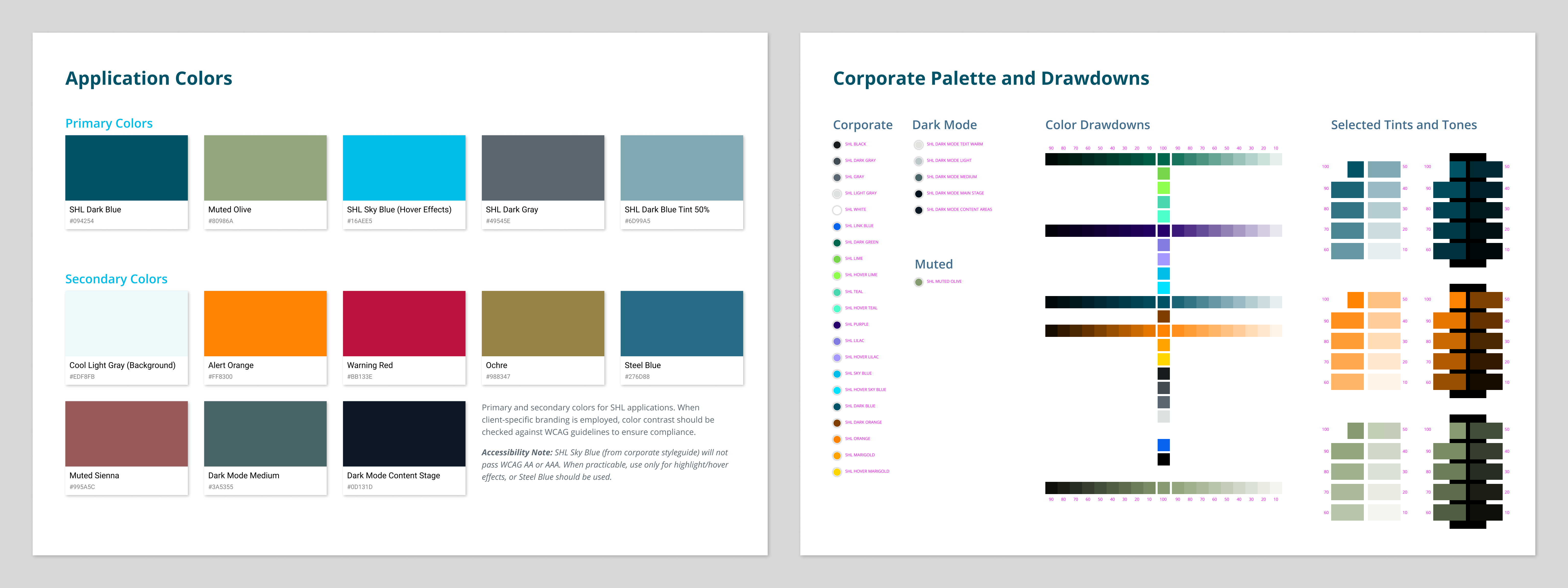
Application colors, primary and secondary, as well as corporate palette and variants. In order to convey consistency of corporate branding while adhering to usability guidelines and communication clarity, a standard fine arts approach was employed—graying down the color palette. Here, selected strong colors from the corporate palette are expanded through tints (lightening with white) and tones (darkening with black) in order to achieve hue and value consistency. This is especially important in regards to data comparisons, where strong colors can overwhelm others, even that effect isn’t desirable.
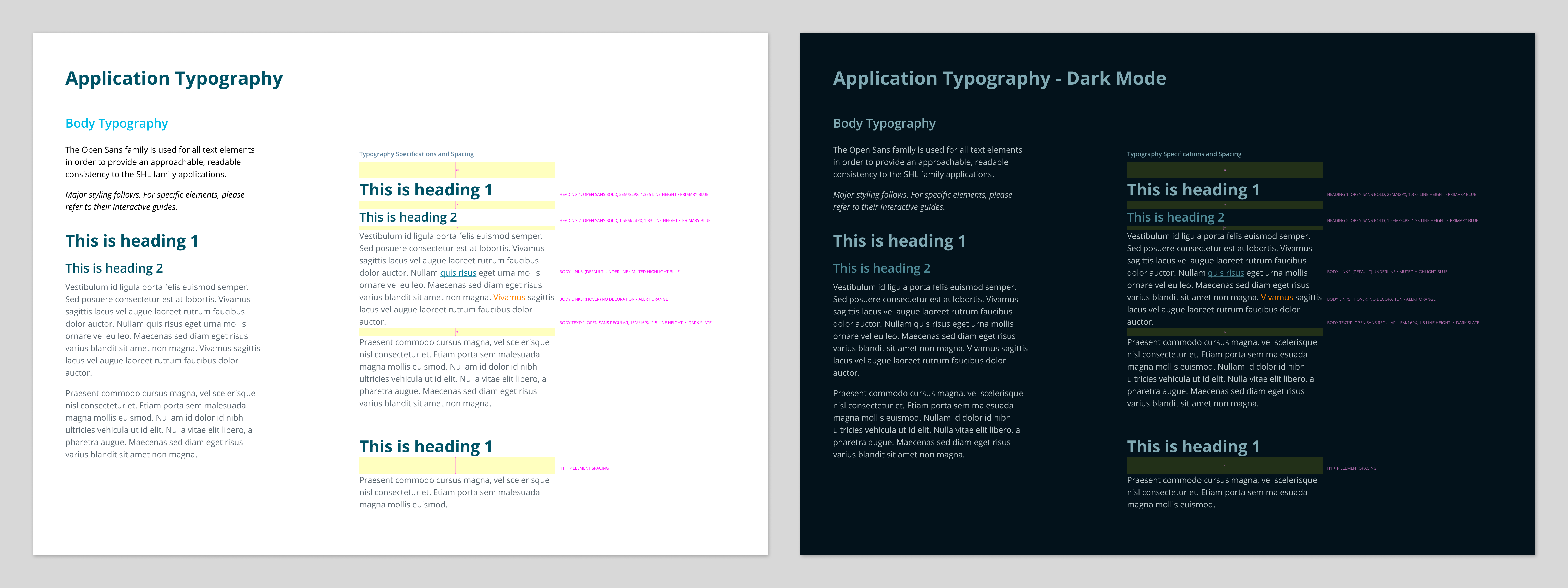
Application typography, light and dark mode. Clarity and readability are the primary focus—which is enhanced by generous spacing where possible. Appropriate contrast is also attended to in dark mode, which is enhanced by the warm/cool tonality adjustments between foreground and background elements.
