

Infographic detailing the Responsive Web Design (RWD) process. In order to make a technical subject more inviting, an informal, lighthearted feel was created. The design involved a good amount of research into 1950s pop culture, from typography and color, to image treatment. Avoiding a canned, inauthentic look was key—and why custom illustrations are employed. The design process itself is based upon first-hand experience on a number of projects, from large teams to solo gigs, and is constantly evolving. Like a recipe, it’s not meant to be followed exactly, but to be used as a guide in the process.
The branding and identity of the project employs period-specific colors, typography, and overall feel. Some custom typographic manipulation was used to achieve the desired effect.

Custom illustrations, styled for the period, were used to give an authentic feel and merge well with other design elements.
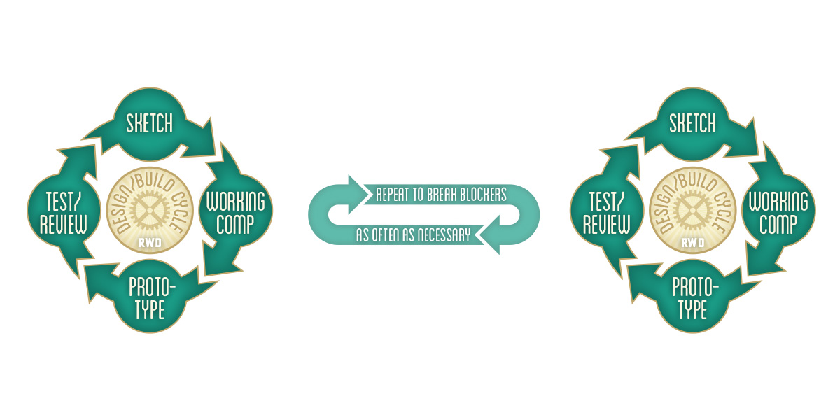
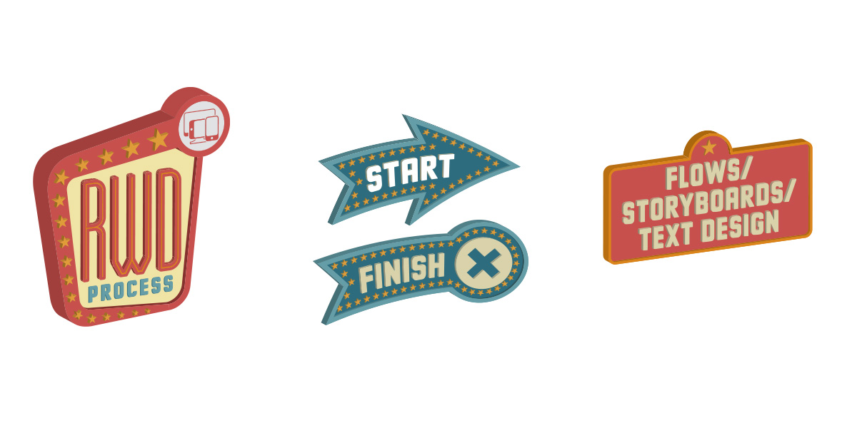
Process flow illustrations can work, if visually appealing and informative. These are custom designed for the project.

Style tile to set color, typography, images, and feel for the infographic. Even for one-off projects such as this, cohesion and organization are vitally important.