Great strides have been made in the Drupal core Media Initiative, which promises an improved authoring and content management experience. What used to require a number of contributed modules and custom setup can now be accomplished by using 8.8+ core alone.
The advantages of using core media over inline content include reuse of media assets (images, audio/video), providing a consistent authoring and management workflows across media asset types, and providing choices in custom content output that can enhance the user experience. For site updates/migrations, placed media assets may help by separating them from the content they are embedded in.
Drupal 8 Media in Action—Inline Responsive Images
A practical example involves Responsive image displays. This can significantly enhance site performance for users, especially those on mobile—where smaller images are served, cutting the bandwidth transfer needed.
Setup
This assumes you are running Drupal 8.8+. Everything you need to do this is included in core.
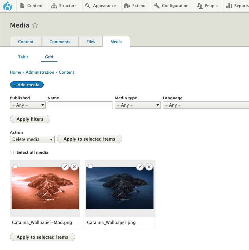
- Required modules—go to /admin/modules, and activate the following modules: Media, Media Library
- Display Mode(s) (Optional Enhancement)—go to /admin/structure/display-modes/view, and create a new Media view mode entity type (named Responsive Image in this example)
- Image media type configuration—go to /admin/structure/media/manage/image/display, open Custom Display Settings, and select the new View Mode you created
- Manage Display—tab to the view mode you just created, change the format from the default Image to Responsive Image, then select a Responsive image style (this demo uses the Wide Responsive image style that ships with core), and any linking you may want. Save your settings.
- Text Editor Setup—go to /admin/config/content/formats, select the editor format required (Full HTML being used in this demo), tap Configure
- Under Toolbar Configuration, select the Insert from Media Library widget, and pull it down to the active toolbar
- Scroll down to Enabled filters, select Embed Media, then under Filter Settings > Embed Media, select the Media types selectable in the Media Library (in this case Image), and the View modes selectable in the Edit Media dialog (in this case Responsive Image). Save configuration.
Usage
- Create or edit a piece of content (will be creating a Basic Page here)—go to /node/add, select Basic Page, add a title
- Select Text Format—here, since the demo uses Full HTML, select this.
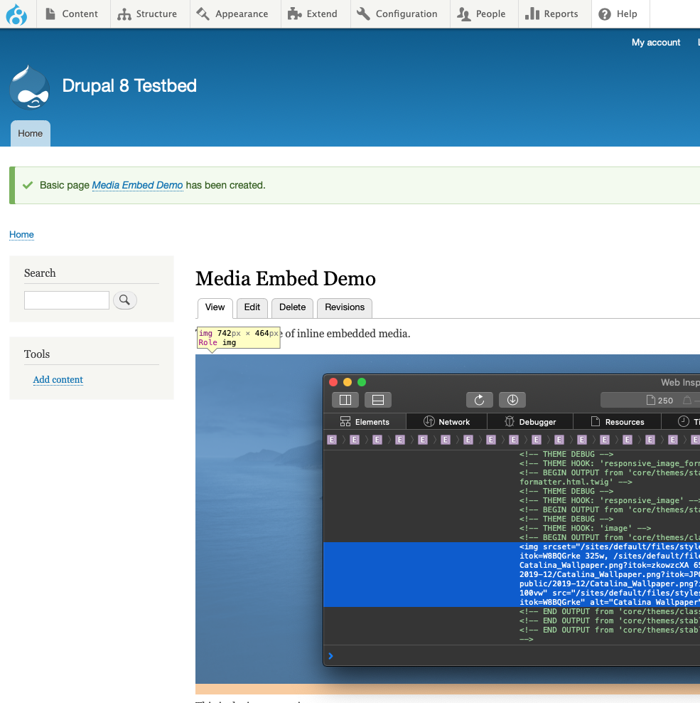
- Edit Content—in the text editor, click on the Insert from Media Library, then select Image > choose an image, then Insert Image. The media image item will be placed.
- Choose Display Mode—click on the Edit Media button above the place image, choose the desired display mode (in this case Responsive Image), as well as any desired alignment, save changes, then save the new page. Your content should now be displayed as a responsive image.
Conclusion
This demonstration example only covers one display mode for inline responsive images. With a similar setup, it’s possible to create display modes for other Media assets, including custom types you may need for a given project. Additionally, it’s also possible to create multiple display modes for any existing media types, which allows content authors to select pre-packaged display output (which can be styled and include custom fields) to further enhance the content experience, while maintaining consistent user and authoring experiences.